USAA Modernization Effort
I am currently part of the greater Modernization Efforts here at USAA. The new design system is expected to be rolled out across 2024 and onwards, and features responsive designs that are more fitting for a modern website. The image on the right is a taste of the new system. The system originally ran off of Sketch and Invision's Craft Library Management, but has now been shifted over entirely to Figma.
So far I have designed modernized versions of over 7 pages. Unfortunately, the webpages I have designed in this new system are not yet updated or live, so I cannot share them publicly. I would be happy to share them in an interview and go over that process and work.

USAA Storefront - Current Design Process
The environment of the USAA website is huge and constantly expanding. The pages showcased here were all work in which I designed the webpage in question, participating in the experience from start to finish, including working with Business and Content partners and presenting all design work.
Step 1: Content Alignment
These pages would start off with Content Strategy Alignment Sessions with Business, Content, and Design (myself). We would speak through any desires Business wanted for the page, any requirements that were mandatory, and any concerns from Content or Design in regards to the page before the work was begun. Legal disclosures and any custom design needs are also discussed here.Step 2: Page Design and Accessibility
Once content was approved, I would design the page using the current standards for the website using the current USAA design library. After reviews with Business and Content, I would then mark up all the accessibility information for screen readers.Step 3: Foundation Review
The page would then be sent to Foundation Review, which would catch any content updates or design issues that would need to be fixed. Once all issues were addressed, they were sent off to our development team.
Step 4: Maintainence
I would then remain available for any questions our developers had, as well as to add any updates in the meantime from Business or Content.All content on this page is currently live on the USAA website.
RepairPal Storefront Page
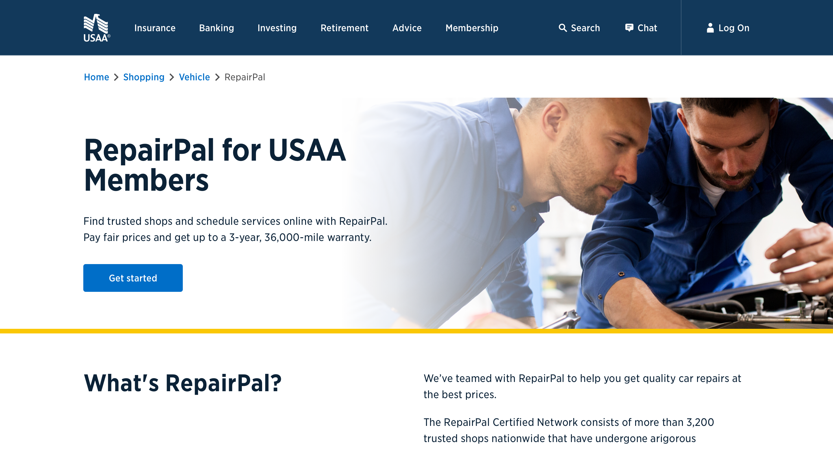
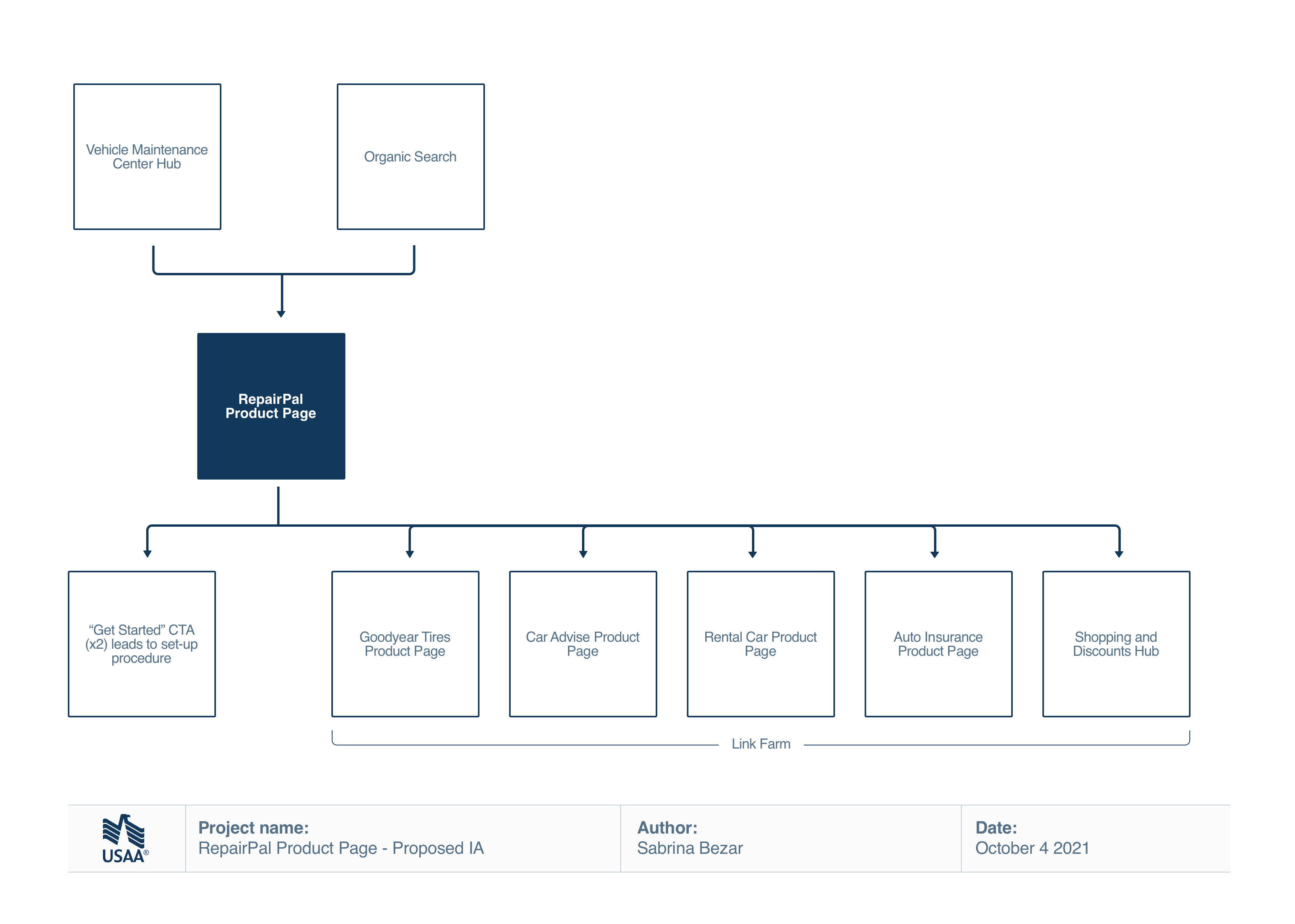
USAA's program with RepairPal required it's own storefront page. The process was fairly straight forward, using a layout similar to the existing storefront page for CarAdvise. After content alignment, I put the page together. I chose imagers from the libraries available to us and laid it out as I saw fit using the current library.
The page is not responsive but there is a desktop and mobile version of the page. You can view the live storefront page by clicking the link below.
Sitemap

Accessibility a11y markups

Mobile version


Flood Insurance Storefront Page
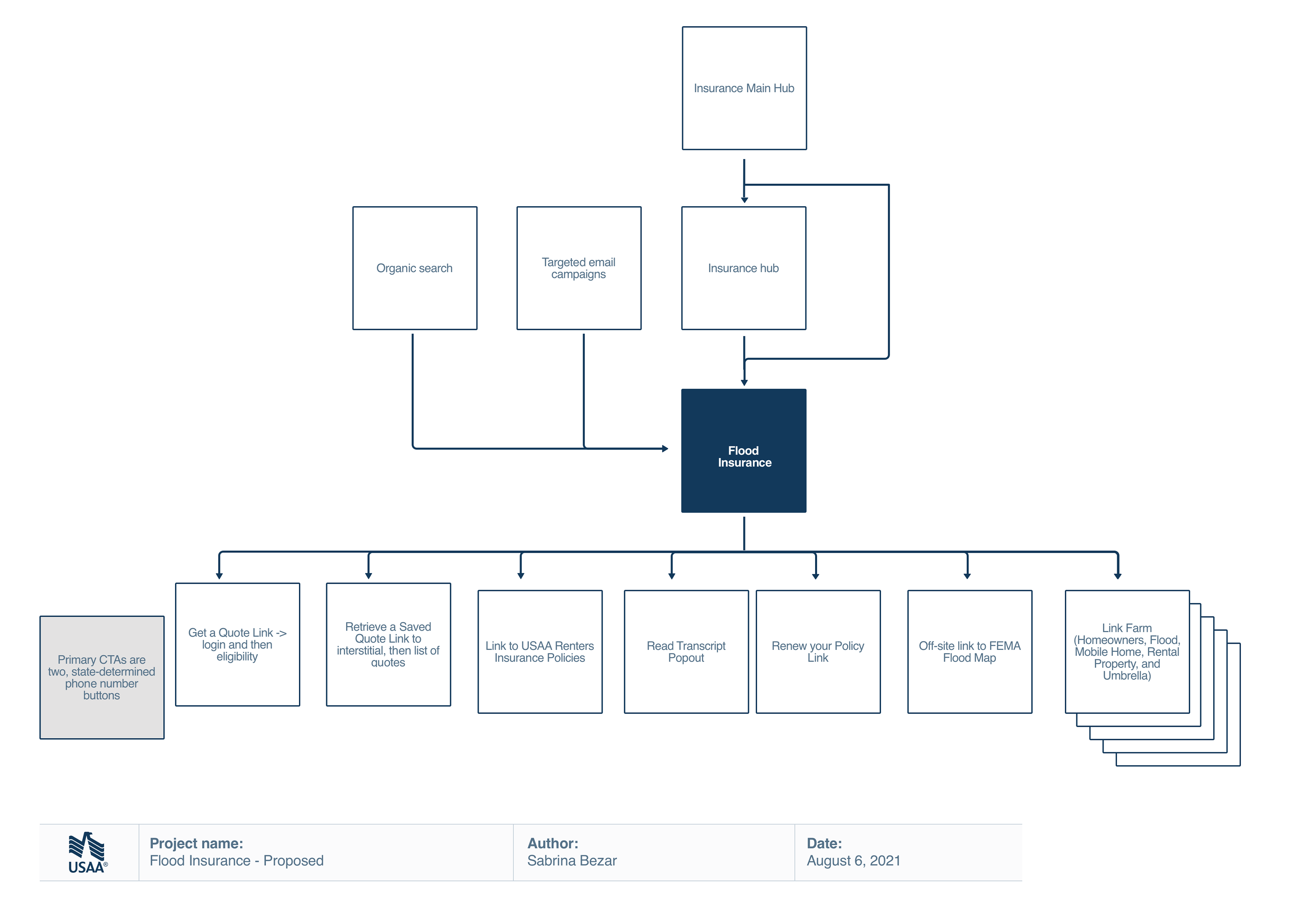
The flood insurance page for USAA was outdated. I was assigned on the project to update it's design and content to be up to date with the current website standards. Much like Repairpal, the process was fairly straightforward, but allowed me an additional freedom of choosing all the components I saw fit for the content with few other limitations, unlike RepairPal which had sister pages. My choices were well regarded by the Business and Content teams.
The page is not responsive but there is a desktop and mobile version of the page. You can view the live storefront page by clicking the link below.
Sitemap

Accessibility a11y markups

Mobile version

