Inside Disney - User Experience Design
At The Walt Disney Company, I was on the team that was responsible for all internal-facing websites. With a company as big as Disney, it's not surprising that there would be in-house staff to create all internal websites for all manner of events, organization, and work resources. While on this team I got to work directly with developers and experienced UX architects to help design websites, modules, and interactions for Disney employee-facing websites.
My Role
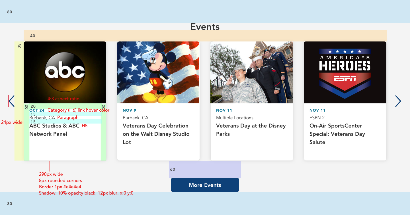
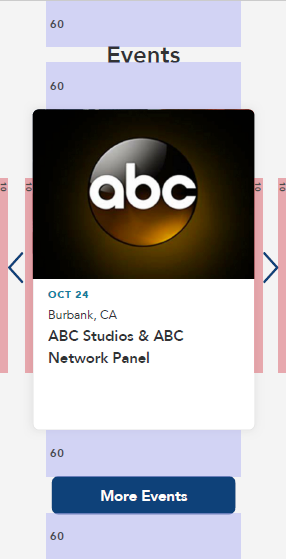
I created high-fidelity wireframes and mockups including interactions using Sketch app and Invision. I worked closely with developers, shareholders, and other designers to review my work. Once the wireframes were approved, I added redline details in for developers and sent over all applicable files.
Disney Belong Club Calendar Module
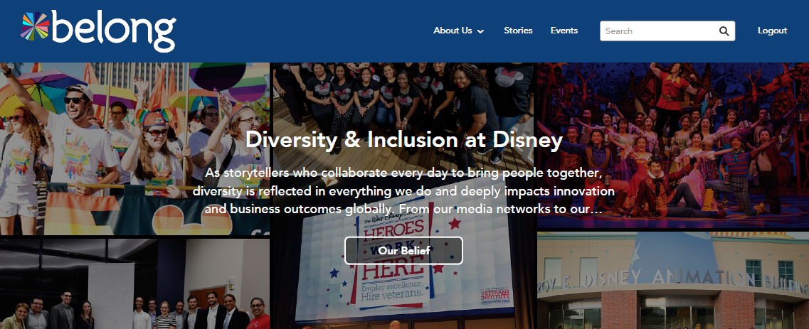
The Diversity and Inclusion team at Disney HR needed a new website. My team was tasked with discovering the Diversity team's needs and what the website would need to function effectively.
My Role
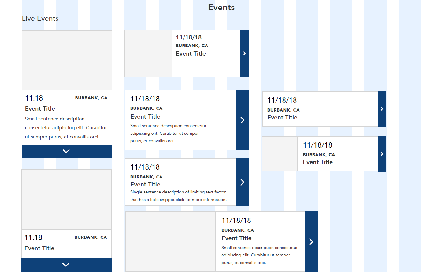
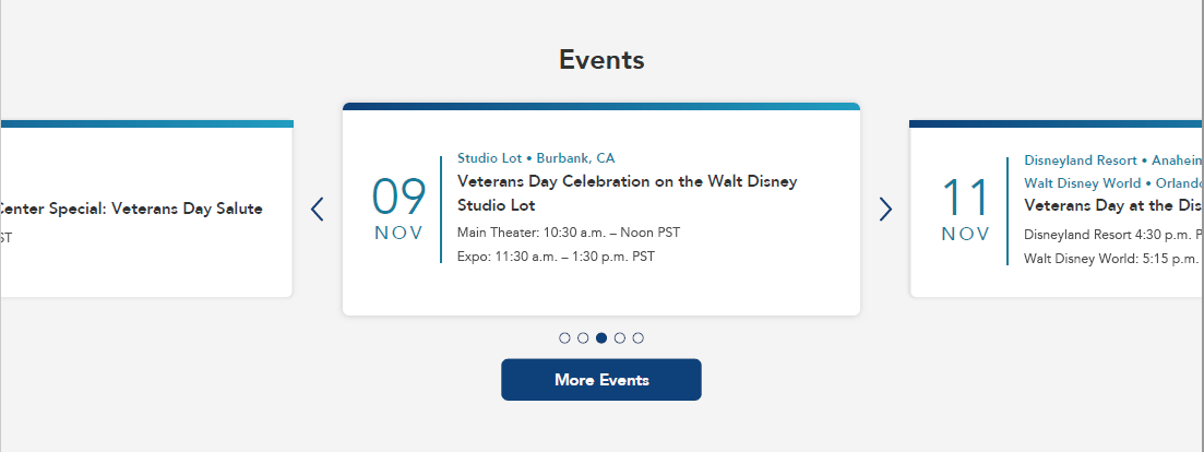
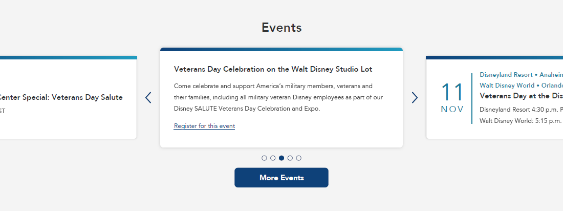
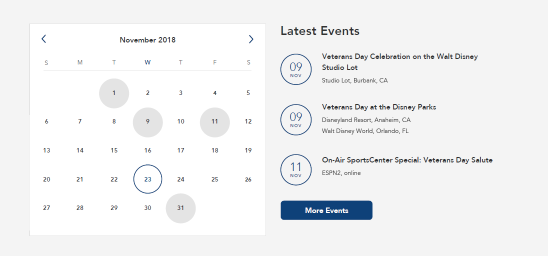
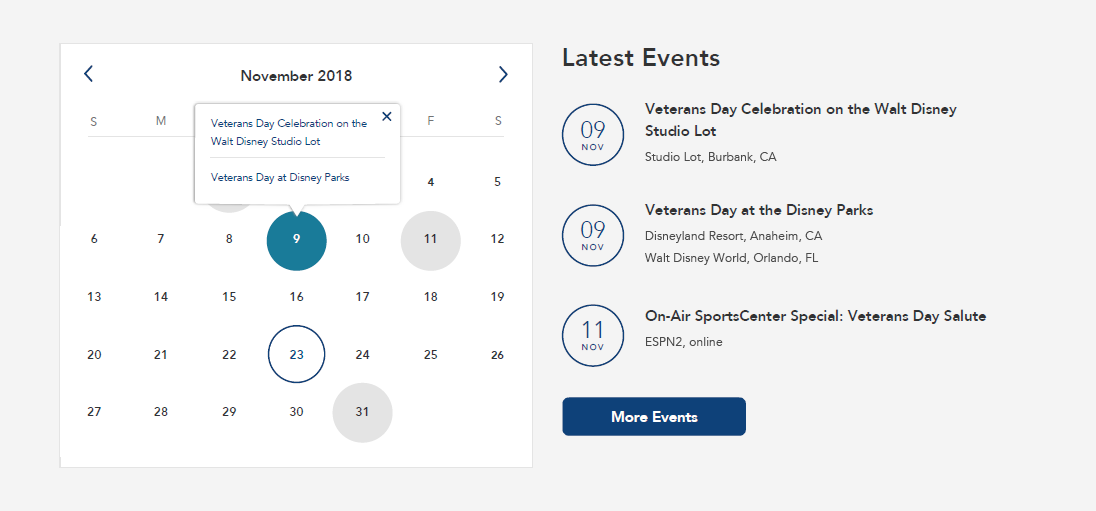
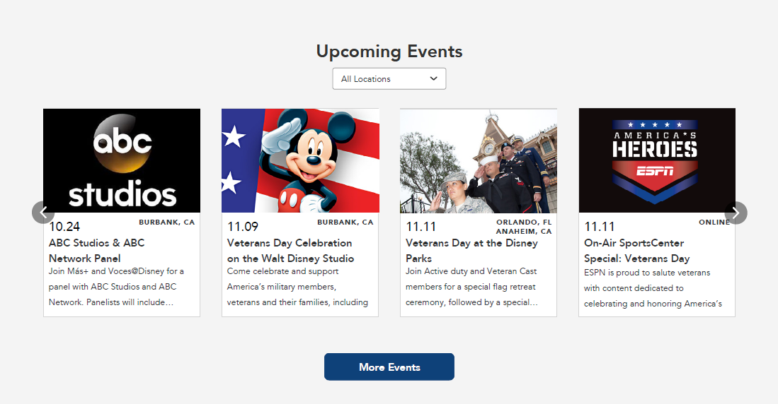
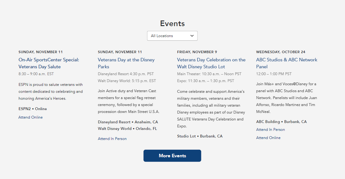
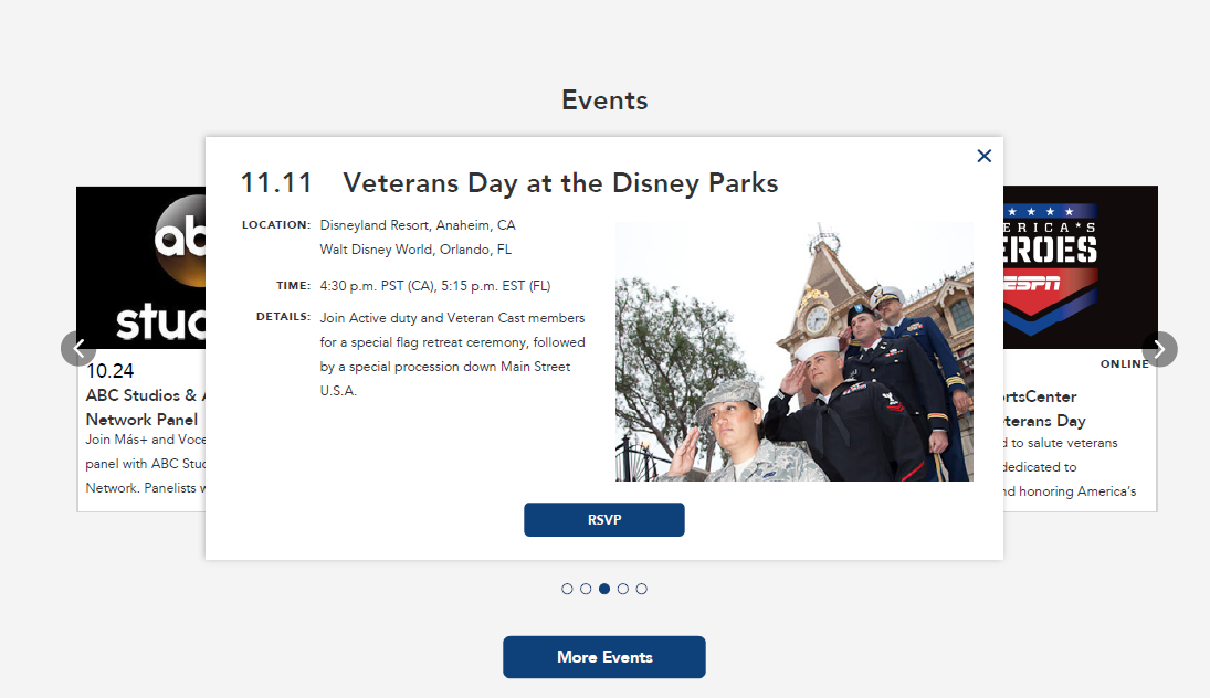
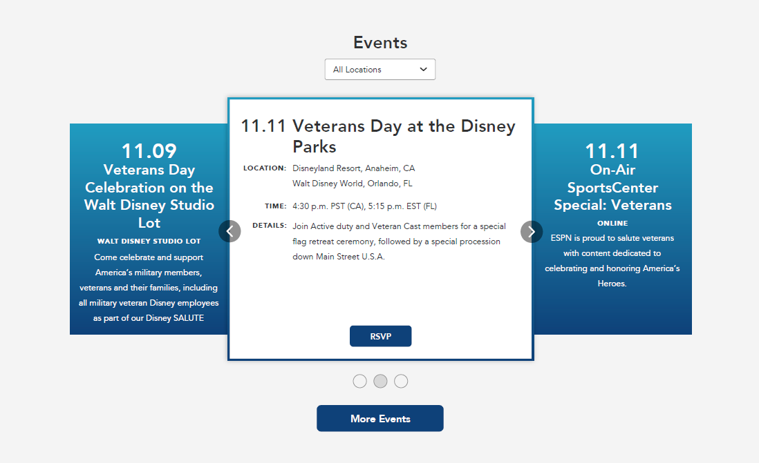
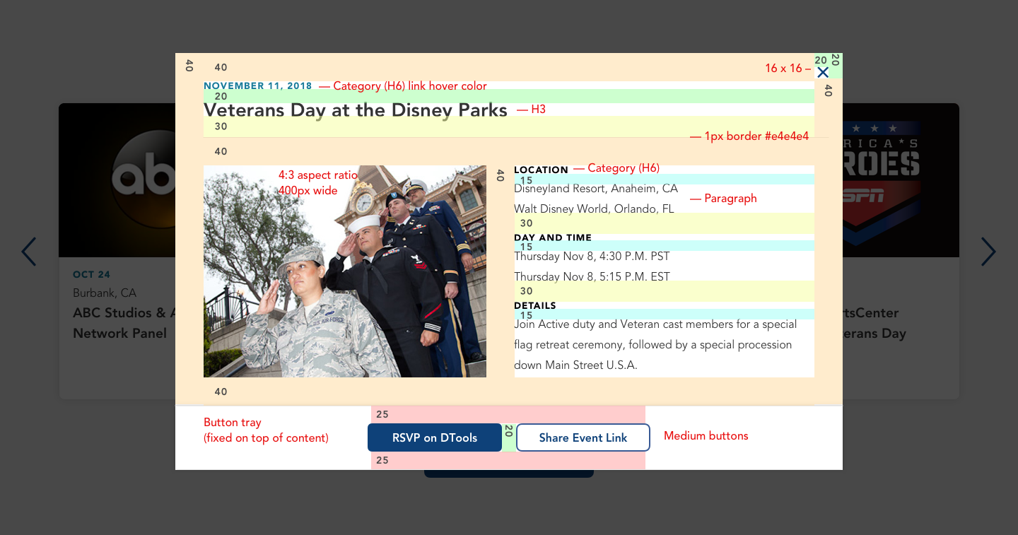
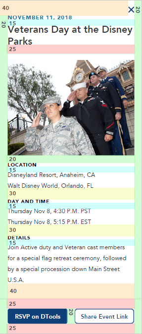
I was tasked with designing a calendar module that would integrate both into the Belong home page while providing all needed information. Once ideation was complete, wireframes and mockups with detailed notes were given to the developers.
High fidelity wireframes were created in Sketch App and fleshed out using Invision for proof of concept.
The website is now live but only viewable to Disney employees since it is an internal website. Please watch the video for the live and final interactions.
The Client's Needs
Disney Belong is Disney's Diversity and Inclusion club, which provides employees with events and resources to promote diversity within the company and have their voices heard.
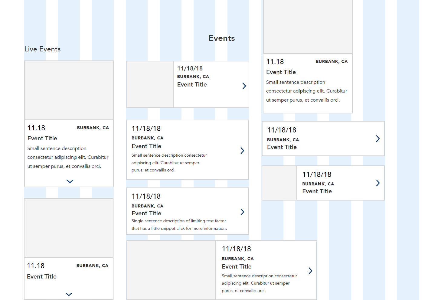
The calendar module needed to be clear, easy to read, but also as full of information as possible. Since some events could get rather wordy in description, they needed a solve that could work for both short and long items.
Competitive Research
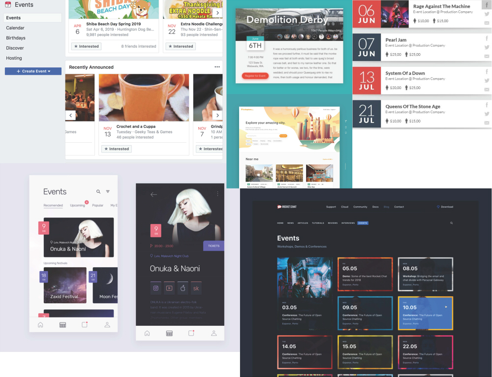
Since the calendar was being made from scratch, I took to finding inspiration at websites with calendars and event modules that I found were effective. Websites included Facebook and LiveNation. The way the calendars looked as well as the way they behaved were all taken into account during this inspiration phase.
Module Wireframe Exploration
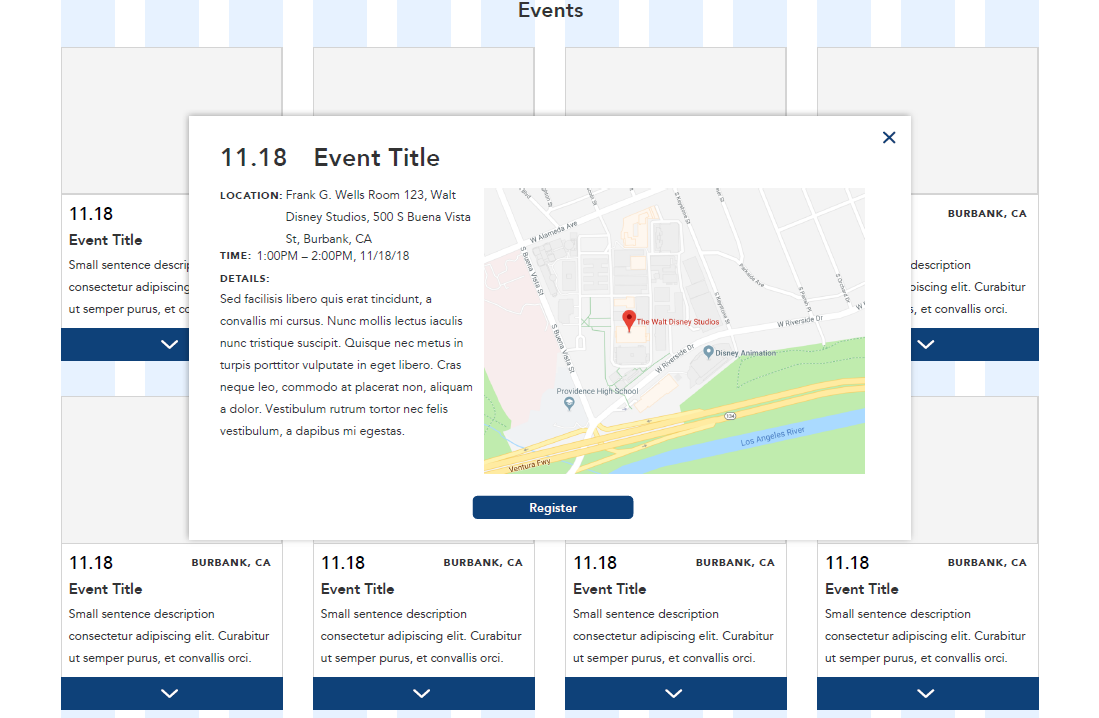
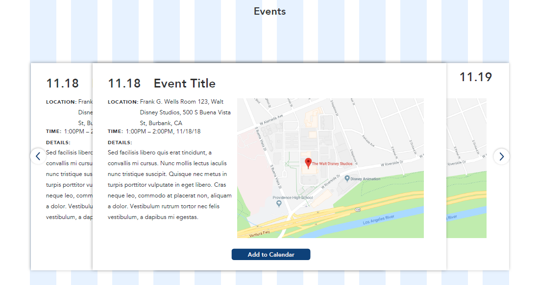
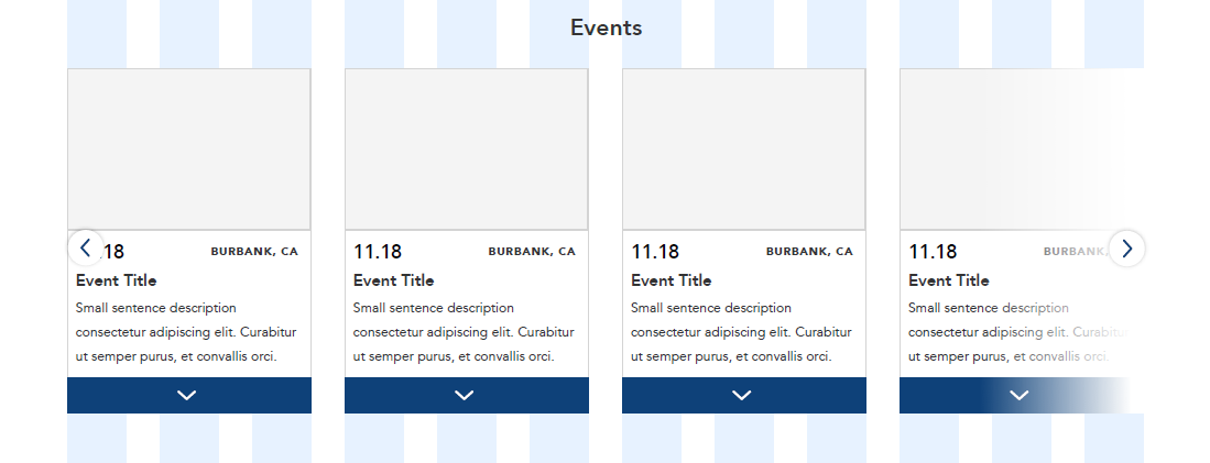
Module Calendar Design Exploration
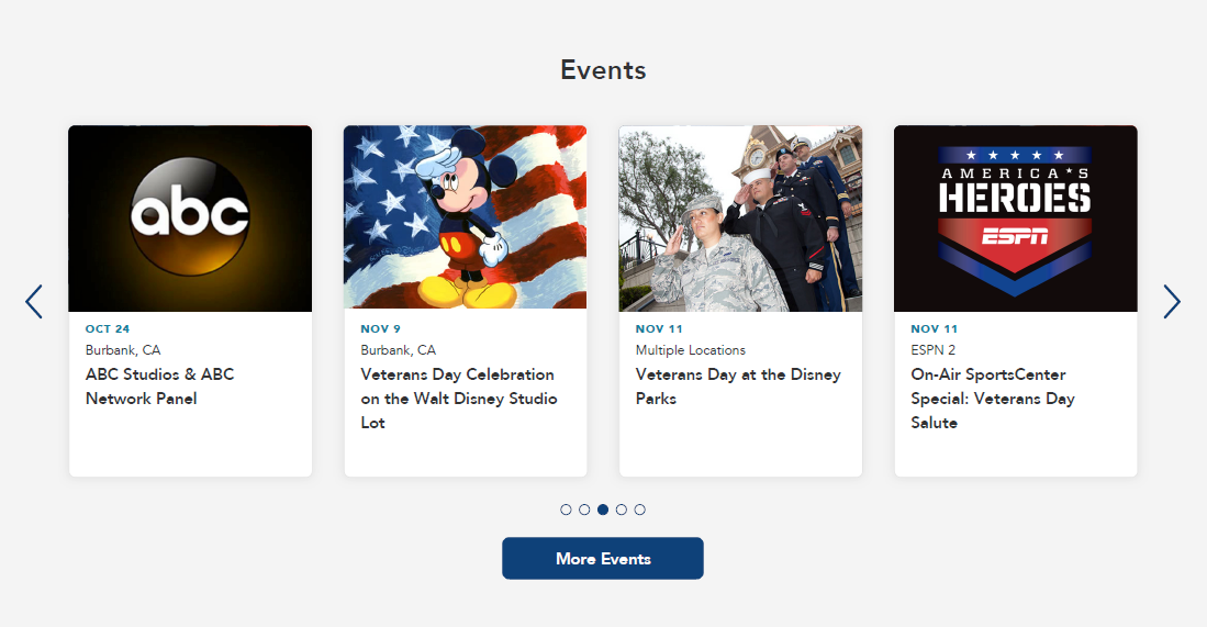
Interaction Flow
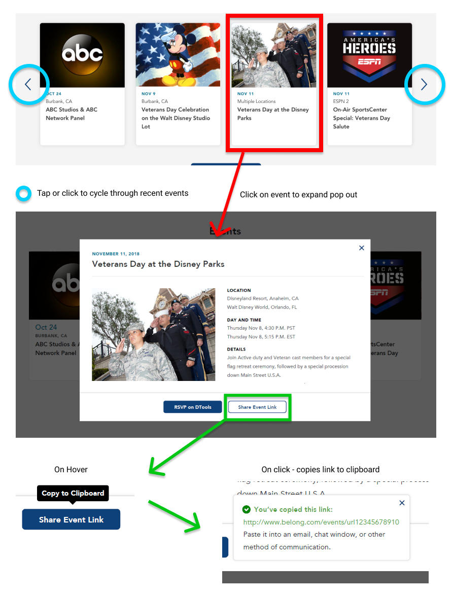
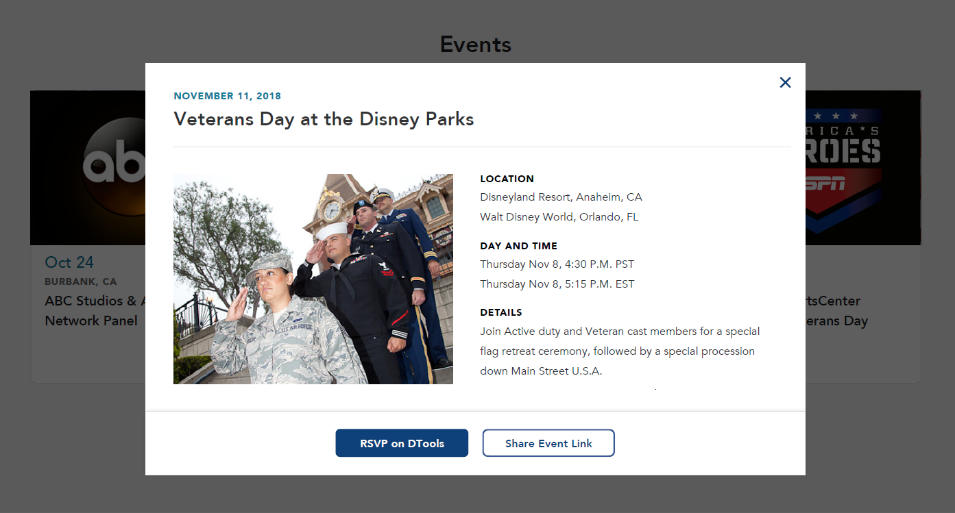
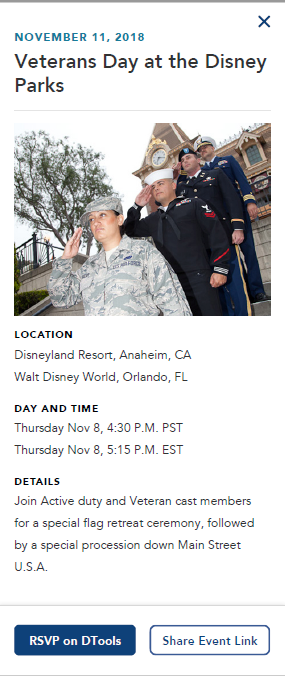
Final High-Fidelity Wireframes for Desktop and Mobile
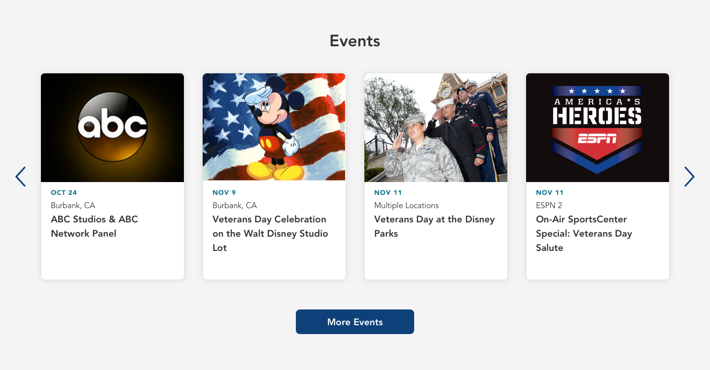
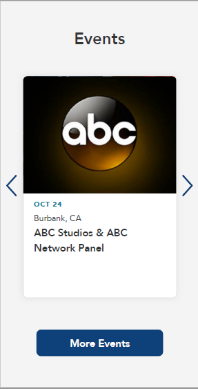
Final Redlines for Desktop and Mobile
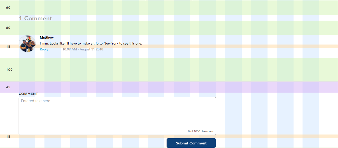
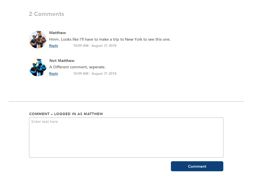
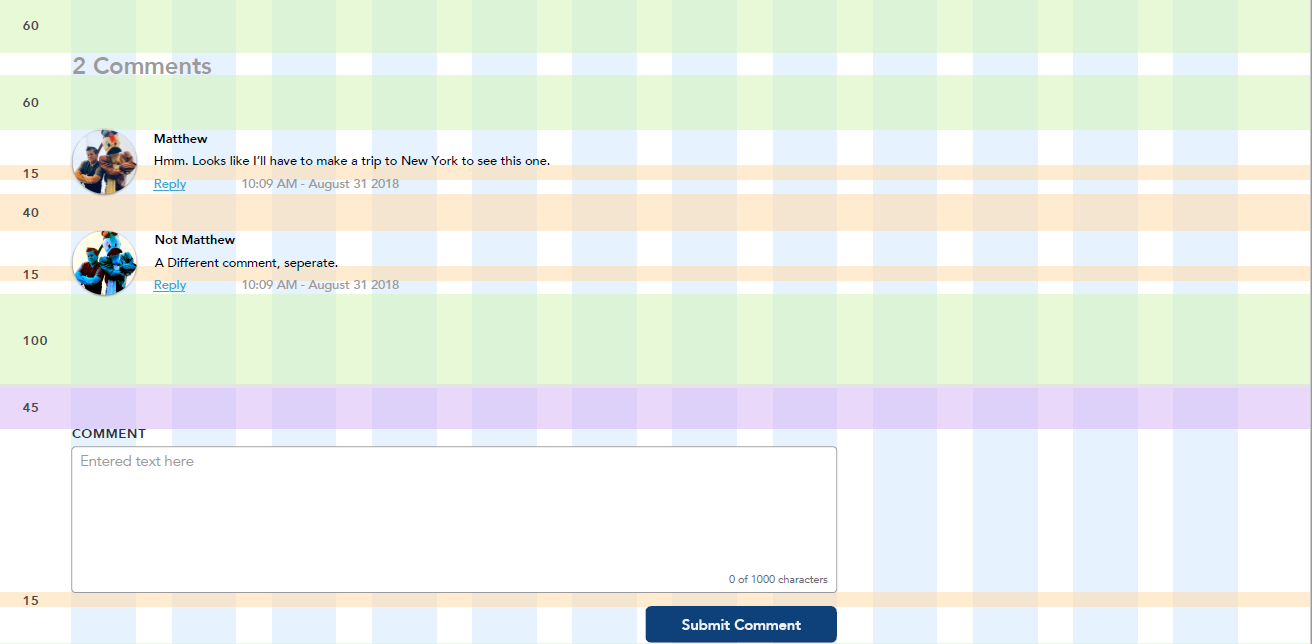
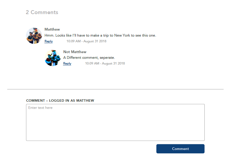
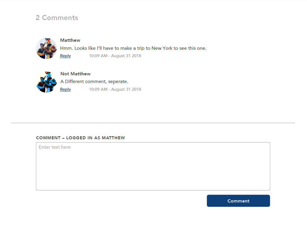
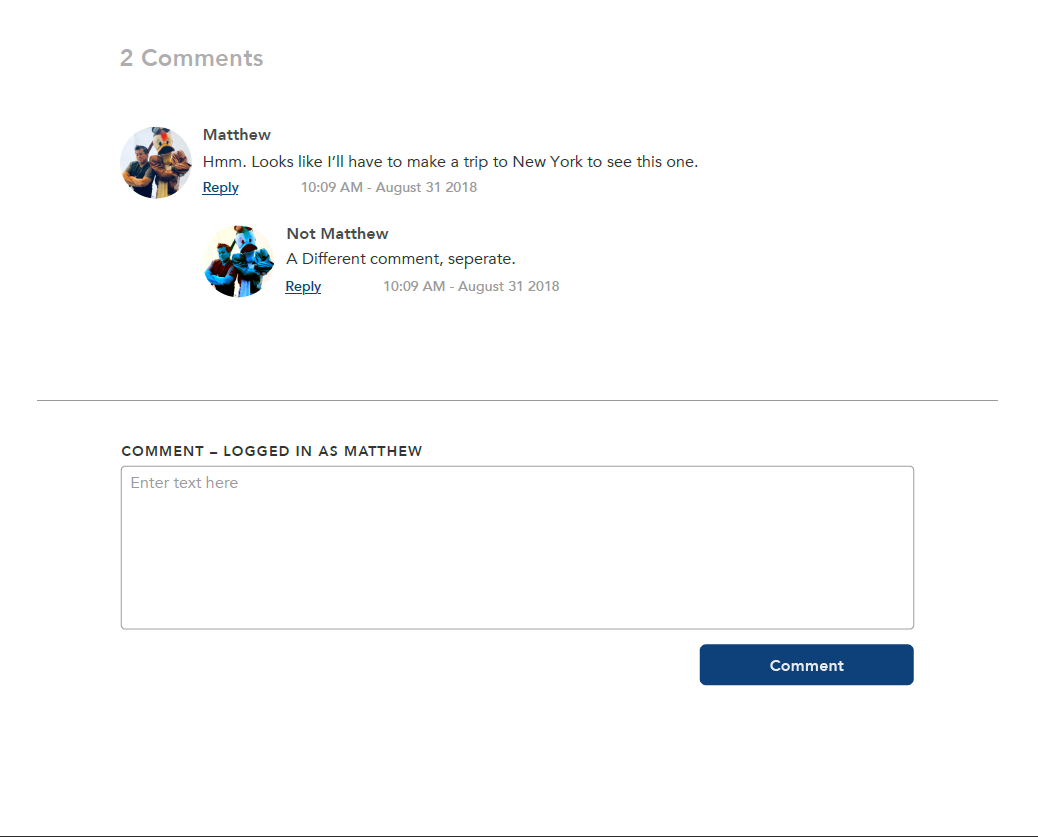
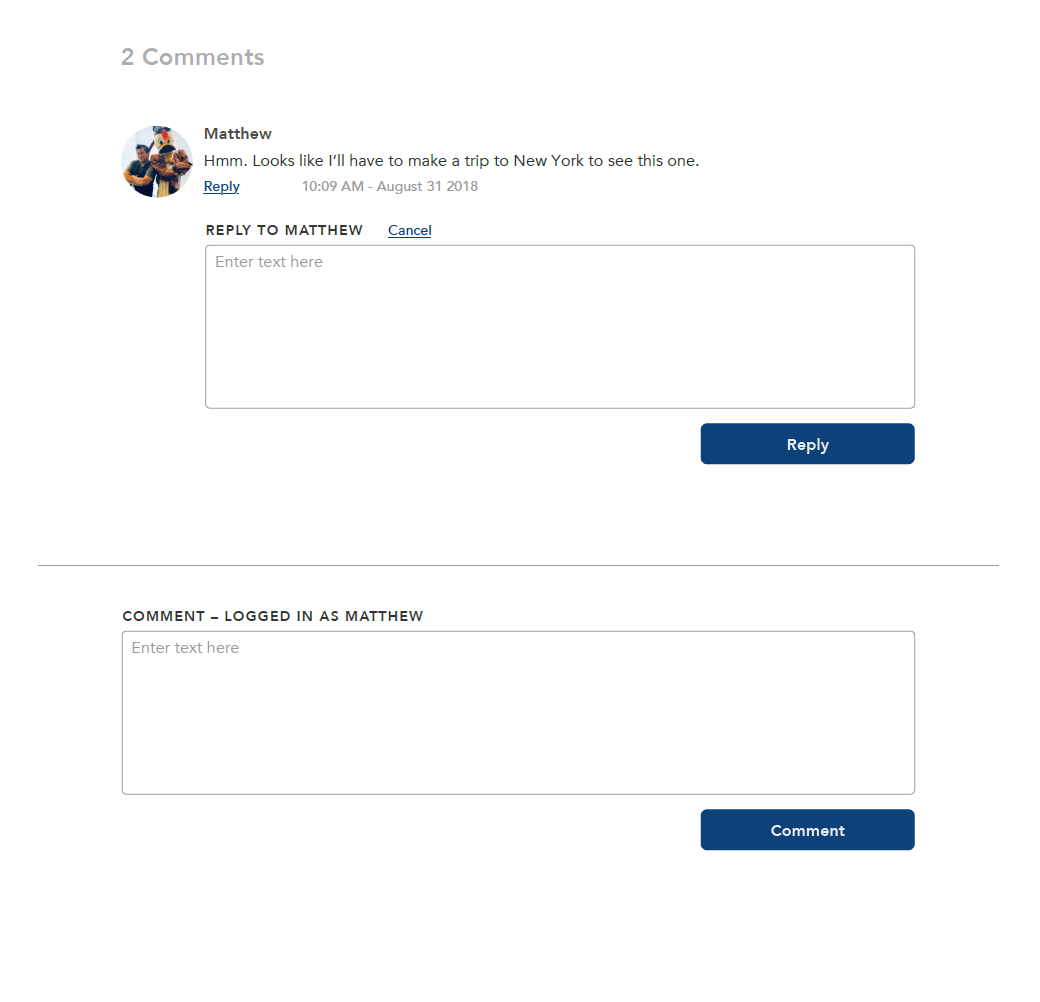
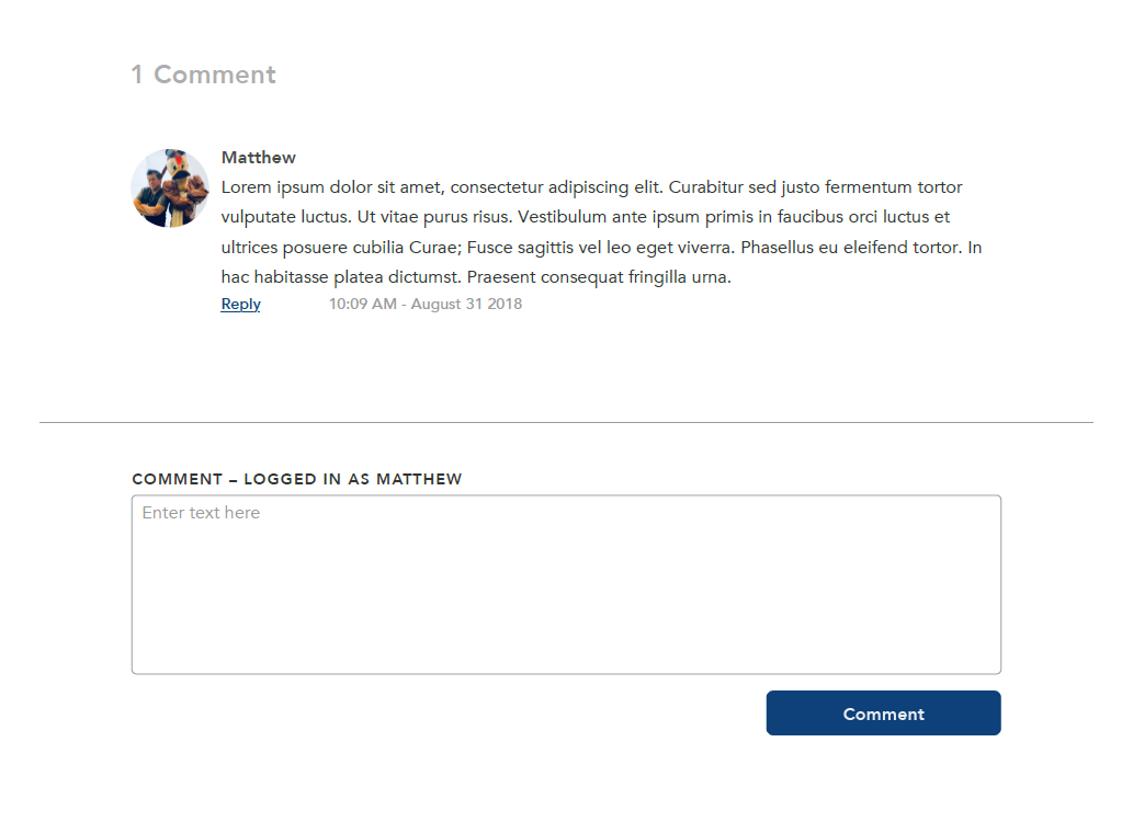
Inside Disney Comments
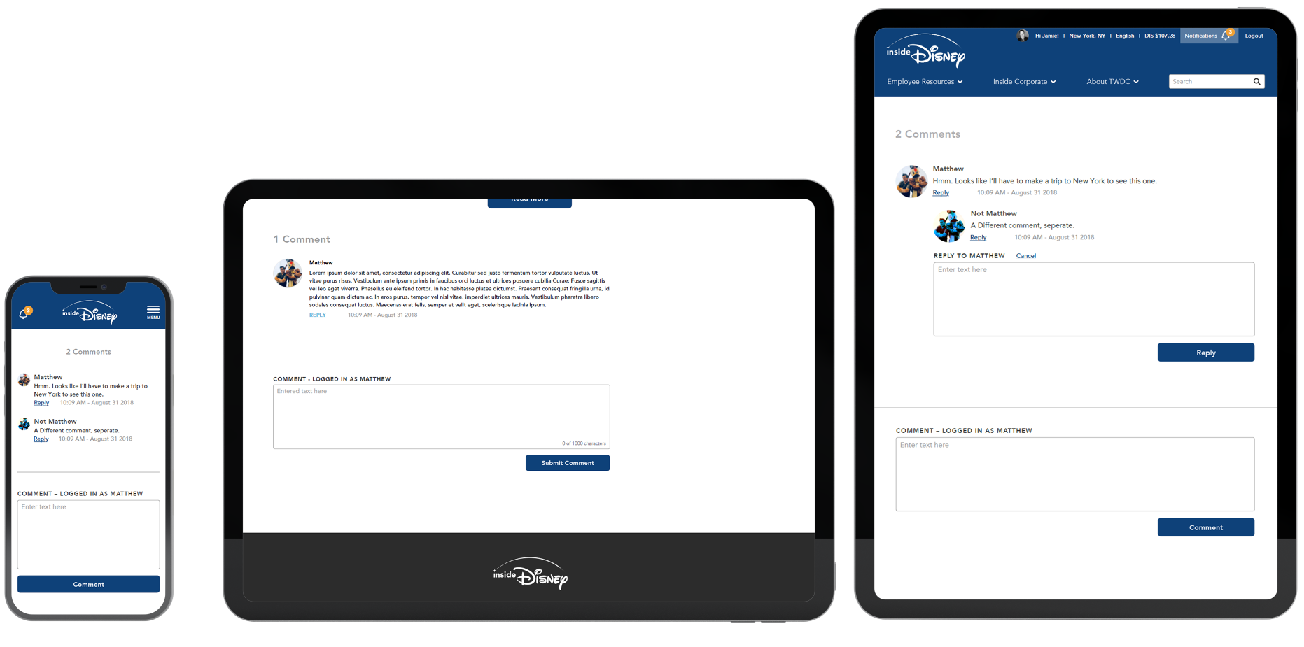
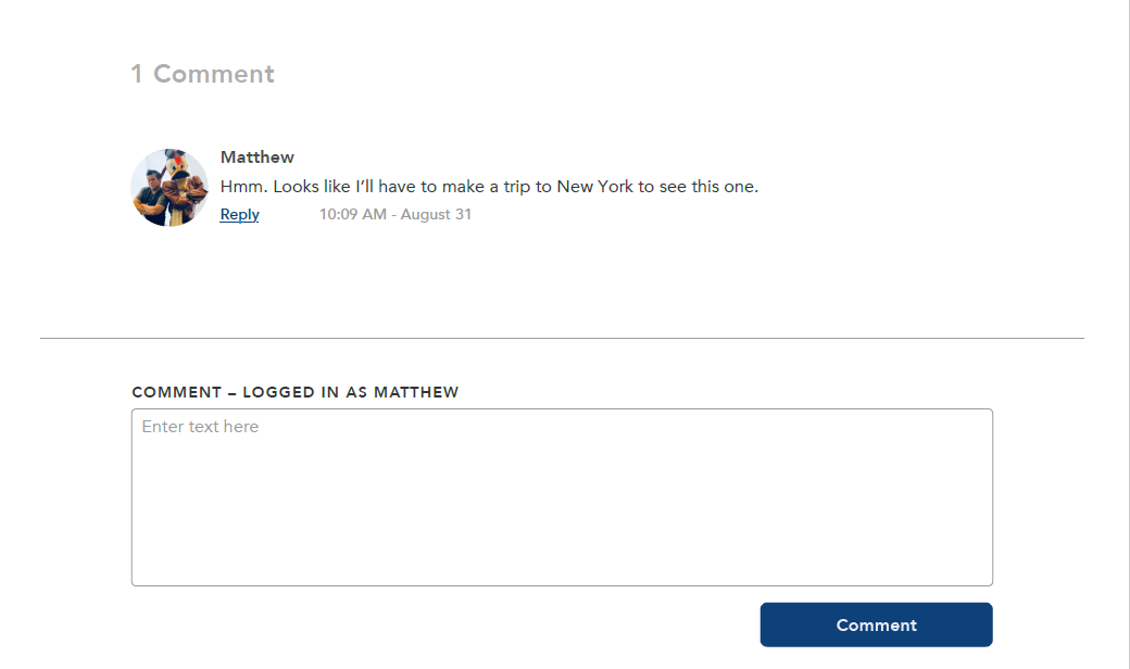
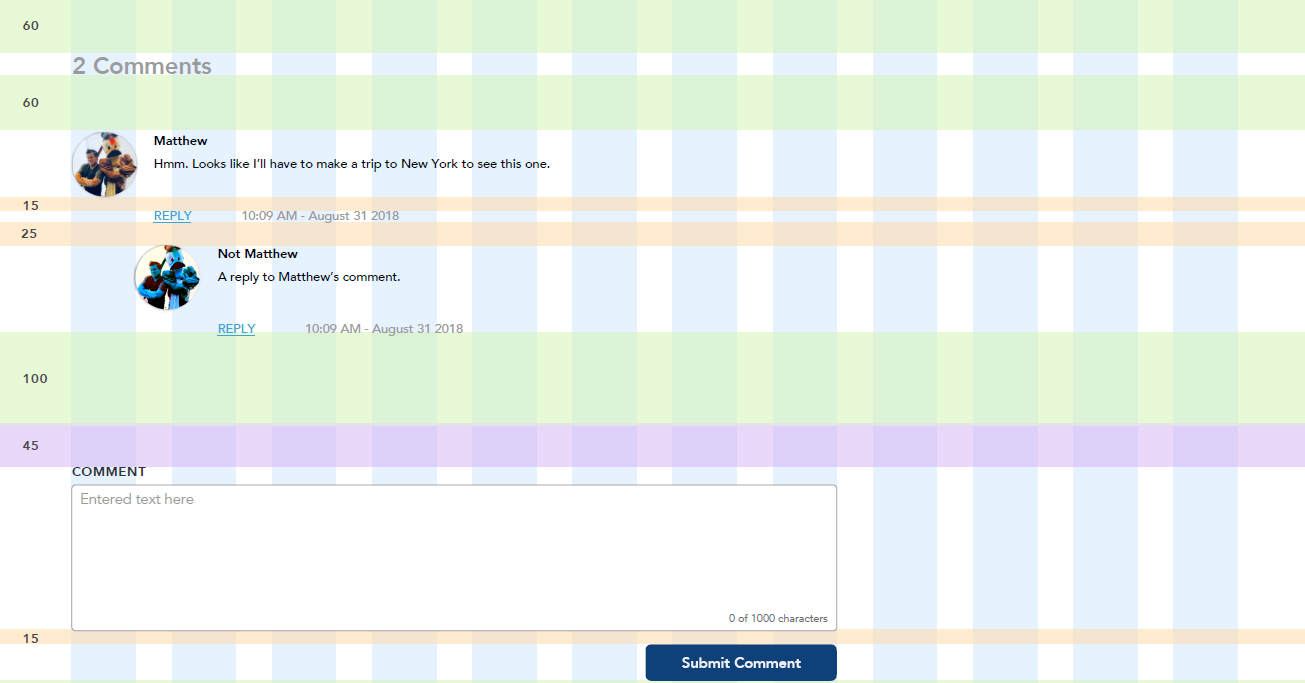
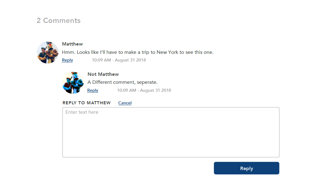
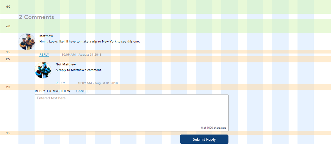
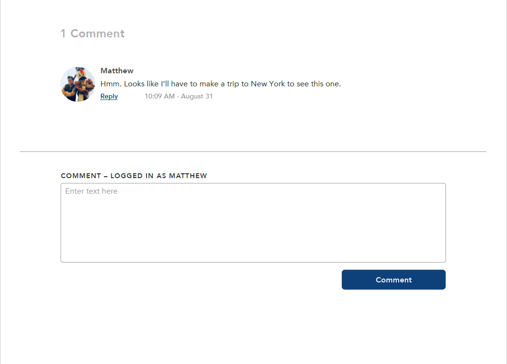
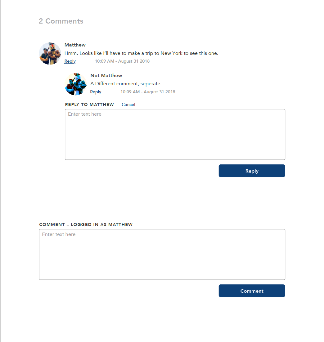
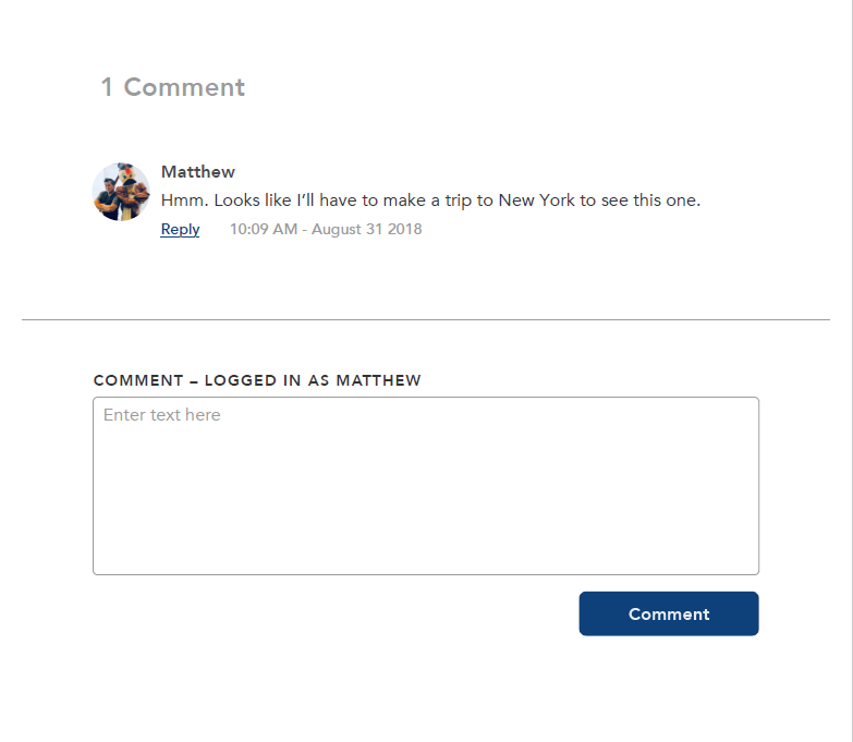
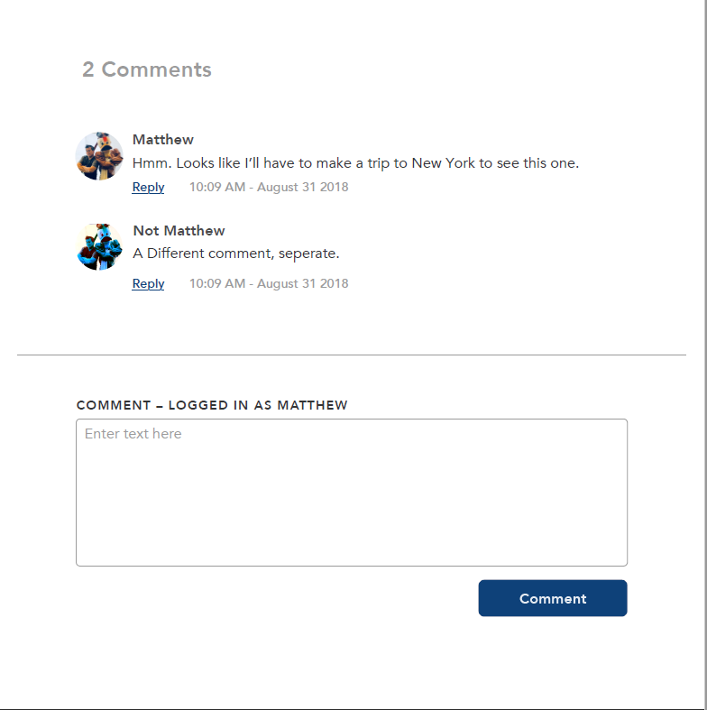
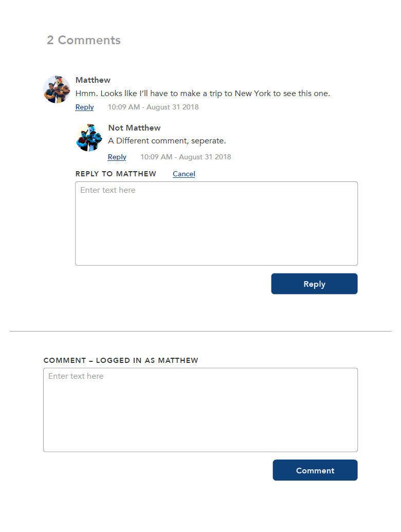
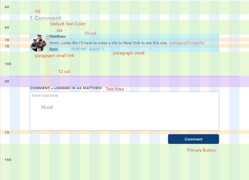
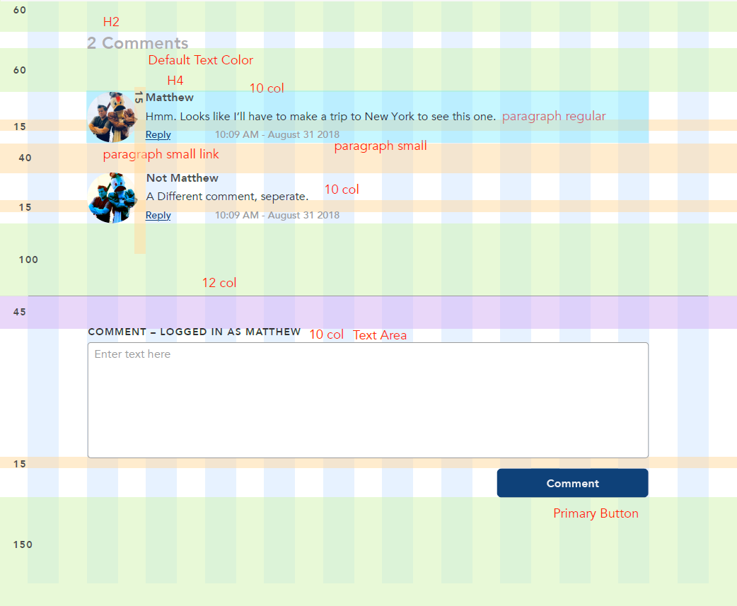
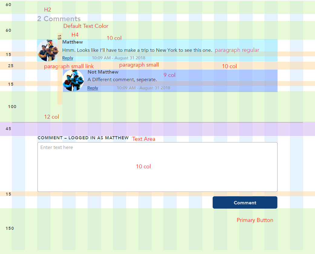
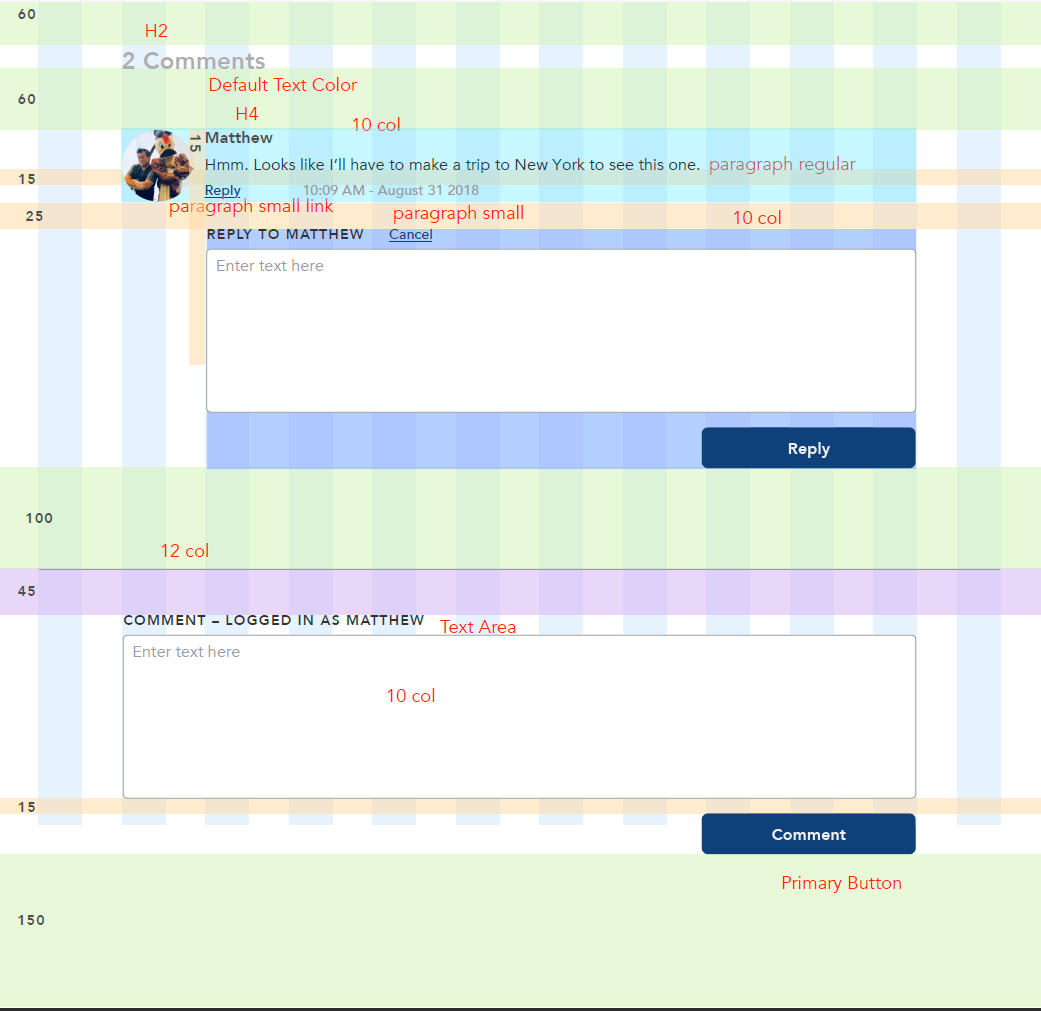
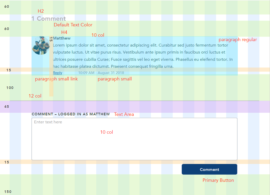
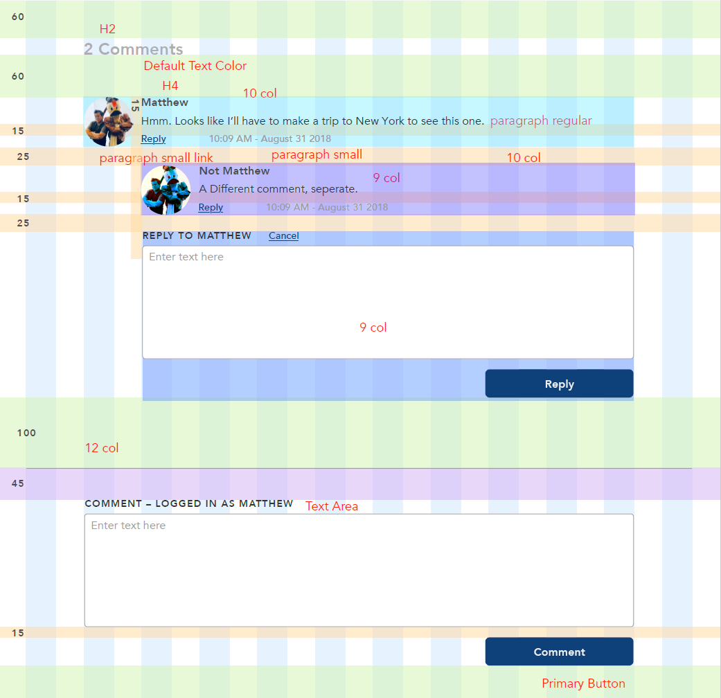
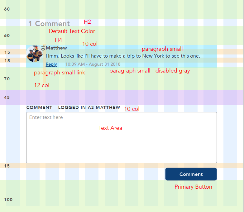
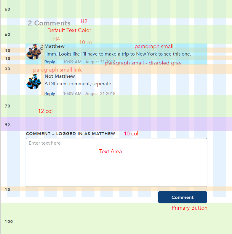
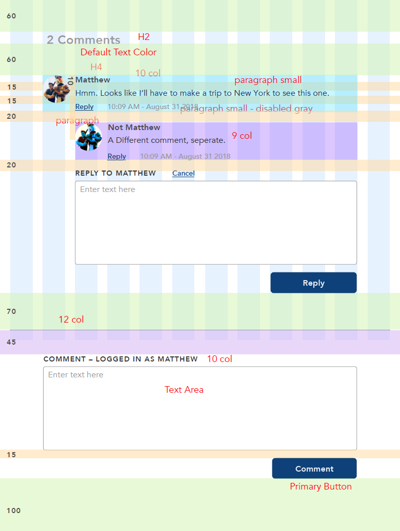
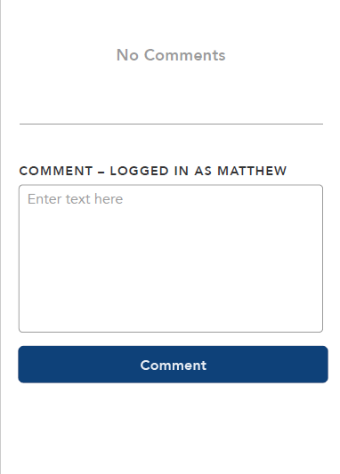
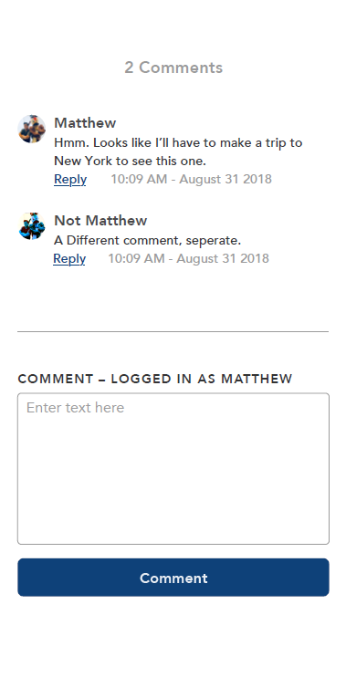
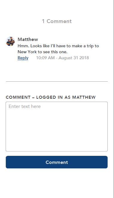
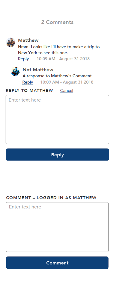
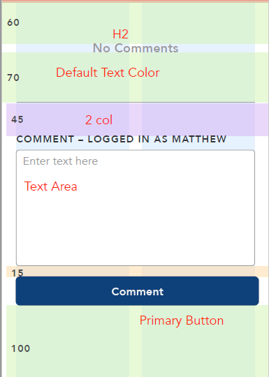
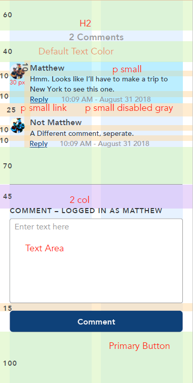
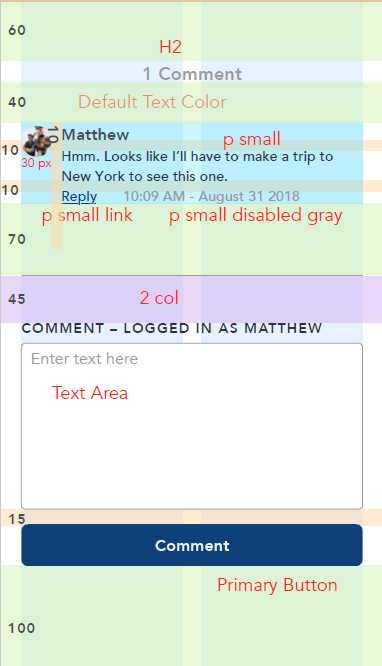
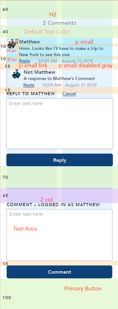
When the Inside Disney site was getting an update, I was tasked with fixing the comments section module and how it worked. I got to design both how the interaction worked and what the area looked like. Once I was finished, I gave detailed wireframes with spacing information to the developers.
In the video you can see the final product which is utilized live on the Inside Disney and Inside ESPN internal websites. The module was designed to be responsive and work on desktop, tablet, and mobile.
Responsive for Mobile, Destop, and Tablet
Inside Disney Likes
I was also tasked with figuring out how the like button would look and how users interacted with it on not only the article pages but also on the larger overview pages.
In the video you can see the final product which is utilized live on the Inside Disney and Inside ESPN internal websites. The module was designed to be responsive and work on desktop, tablet, and mobile.
Disney People Insights
The People Insights team is responsible for sharing marketing data and other important information with other organizations within Disney. They did not have a functioning website to share this data and other resources within the company. My team was tasked with designing a website for them using the Disney Octavius UX design system while also working within the capabilities of Sharepoint.
My Role
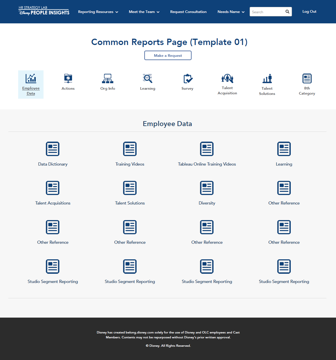
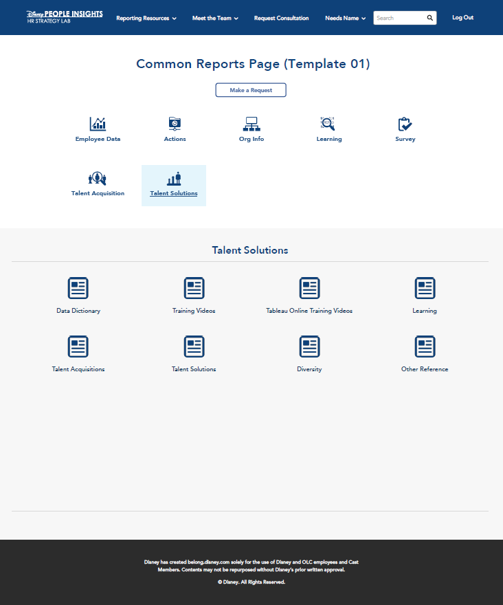
I designed several components of this website, most prominantly the Common Reports page which had the interesting challenge of showcasing lots of resources without being overwhelming. I designed all the icons from scratch to match the Octavius Design System's existing icons, as well as how all the interactions on the page would behave. The result is a nice module that does an effective job displaying all resources in an organized manner.
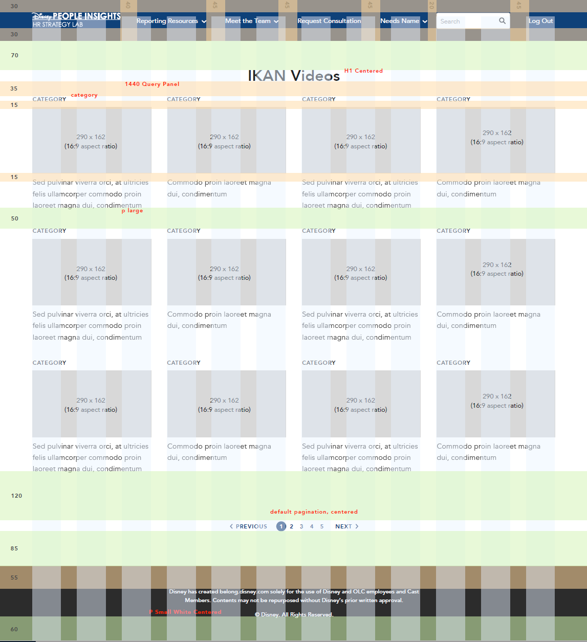
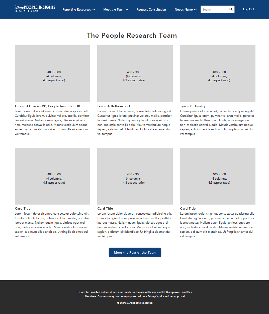
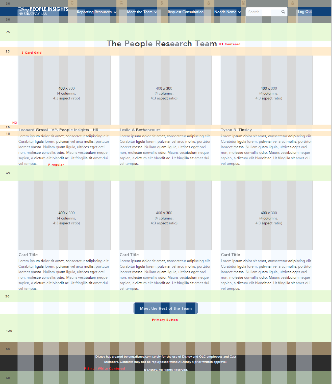
In addition to this, I also put together all the wireframes for the entire website to send to the developers, and mocked up all interactions in Sketch and Invision. All visuals were done in Sketch as high-fidelity wireframes.
The design is now live, but is viewable only to Disney employees as it is an internal website. Please view the video for live interactions.
Working within Sharepoint and Octavius
The Sharepoint system has certain limitations that must be taken into account when designing. While versatile, Sharepoint did not support responsive websites at the time and this was taken into account while we worked on both concepts as well as the wireframes and redlines we had handed off to developers. Thankfully, Disney's UX design system Octavius was built to be useable in both Sharepoint and many other platforms.
New Icons for People Insights
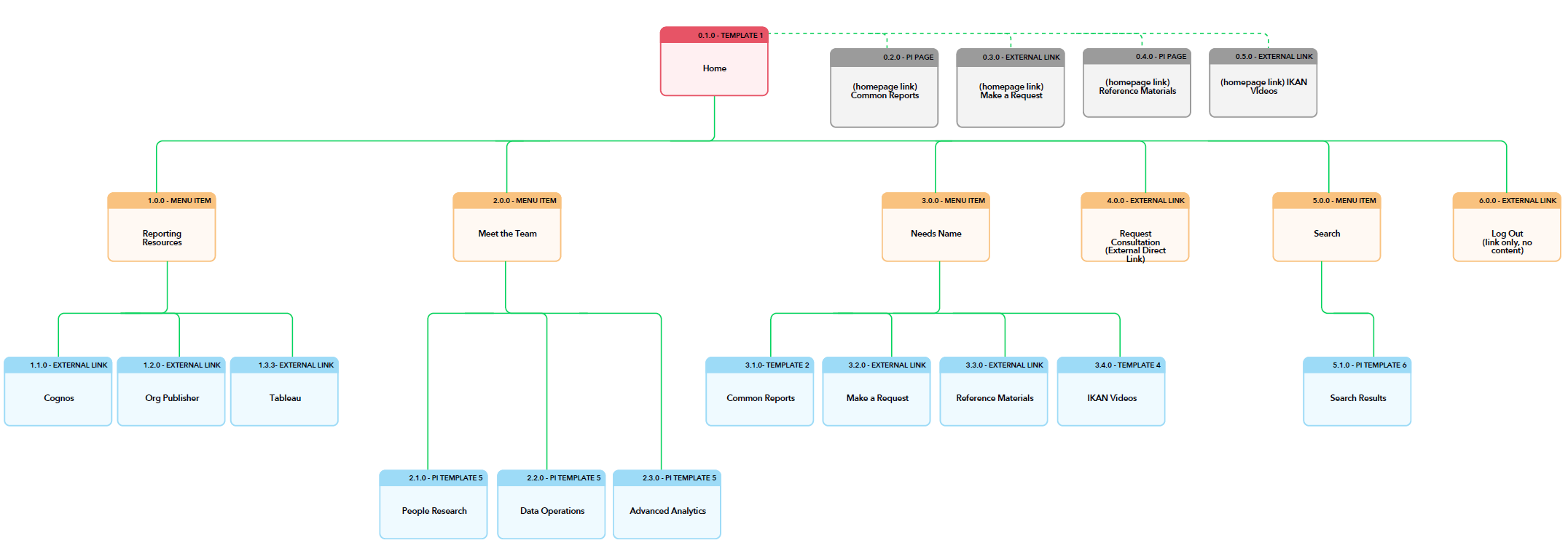
People Insights Sitemap & User Flow
Common Reports
The Common Reports page features an interactive module that allows the user to tab through different sections of resources. The People Insights team did not know how to convey this information before, and originally it was planned as a bulky, hard to digest list of items.

Common Reports High Fidelity Wireframes
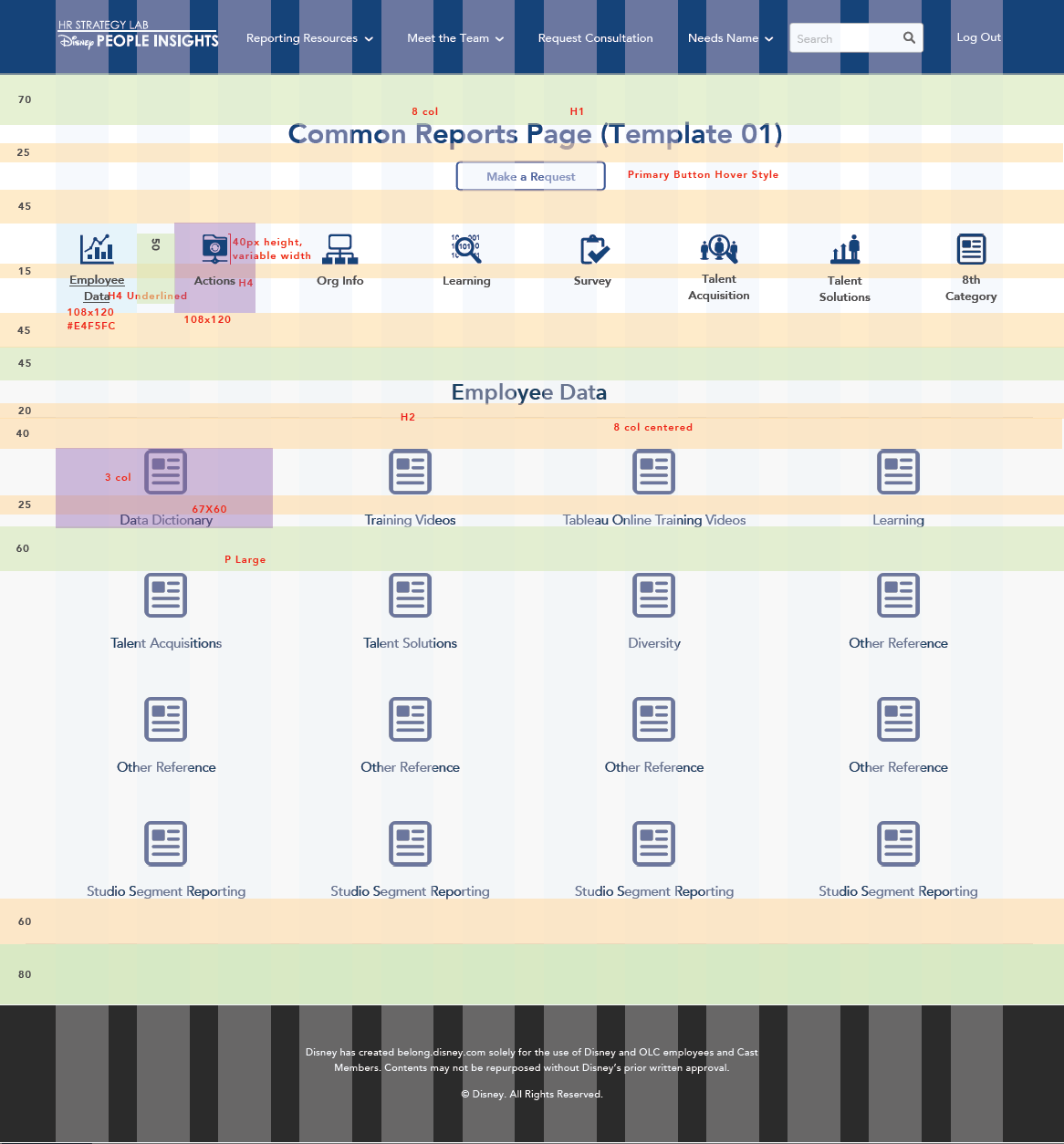
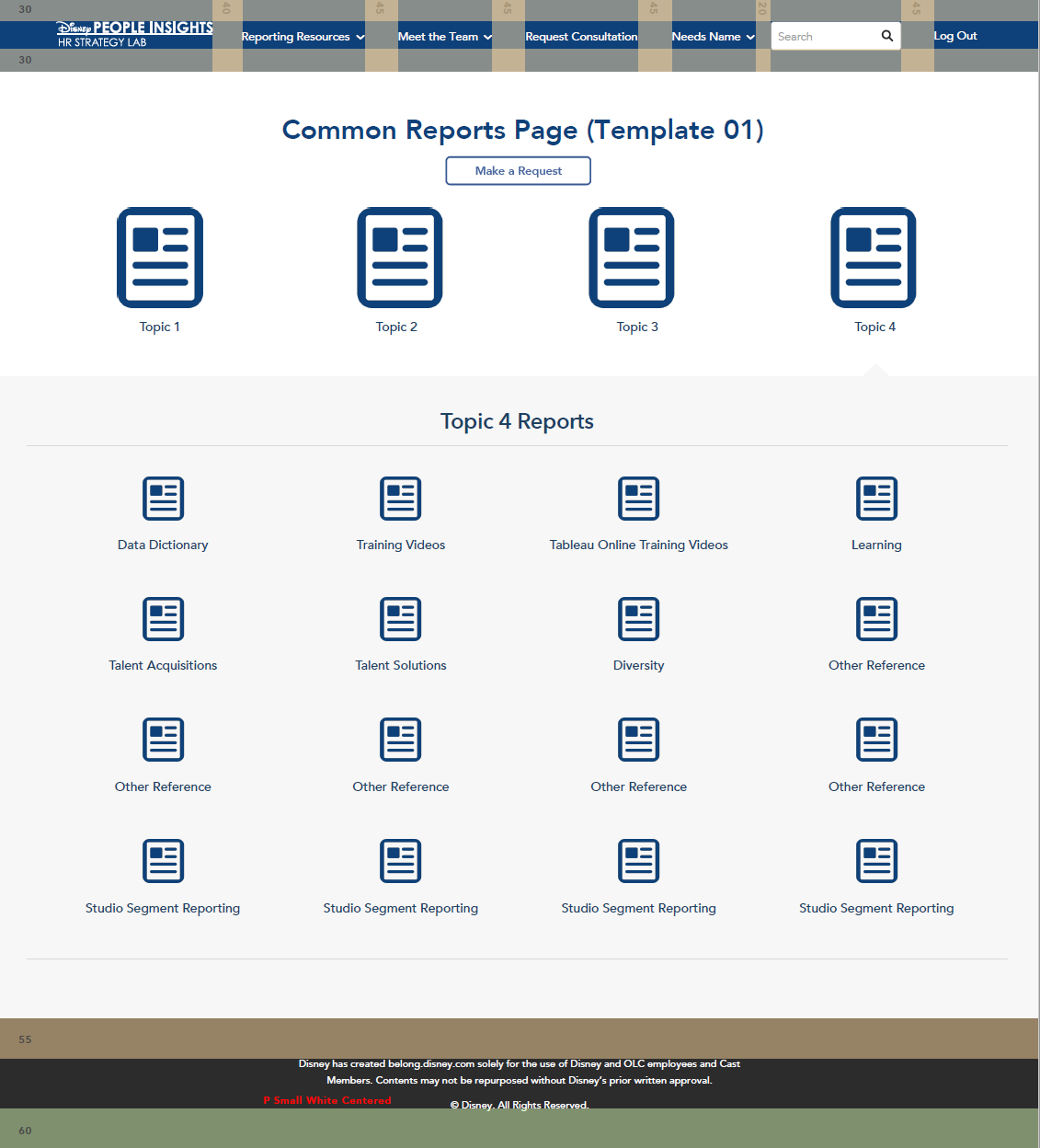
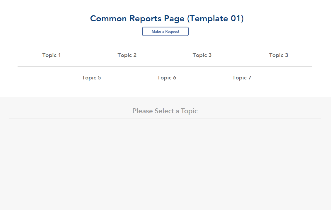
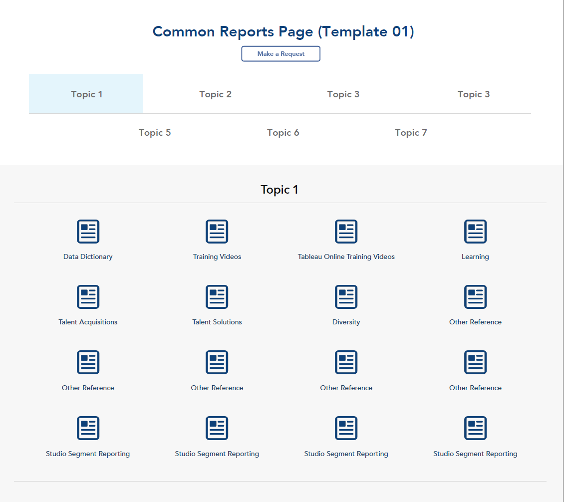
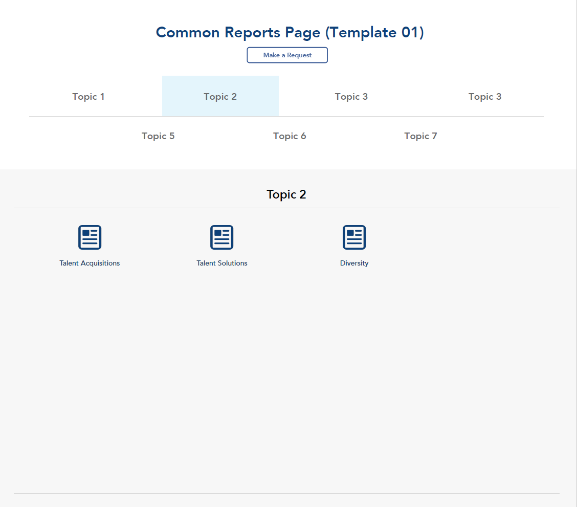
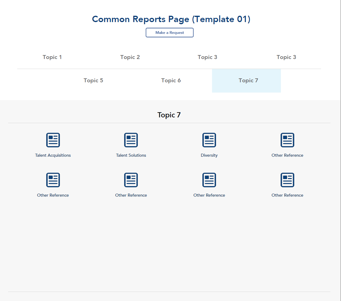
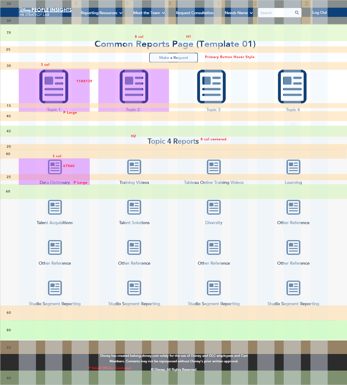
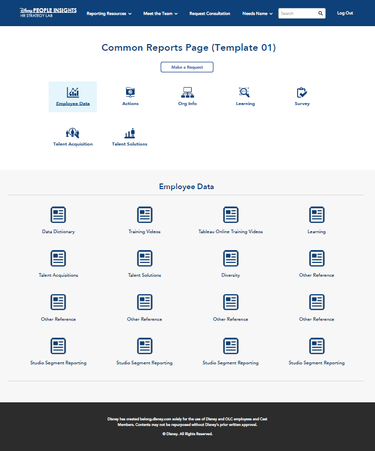
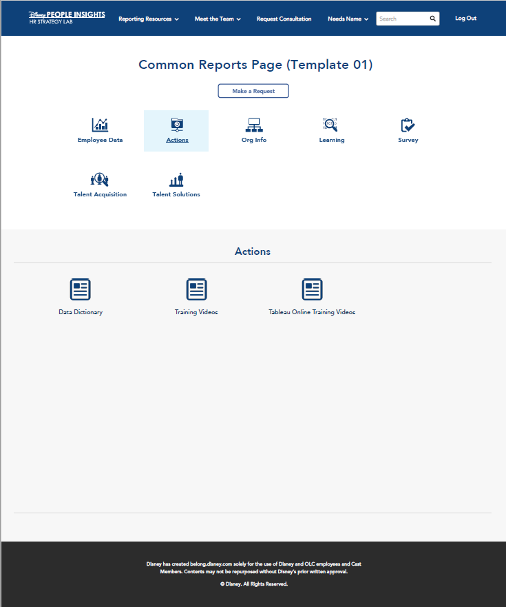

Before it was decided that sharepoint was going to be used, my team had me design and mock up the mobile and template versions of the main webpage and a couple other pages.


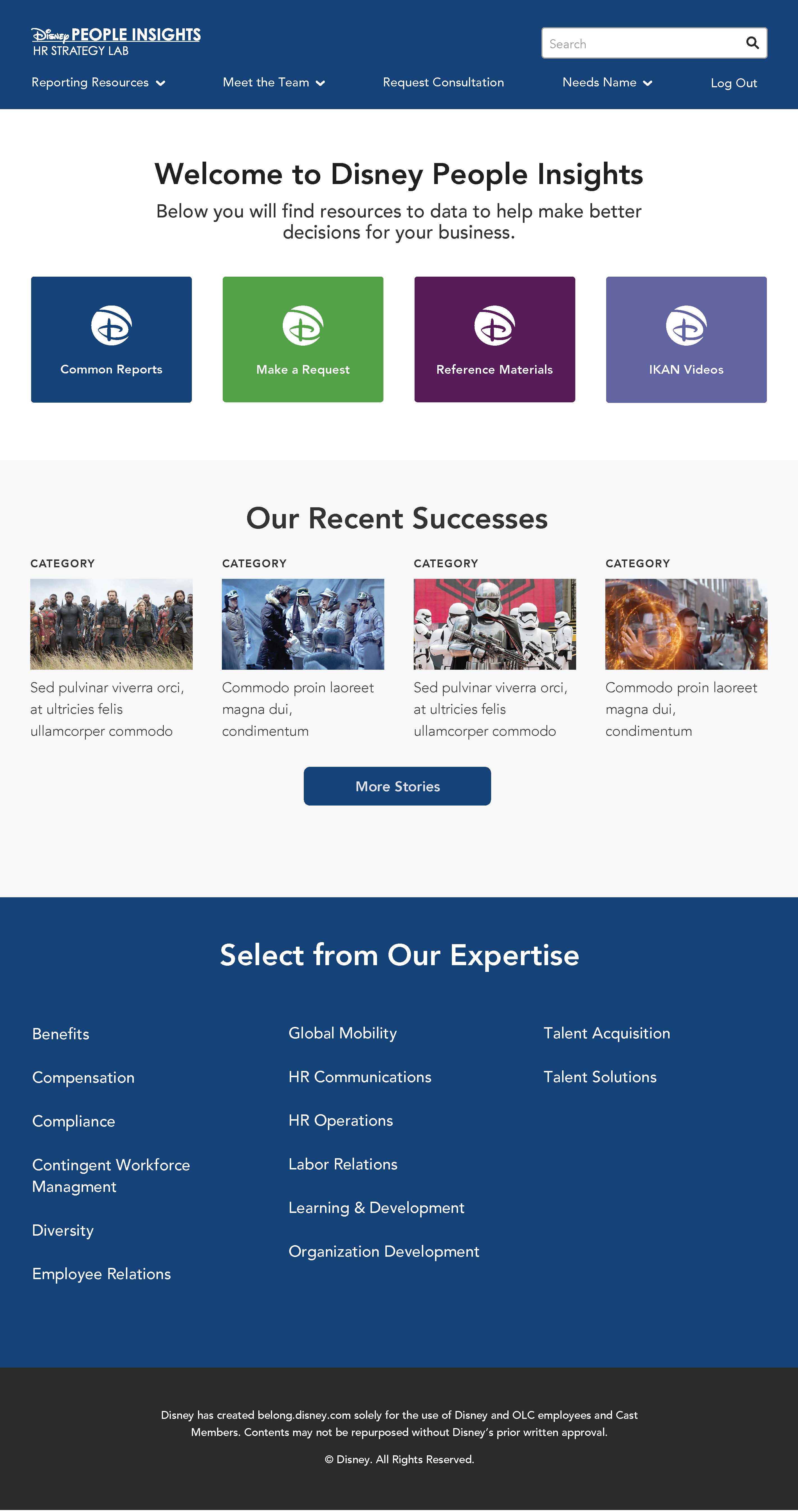
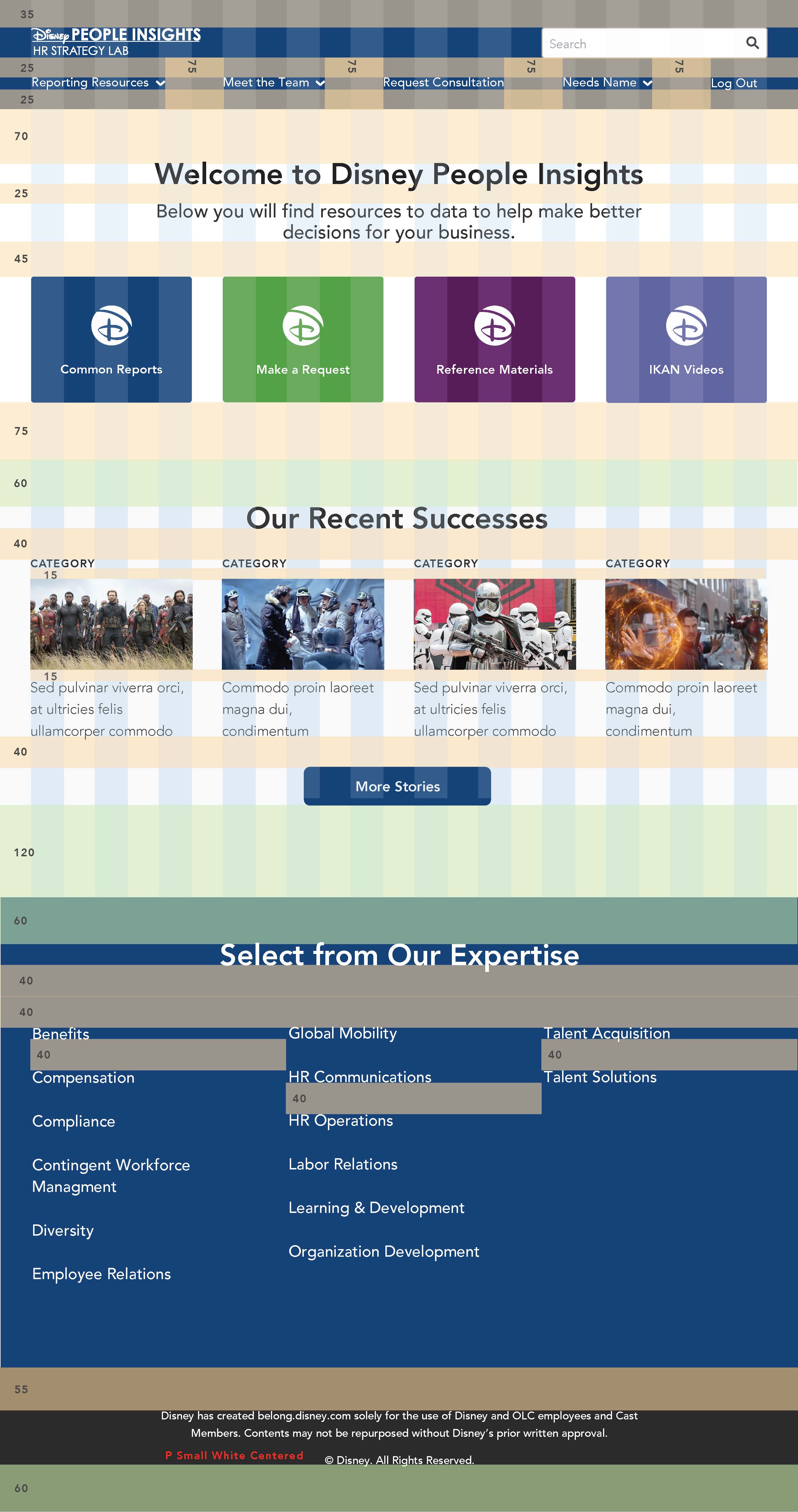
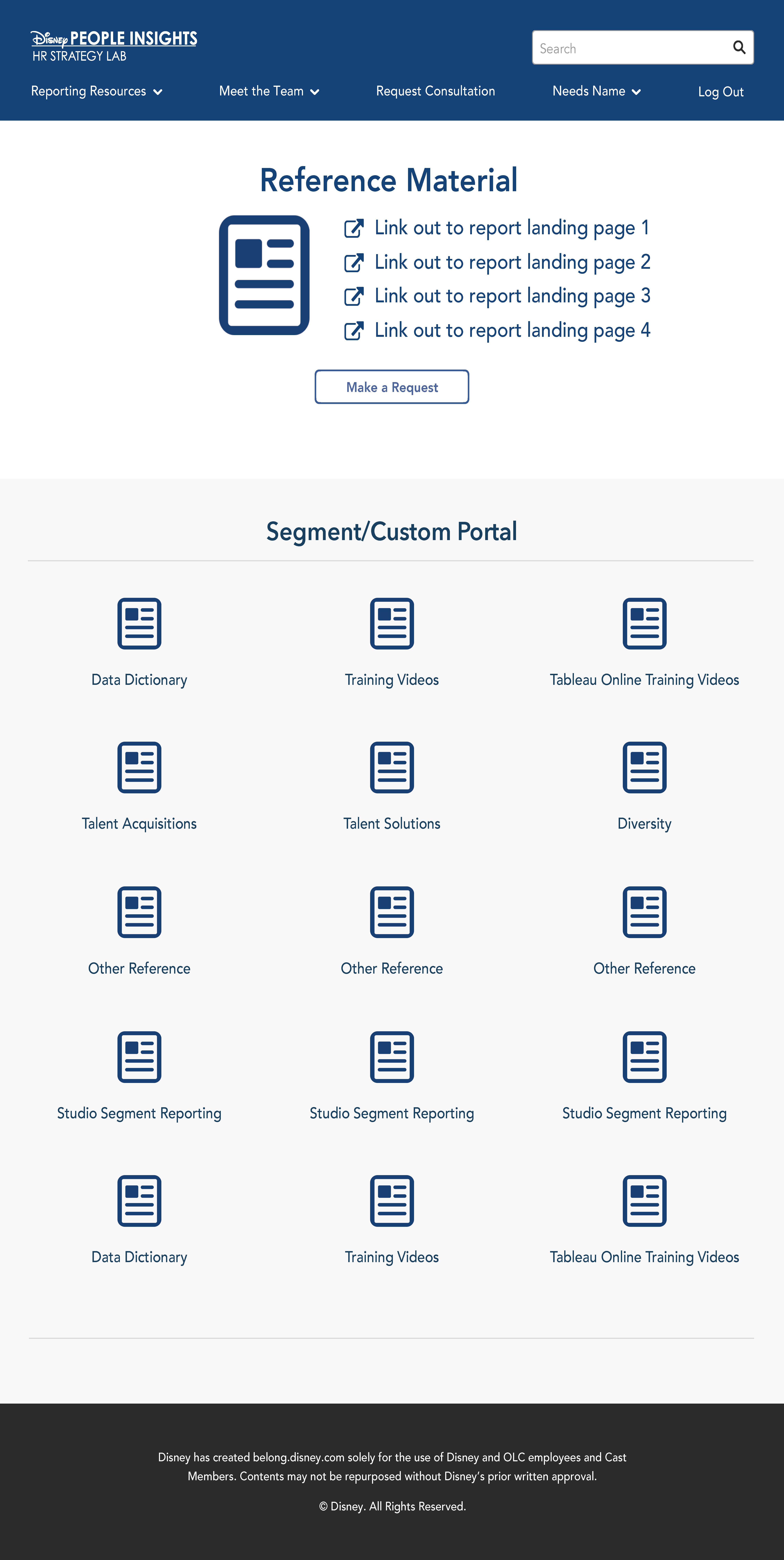
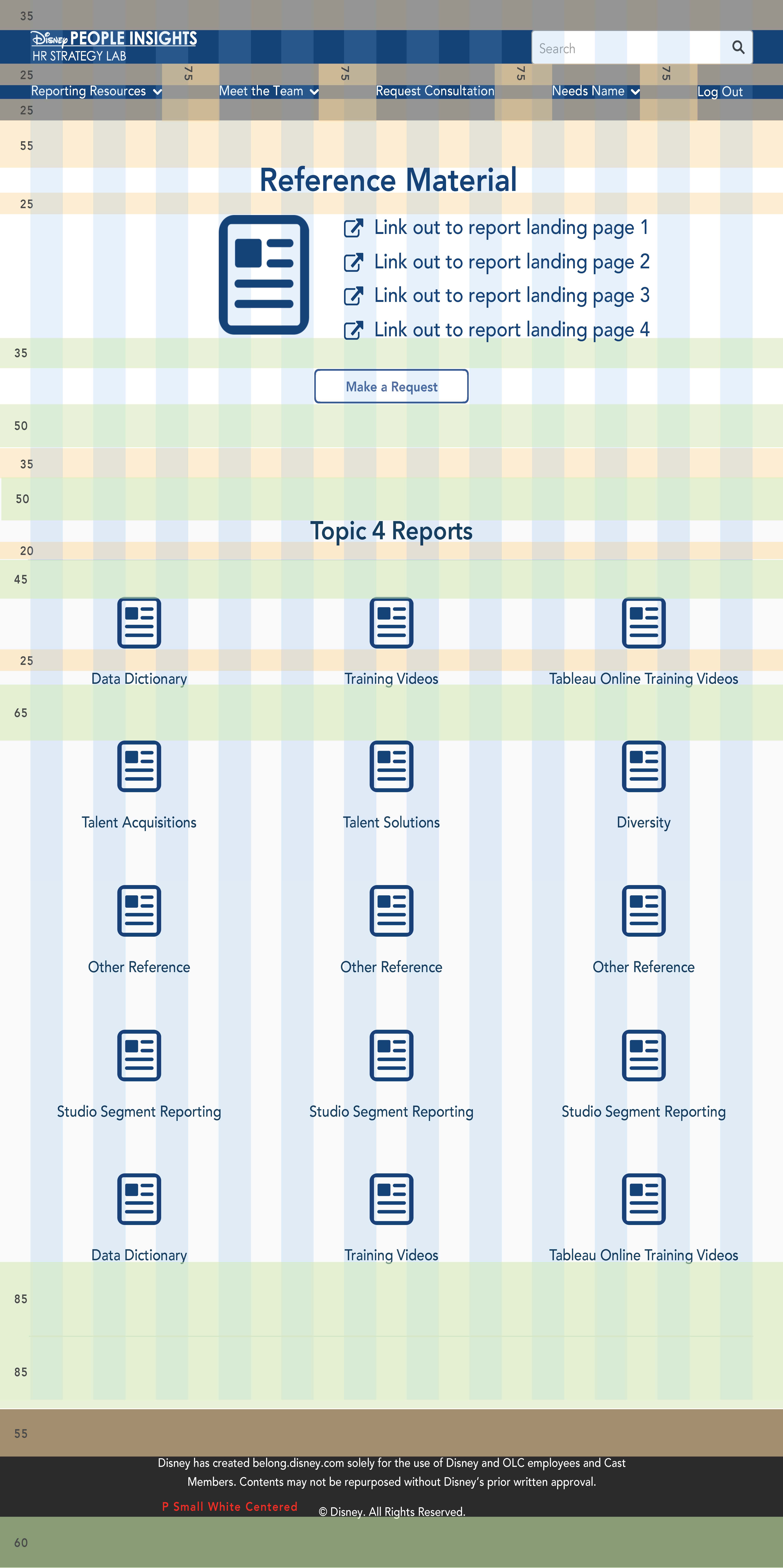

People Insights Websites Wireframes and Redlines
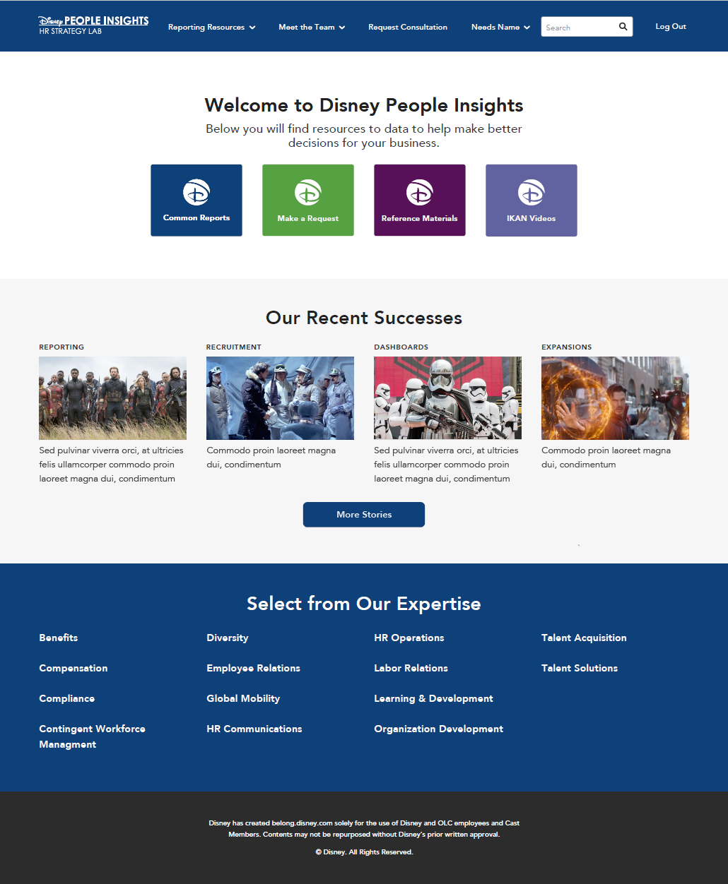
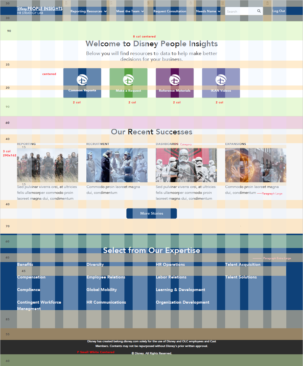
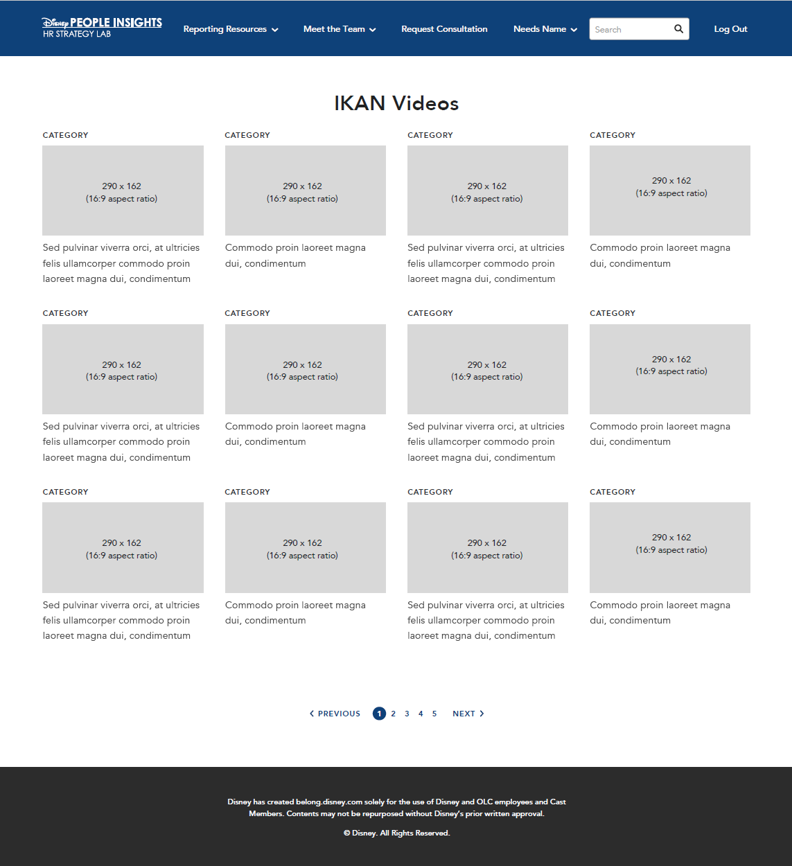
Disney Legal Website Rennovation
The Disney Legal website was outdated and needed a facelift, so they took it to my team. The website was sharepoint but hadn't been updated for several years. They wanted all the same modules but with modern functionality.
My Role
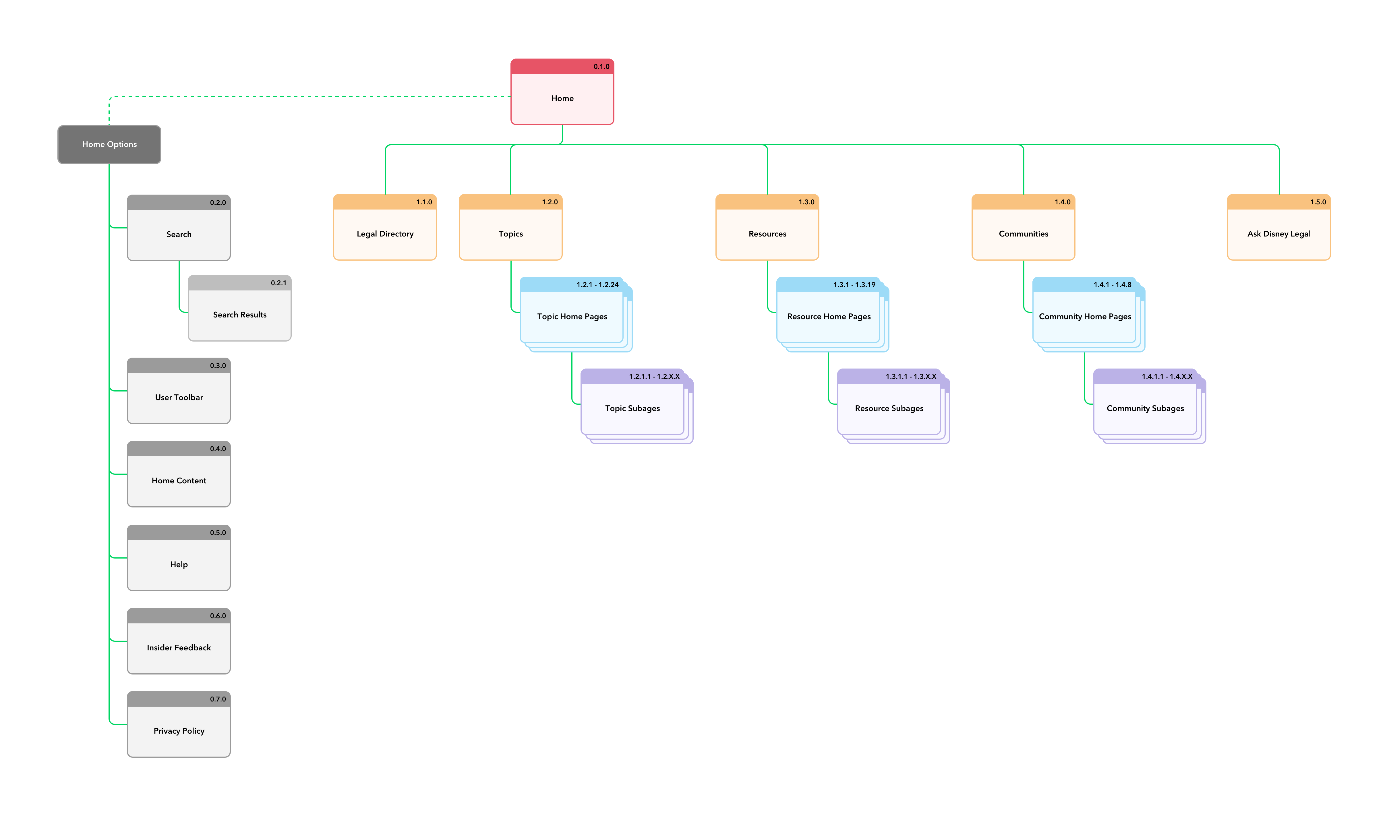
This was my main project while at Disney User Experience. With supervision I created sitemaps, wireframes, live mockups, and detailed redlines. I presented my work to the client and responded to their needs, making adjustments as needed. When complete the wireframes and mockups were given to the developers.
High fidelity wireframes were created in Sketch App and Invision to produce fully functional prototypes throughout the entire process, including all interactions.
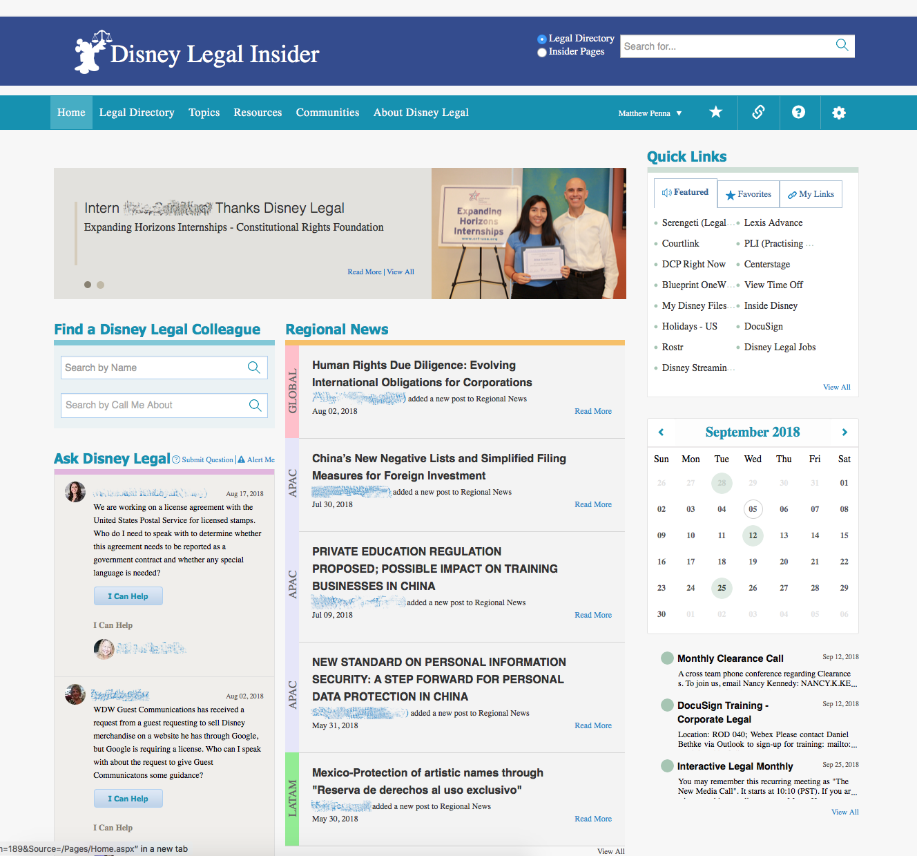
Problems with the Old Website
- Outdated and lacked modern sensibilities, with a focus on having everything crammed above the fold.
- The calendar was not properly functioning and did not work as expected.
- The Ask section did not allow people to leave comments on questions, just allow the user to know that they could be contacted to talk about the question.
- Unfriendly design that was overly bloated with unneeded information.
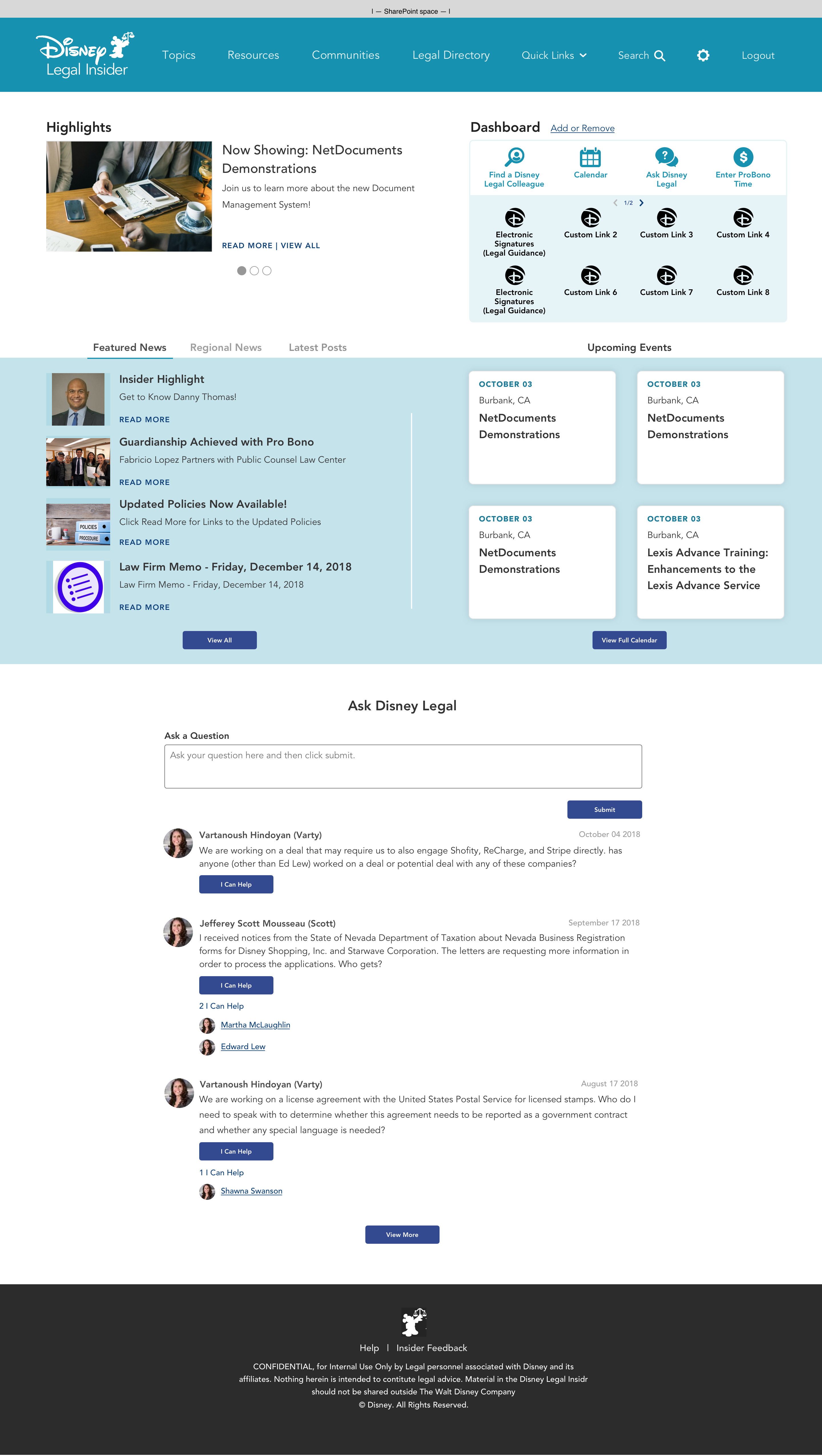
A Fresh New Look
- Refreshed to use Disney's new Octavius design system for user experience.
- Removed the 3 column informational overload while still keeping needed information above the fold.
-Consolidated sections into user-friendly modules.
-Reorganized the entire site to make things easy to understand and quick to find for both new and old visitors.
Many revisions were involved before this solution was brought to the client, including Invision mockups with live interactions. See below video.
Extended Process Gallery
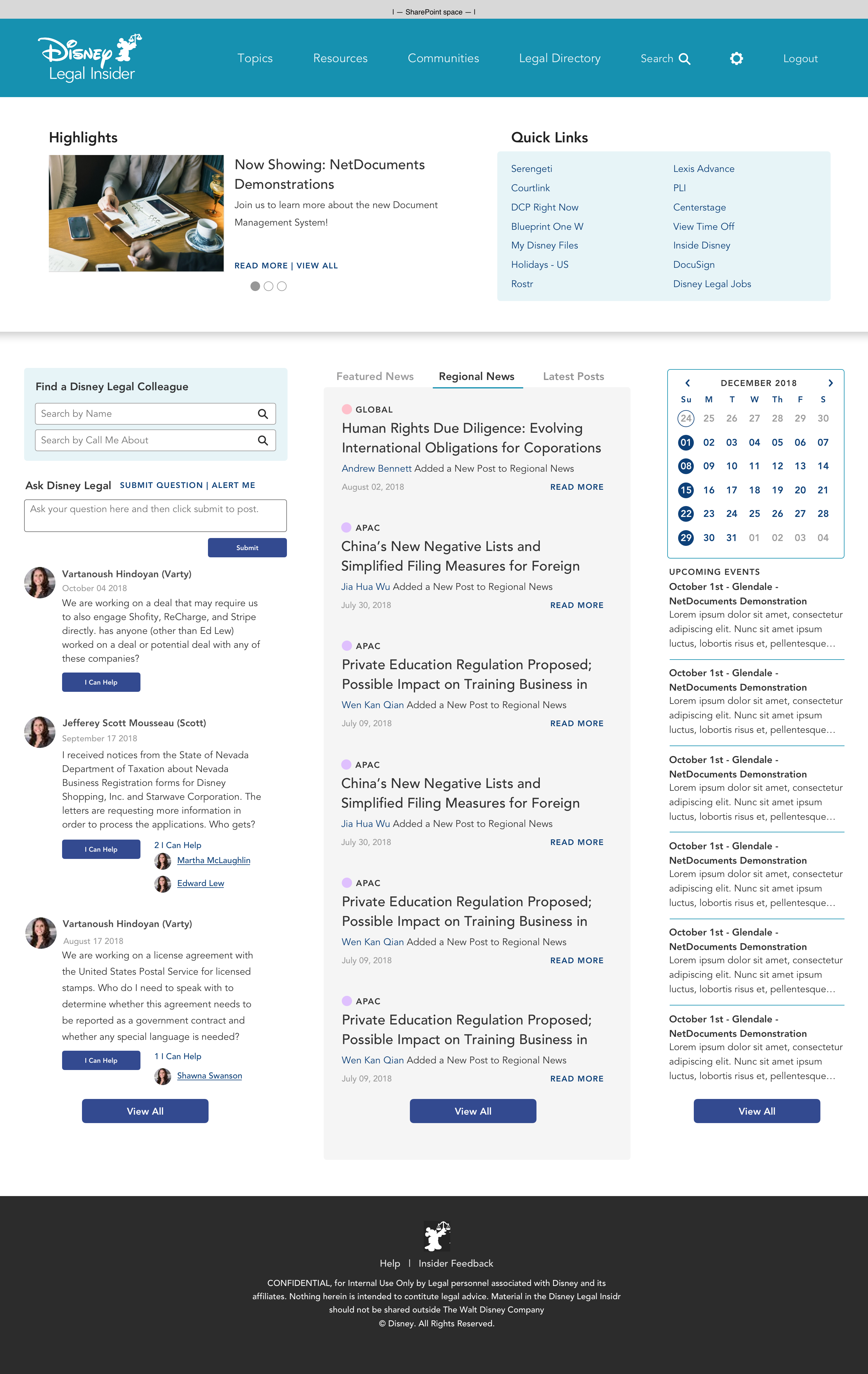
The Final Design
The client was worried that too big a change in structure would confuse the Disney legal community, so they requested we try to refresh the look while keeping the same composition. This is the version that was ultimately approved and used to update the site.
While keeping the structure the same, great efforts were put in to make the page easier to understand and to cut the fat, making for an overall cleaner look than the original.
