L O L Remix Fall 2020 Tentpole
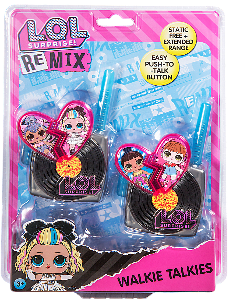
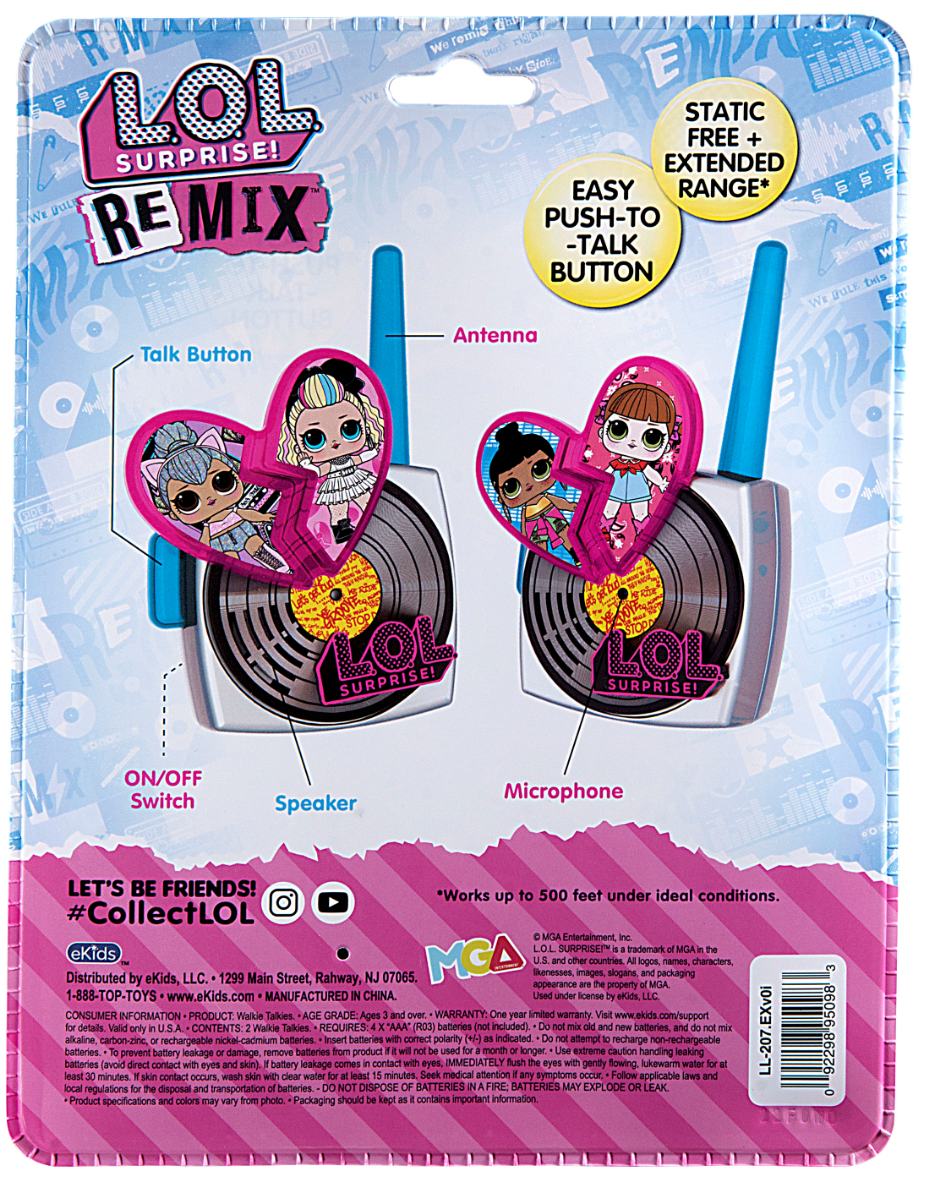
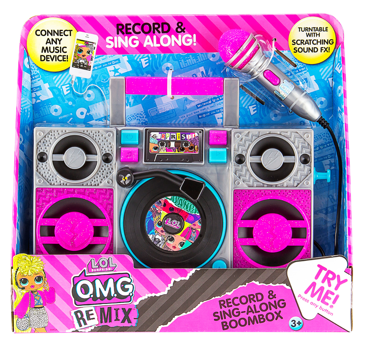
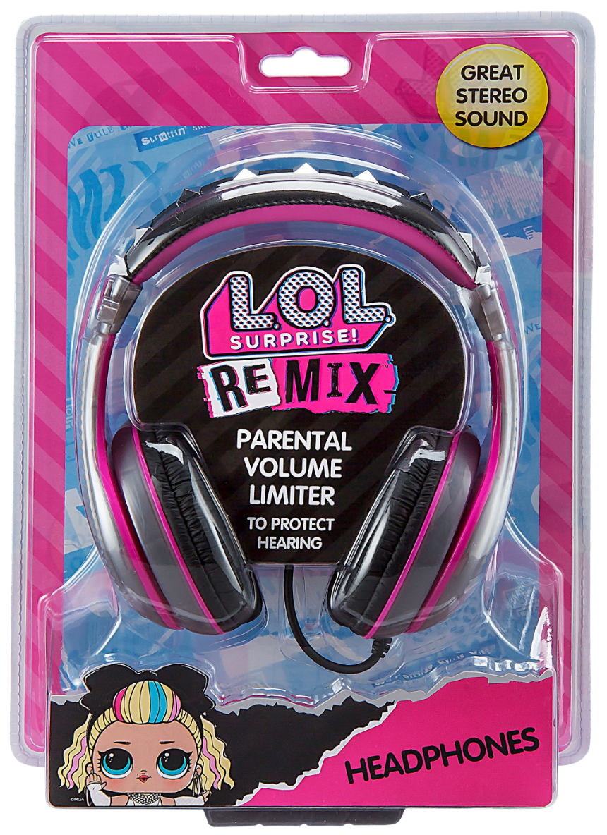
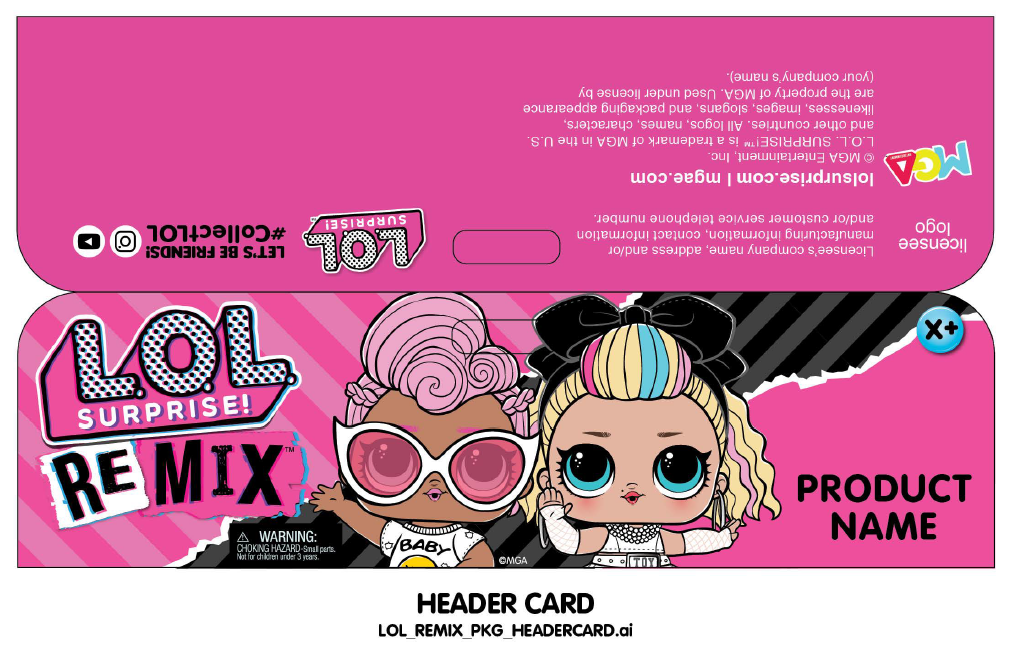
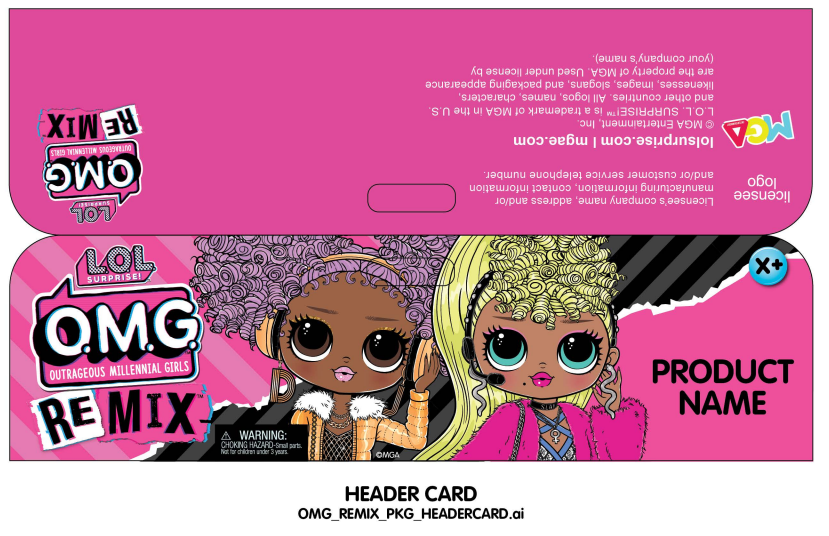
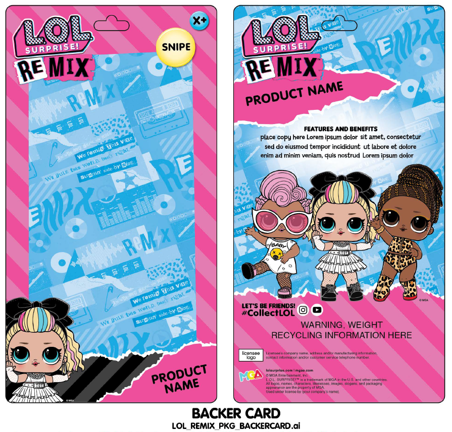
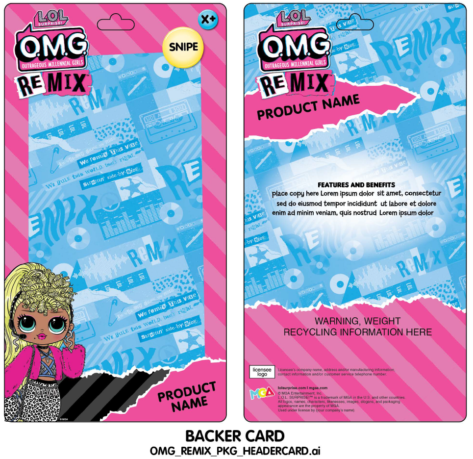
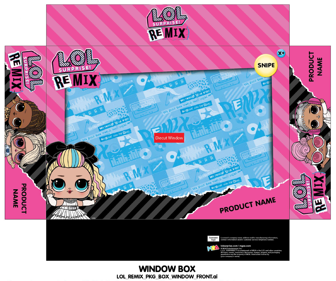
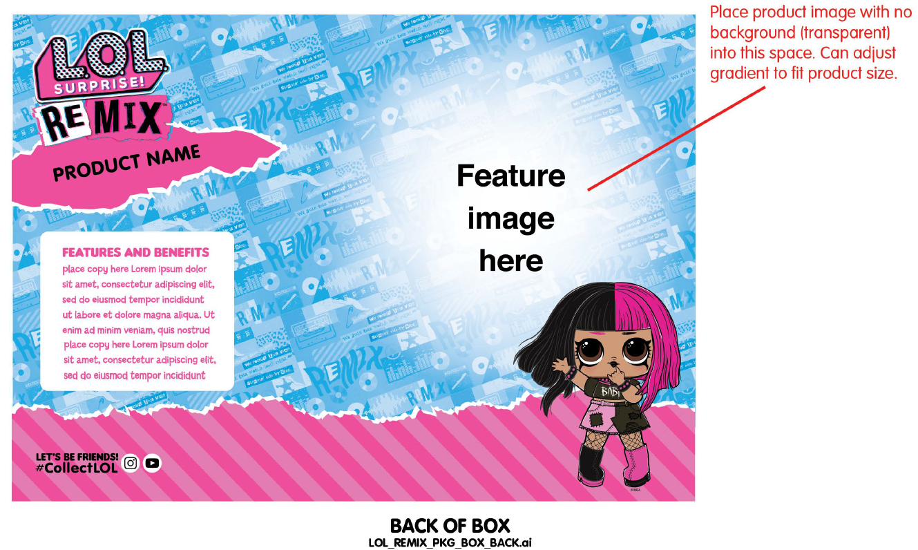
L O L Surprise!'s big fall theme was Remix, a rockin' mix of different music genres done in L O L style. The toys are fierce and fun with crazy outfits and hairstyles, and the toy team wanted to make sure that the packaging for licensing matched back to toy while being visually distinct. As the packaging designer for licensing I was tasked with creating a sister branding for licensing, which was similar to the toy packaging but also aligned closer to the normal branding for licensing.
This project was a great challenge because I had to create a lot of different patterns and assets while also integrating existing assets from the Remix toy packaging. All the files seen here are my own work that was presented to higher ups. I highly reccomend opening the process gallery as this branding went through a lot of revisions.
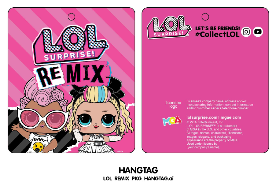
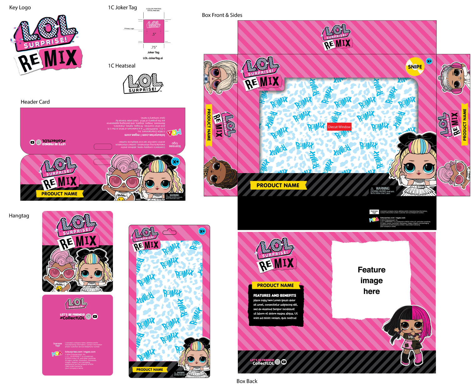
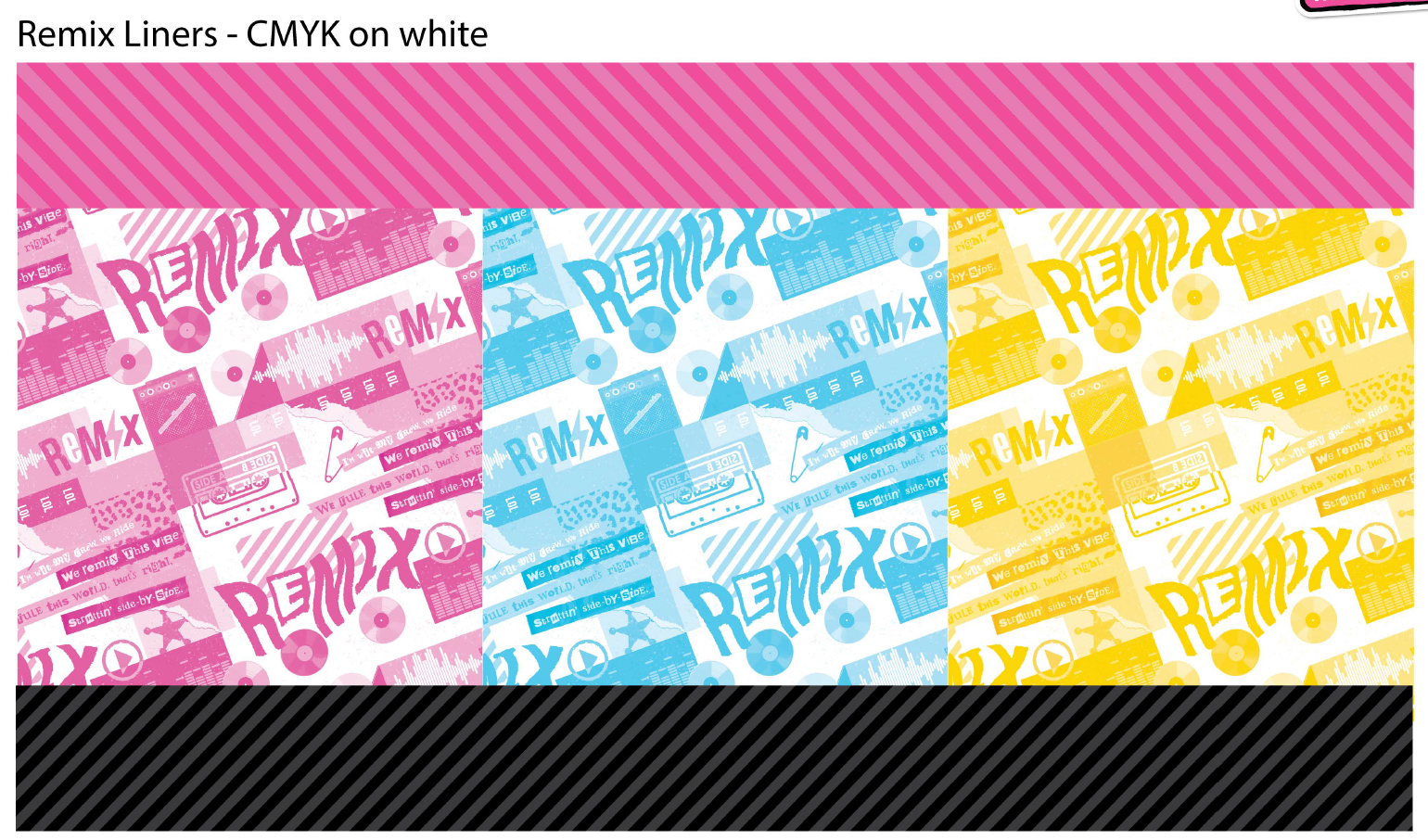
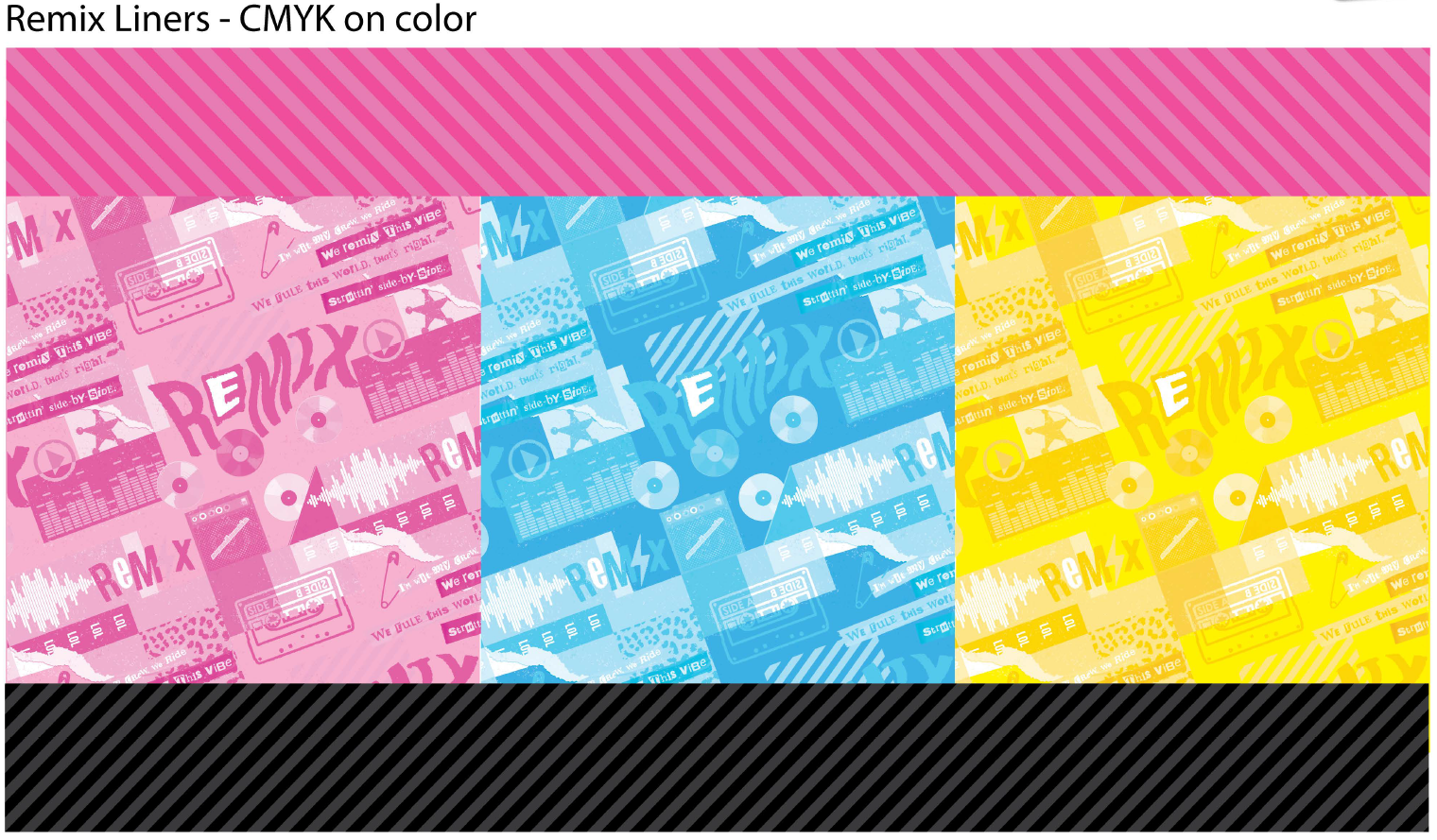
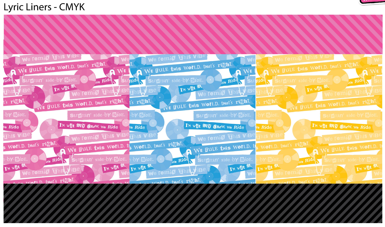
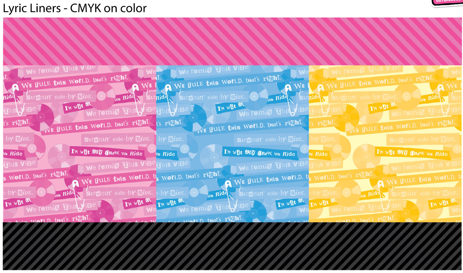
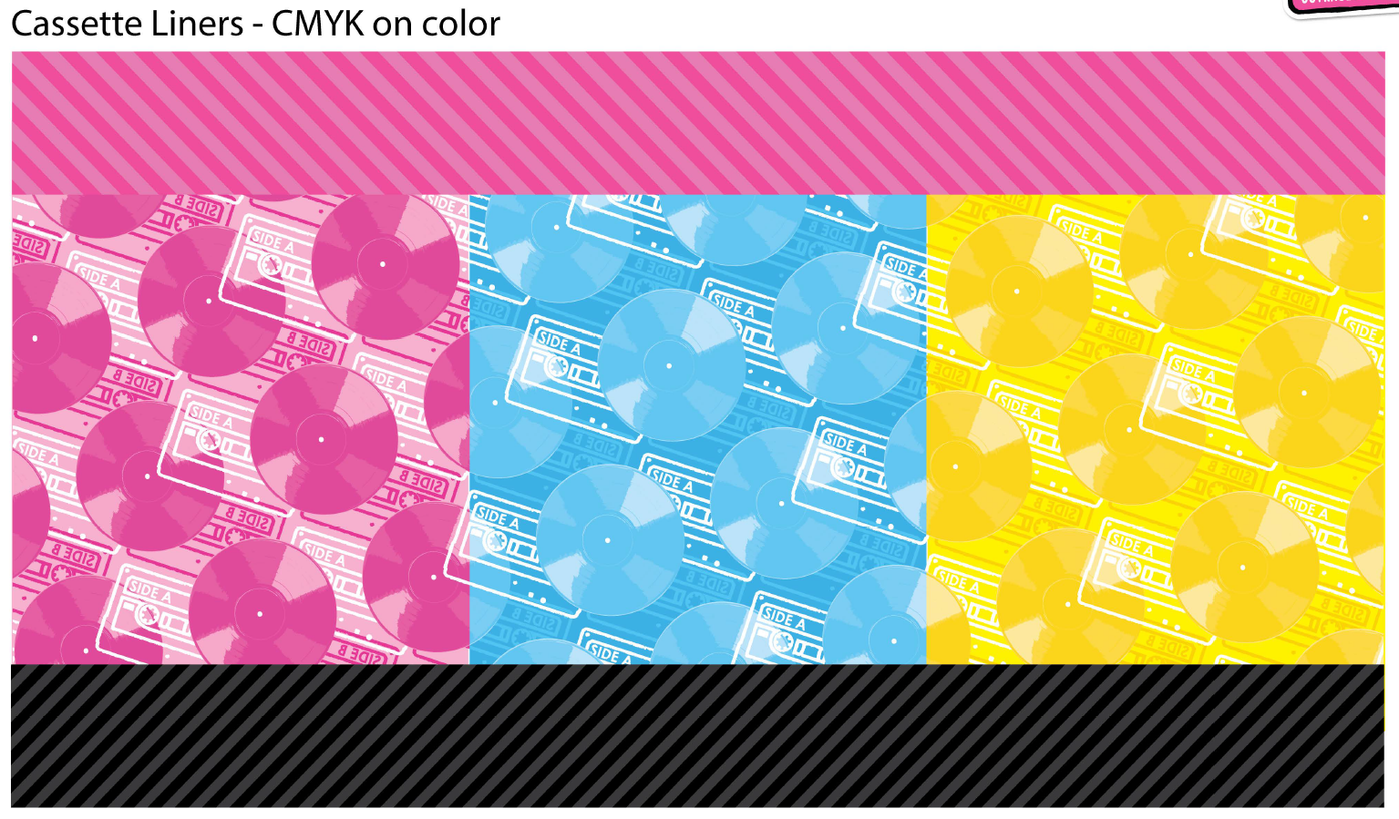
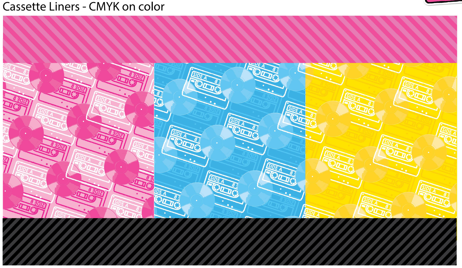
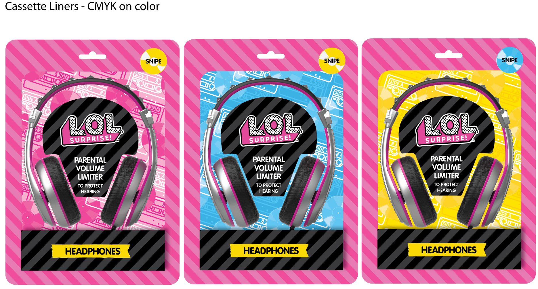
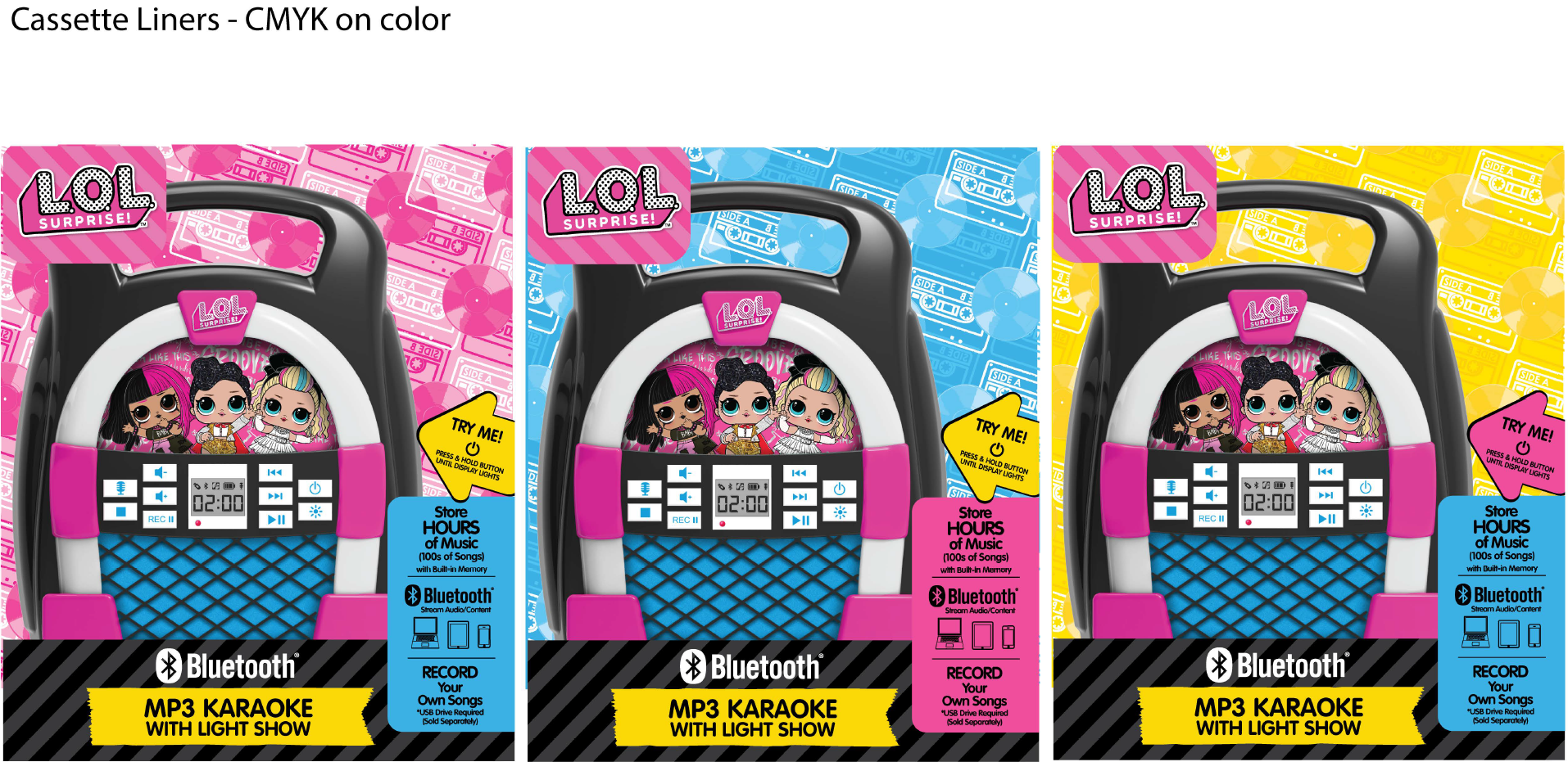
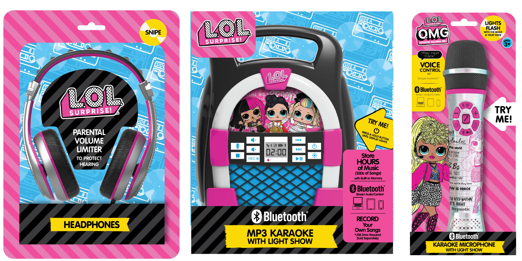
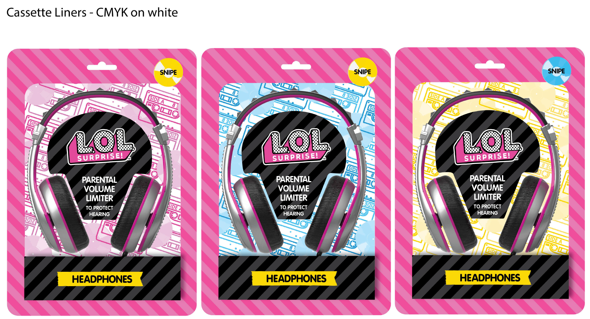
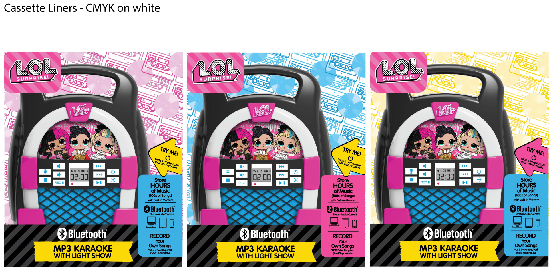
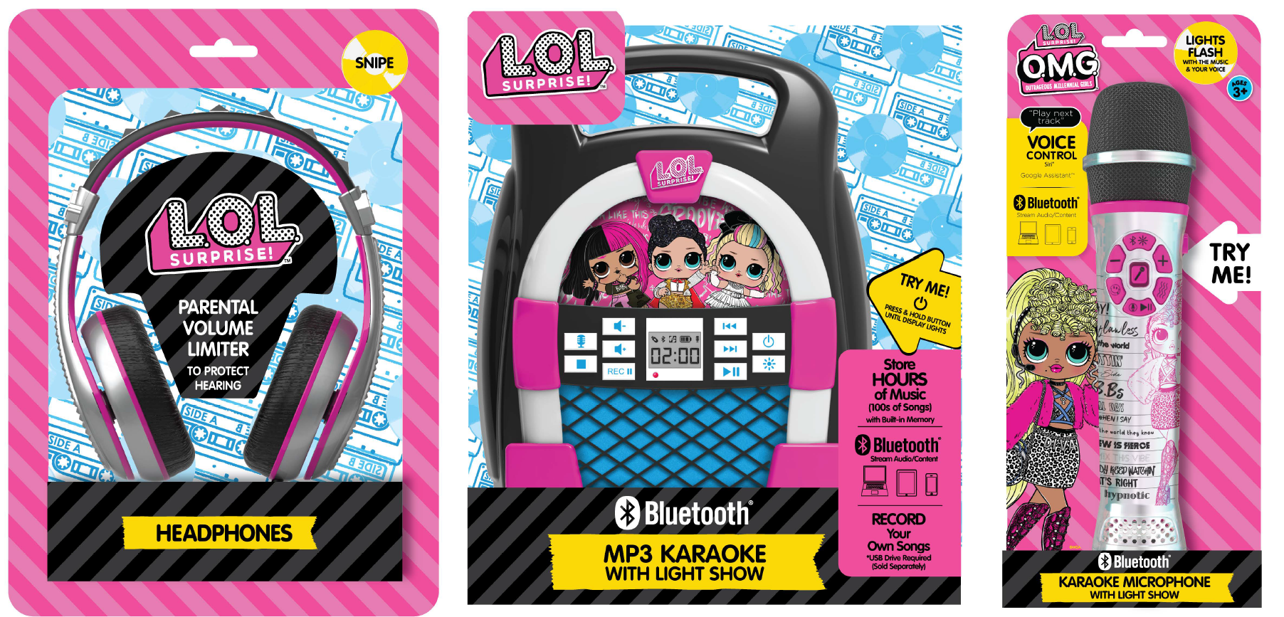
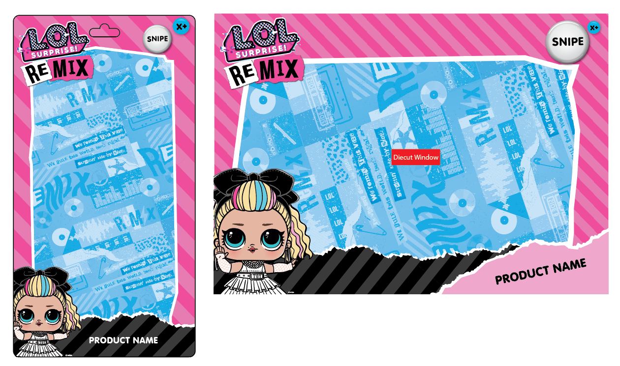
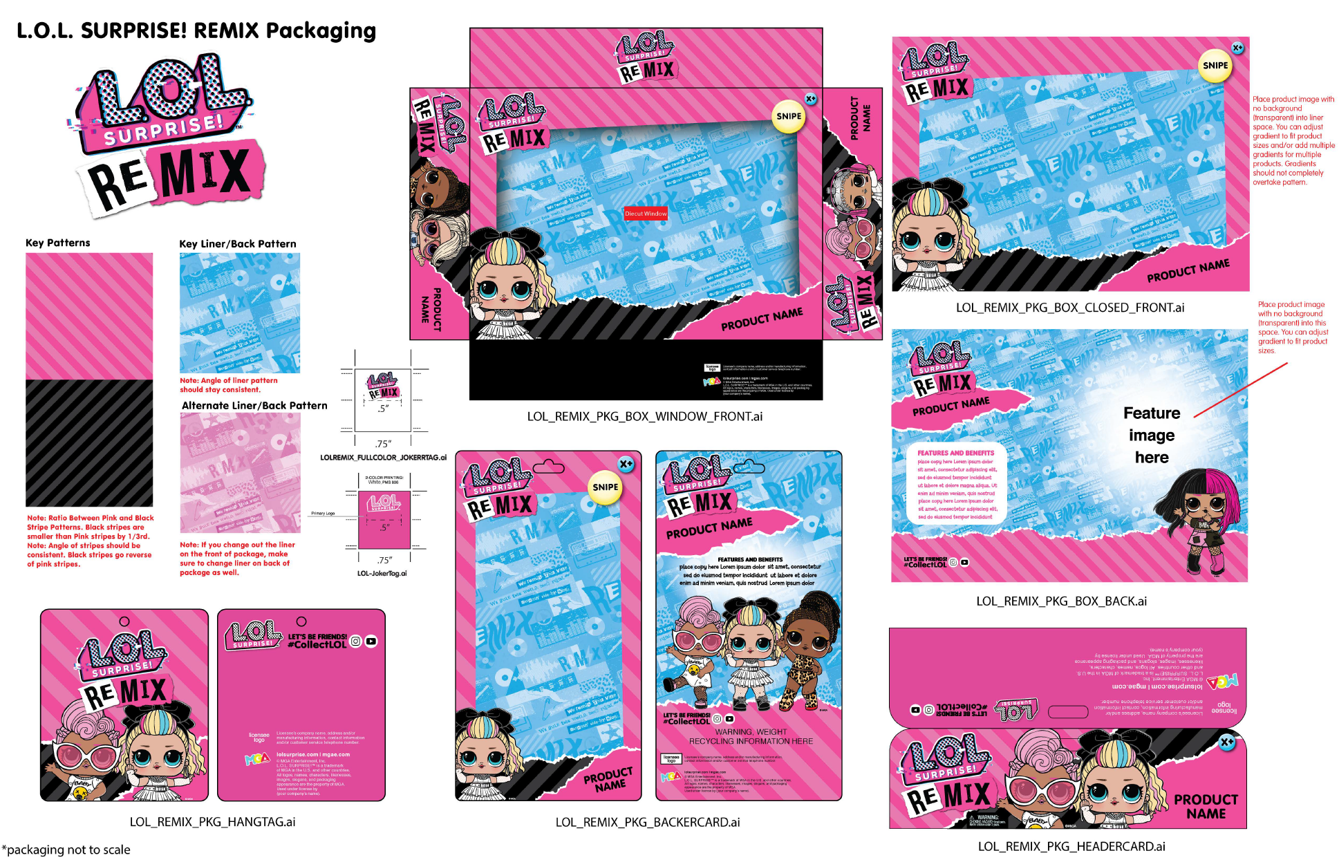
Final Packaging Design Files
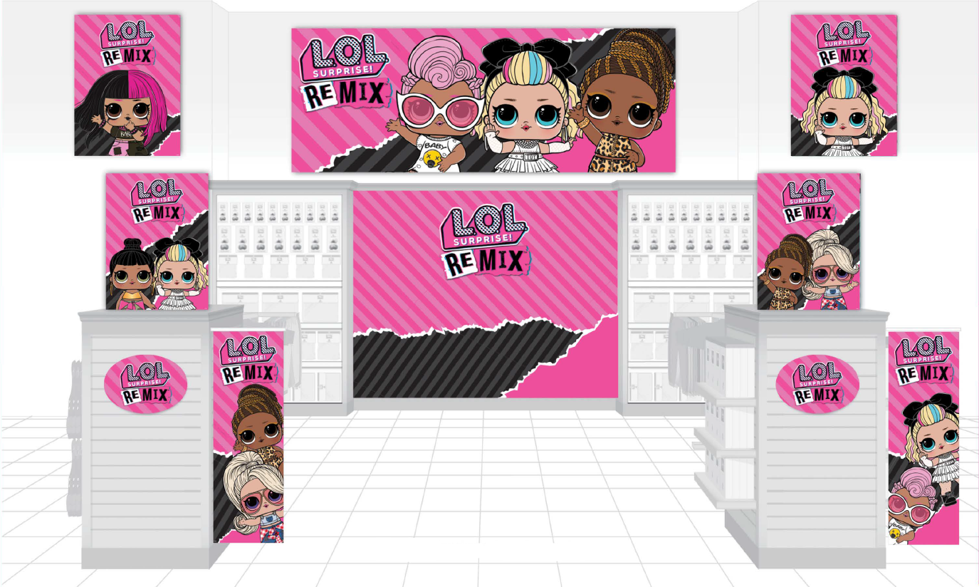
Retail Signage for Licensing
L O L Remix Kid Design
The best application of the L O L Remix packaging for licensing is hands down Kid Design. Part of this reason is because we were working with them actively on packaging while designing the Remix packaging, so I was more or less designing on their dielines for all the mockups seen in the process gallery, as well as the final versions here which I also did for them since they are an important licensee. The printing came out amazing and the line looks incredible, you can really see the culmination of the branding in the Kid Design packaging.
