Branding
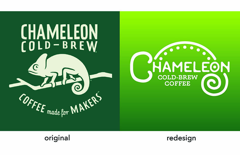
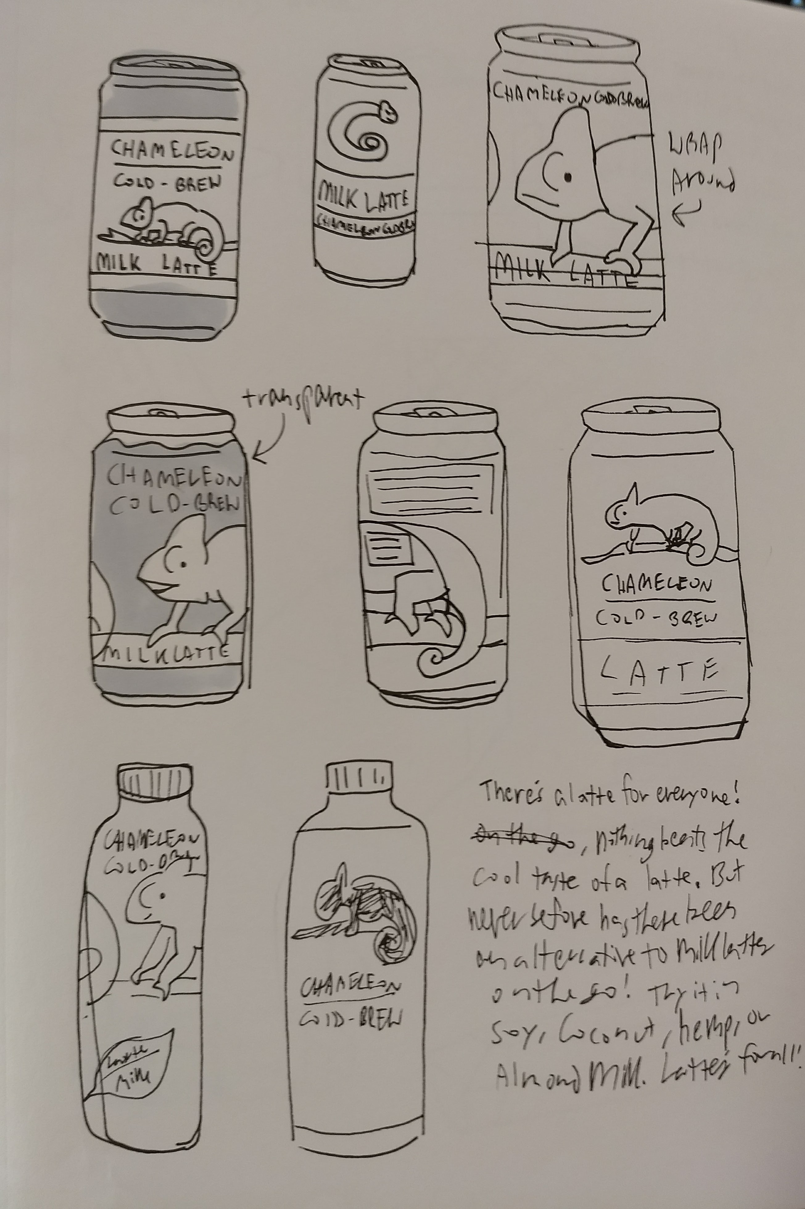
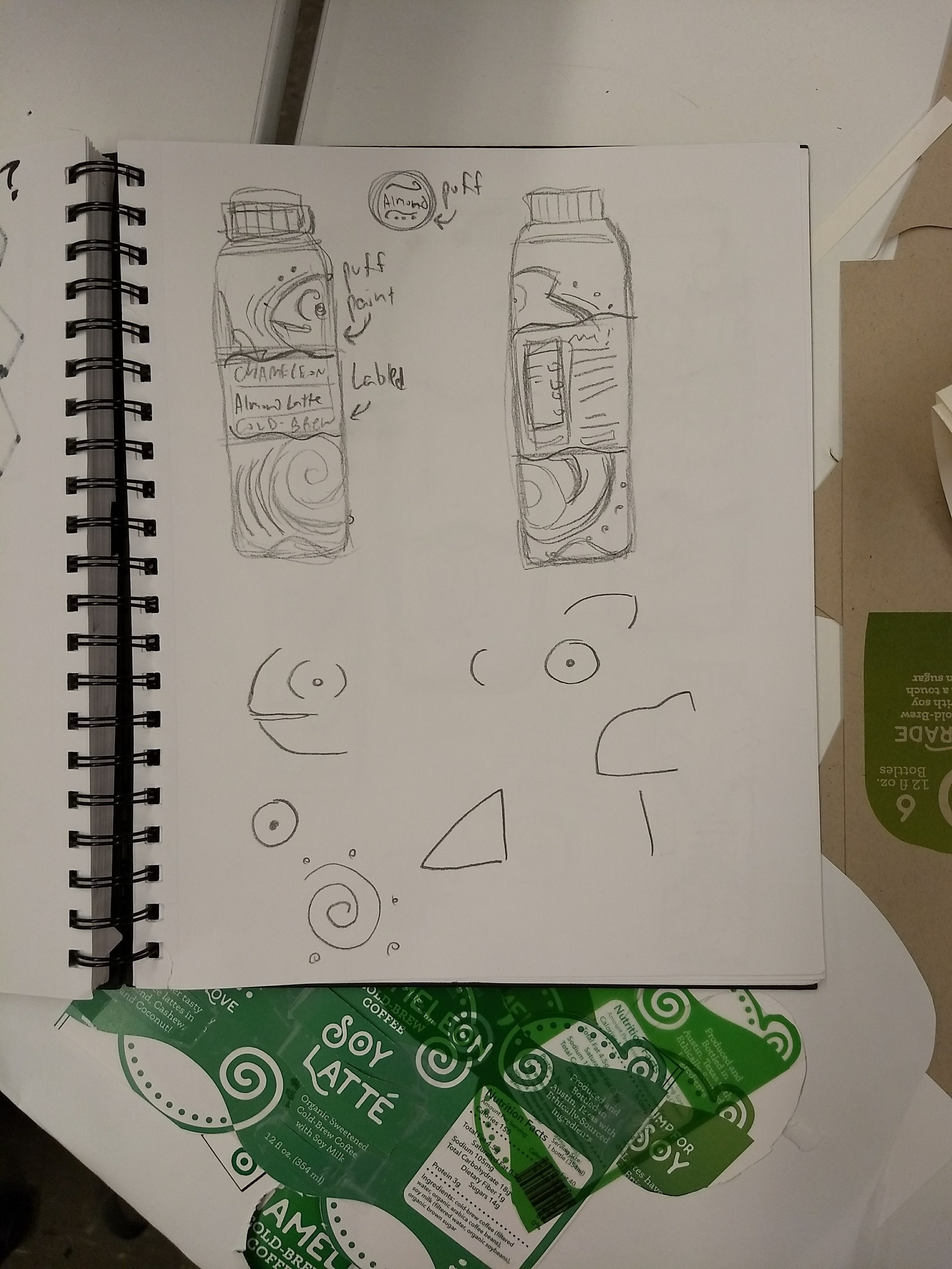
The original Chameleon Cold Brew logo and branding were heavy on using varients of a single chameleon illustration and funky logotype reminiscent of jungle themes. By modernizing the appearance of the logo and logotype there is now the possibility of more variety in the packaging of different products while still keeping rainforest and chameleon vibes.
New Product
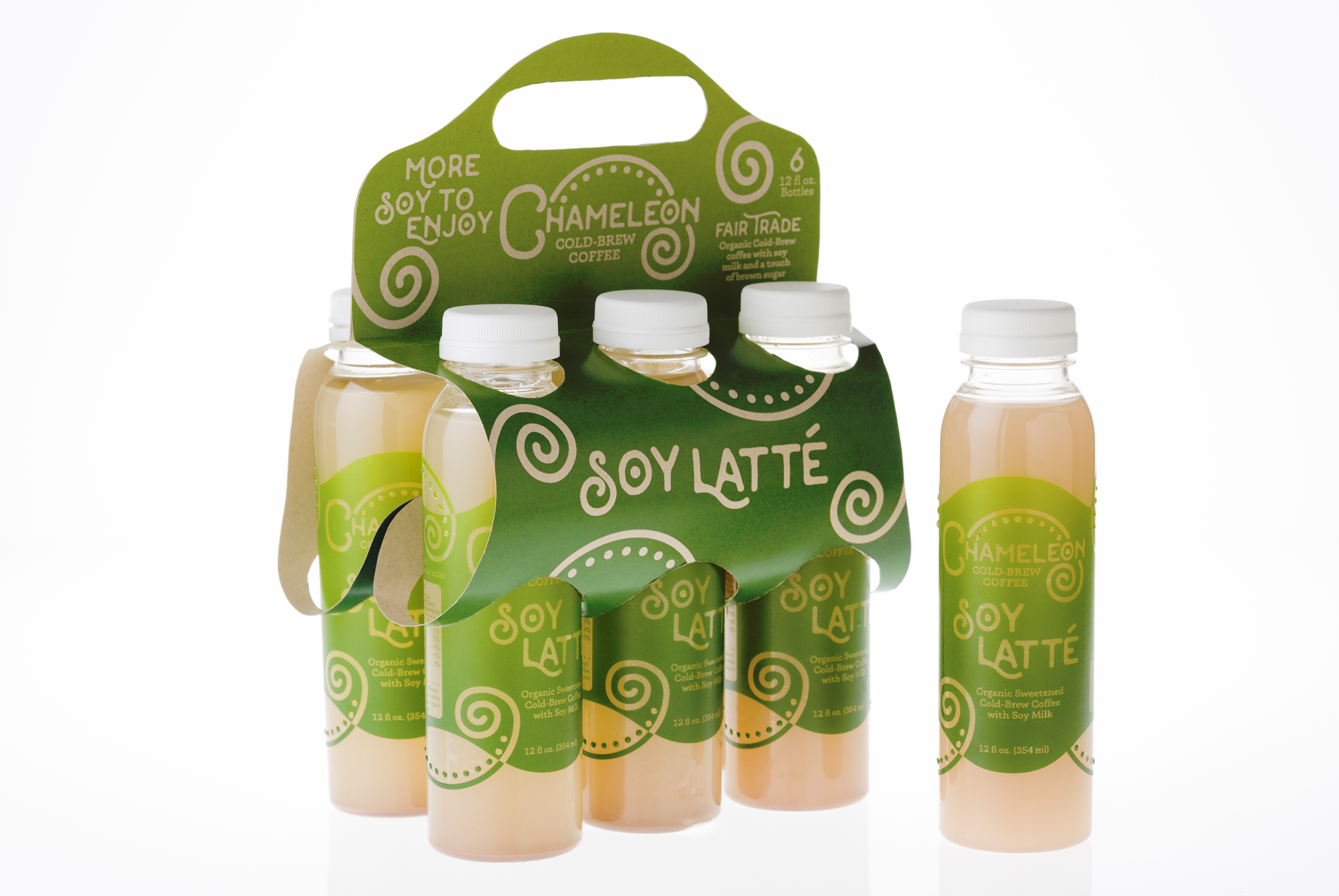
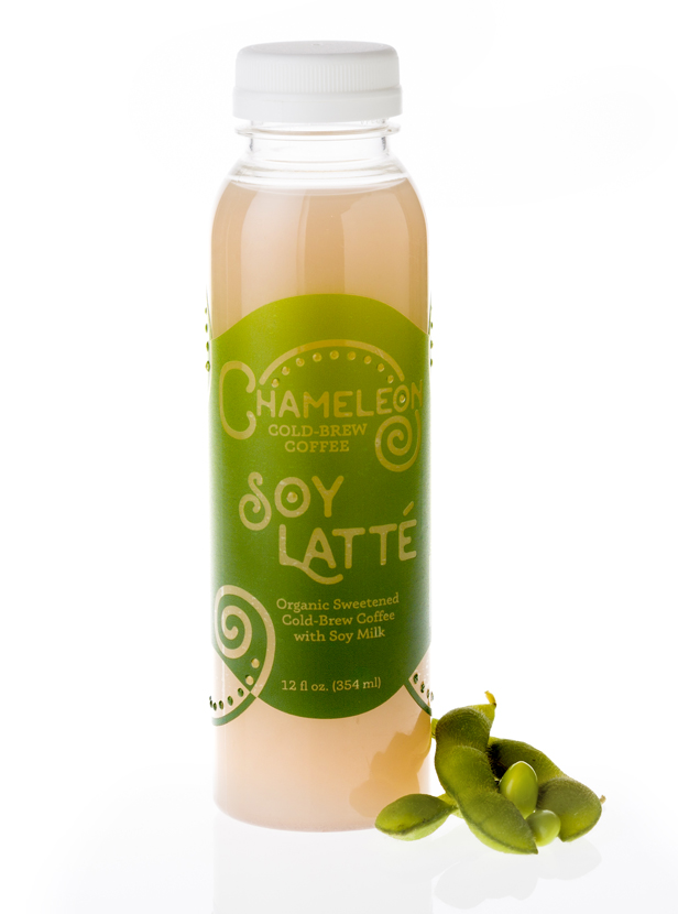
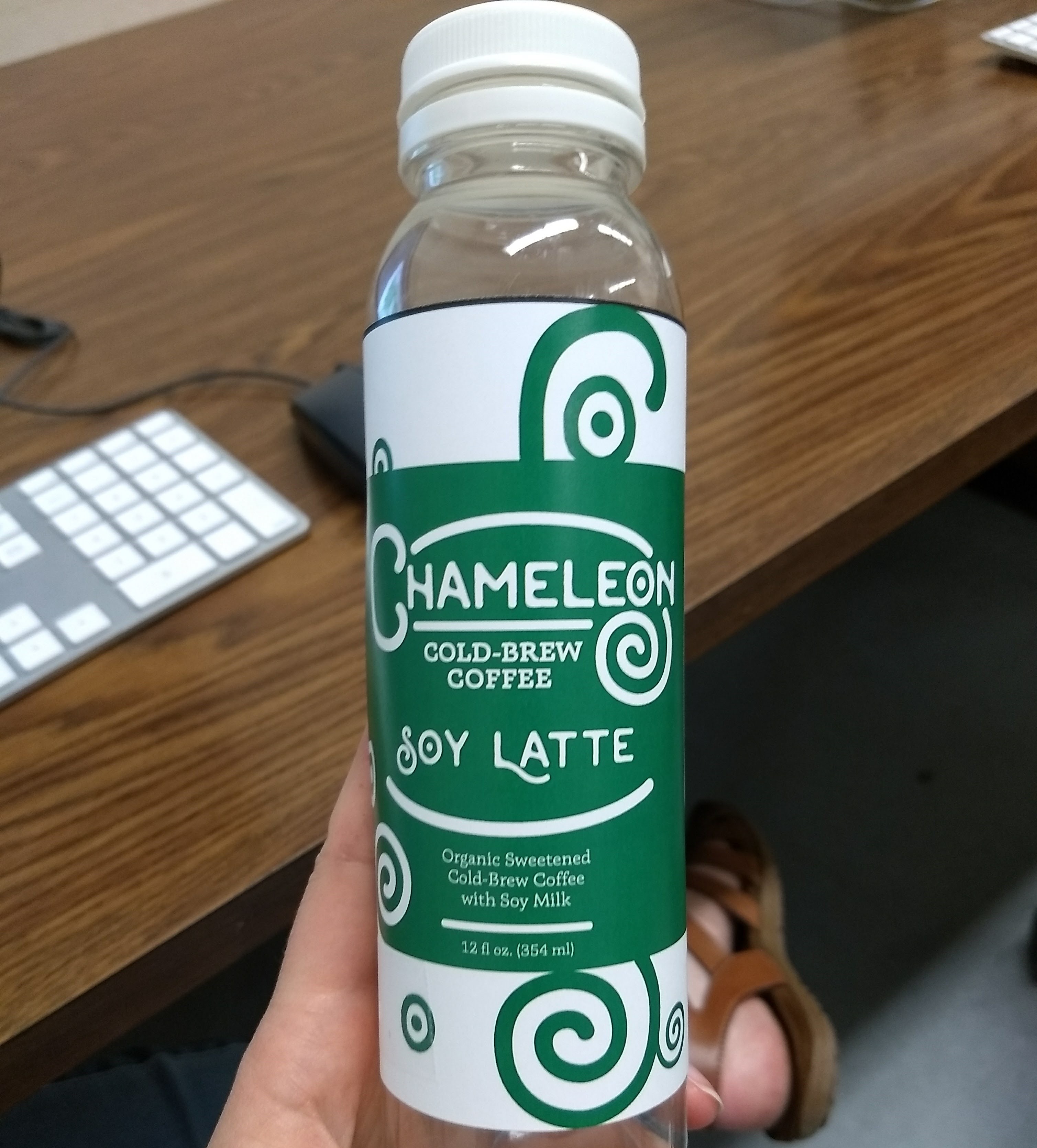
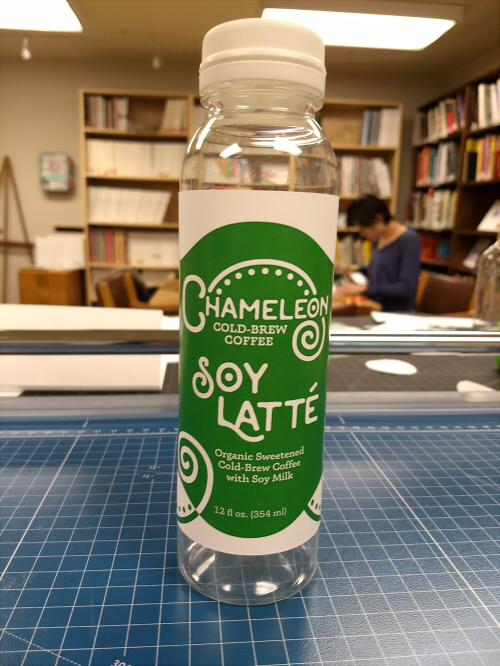
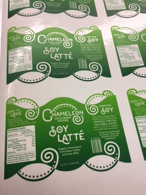
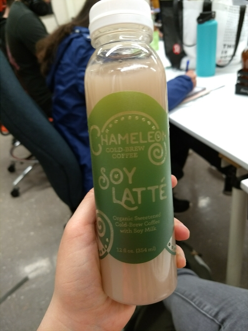
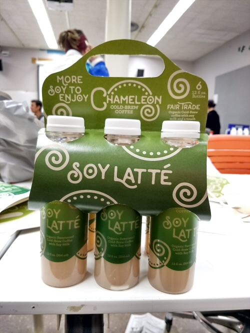
Unlike competitors, Chameleon Cold Brew had not previously offered any to-go beverages that included milk products. This Soy Latte design allows Chameleon to break into the grab-and-go market that is dominated by Starbucks and Dunkin' Donuts, while also providing an alternative to dairy milk lattes that are more prominent in this section.
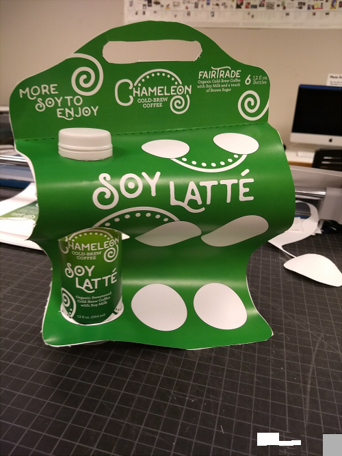
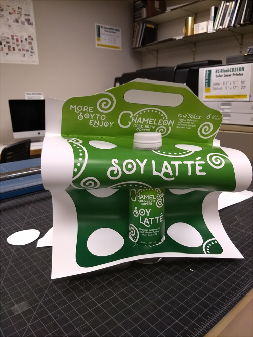
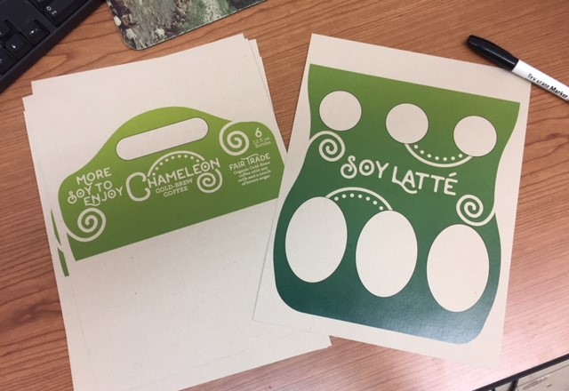
The bottle label has transparencies that allow the product to be seen through the label, playing on the camouflage that chameleons are known for. The label also has a textural quality with a matte finish and raised bumps. The 6-pack was designed with sustainability in mind with environmentally-friendly dyes and recycled cardstock.
County Fair Exhibition
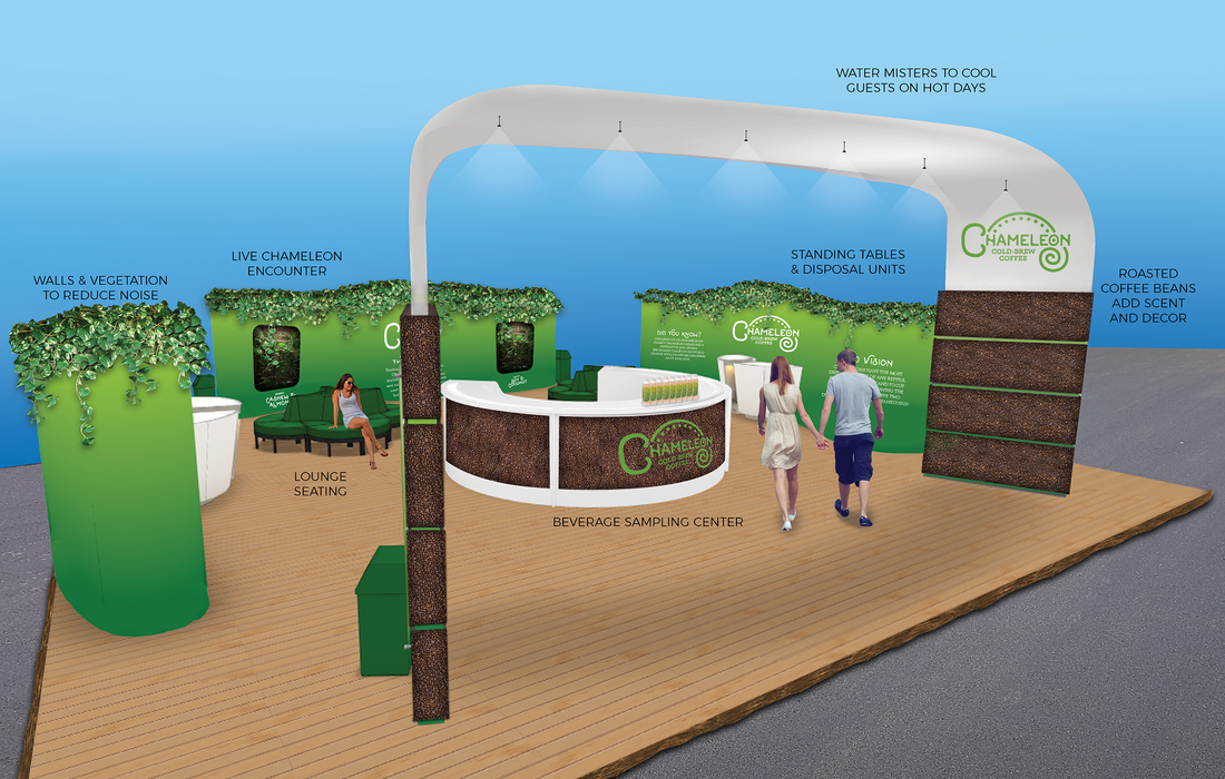
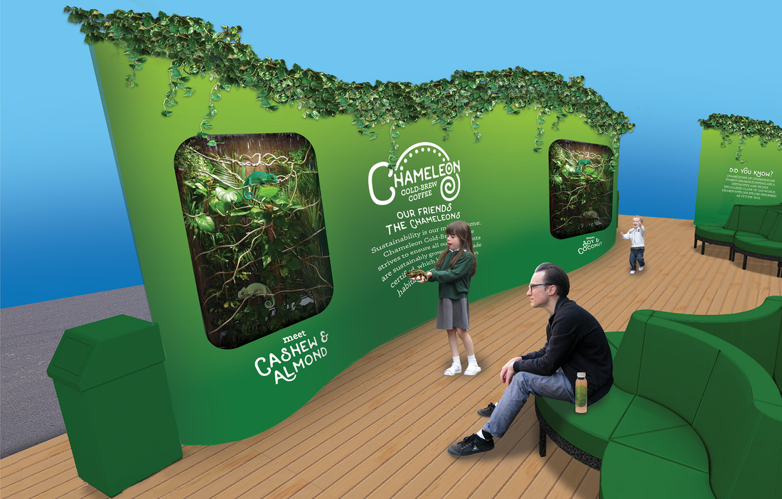
In relation to the Chameleon Cold Brew Latte product launch, a county fair show booth was designed to showcase the new product to the general public. Ideal for outdoor events, the exhibit has features that both adults and children can enjoy. While older individuals sample the new product, others can view and handle chameleons while learning about the importance of sustainability and fair trade for industries in the rainforest.
