Frozen 2 Converse Shoebox
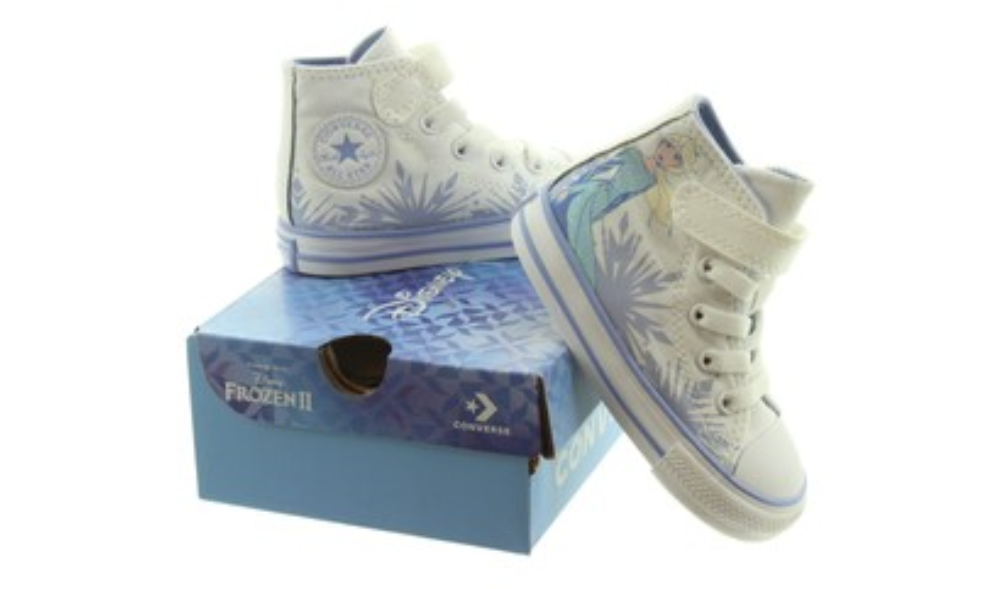
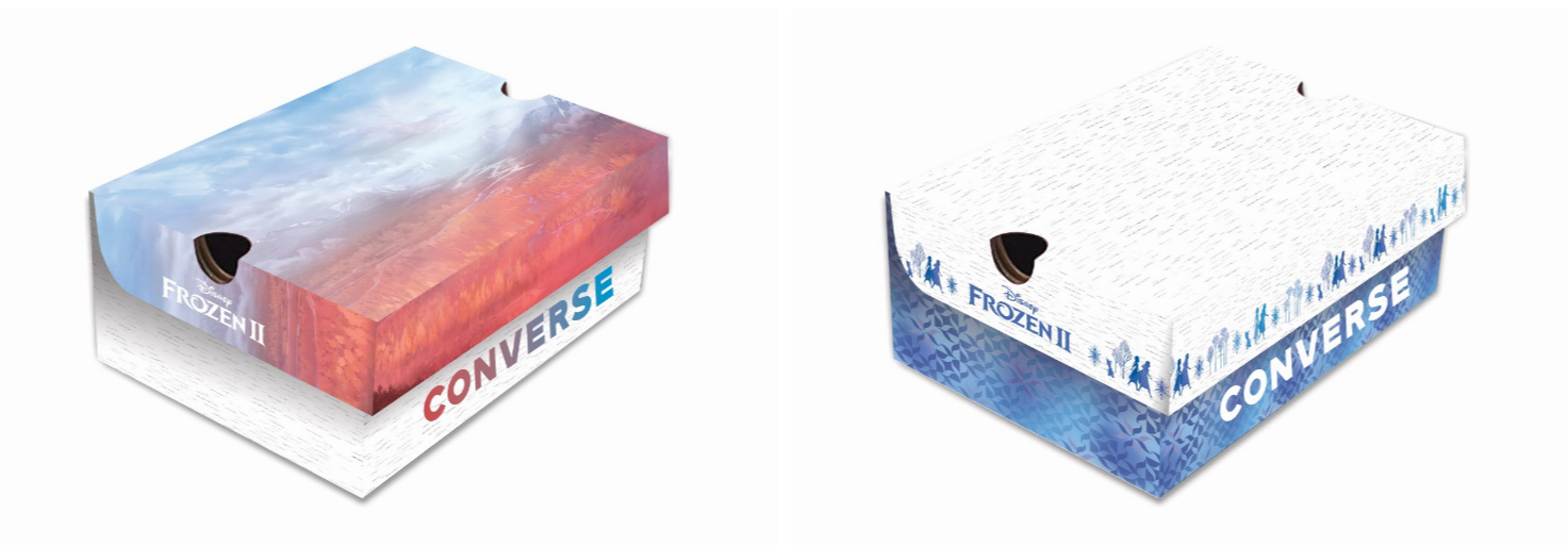
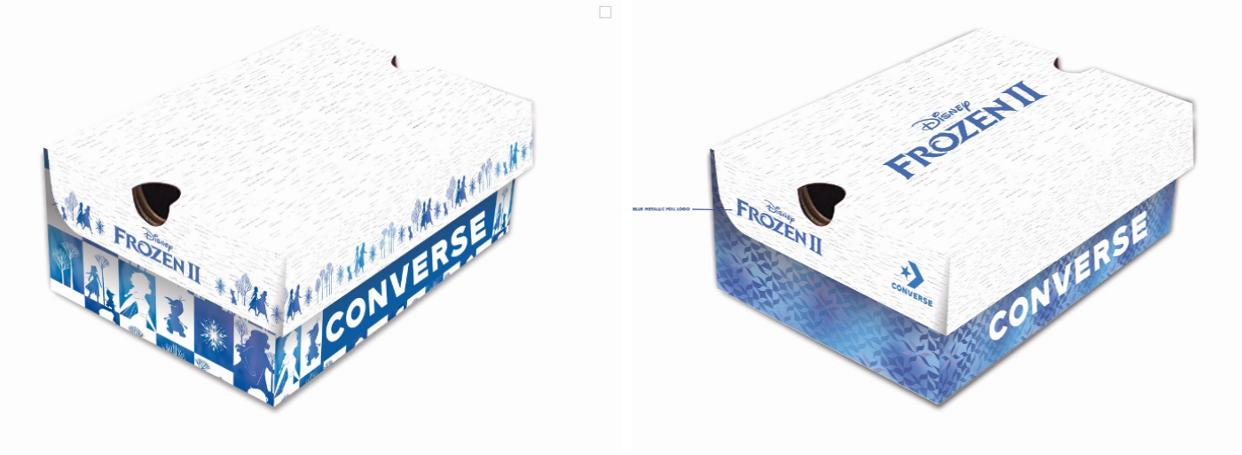
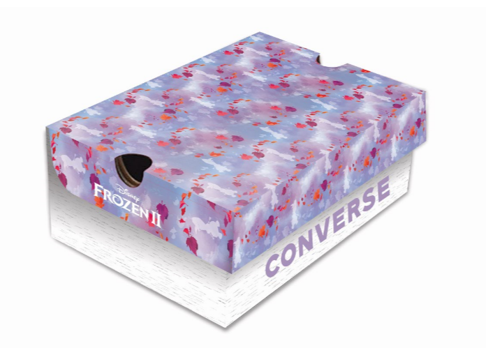
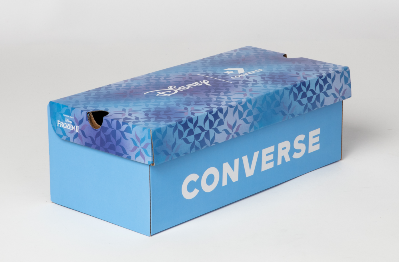
My team put me on task to help design the Frozen 2 shoebox for Converse. The shoebox needed to be friendly and brand-cohesive, but also unisex and for all ages. I tried applications such as applying a twist to the Frozen 2 branding guide, as well as a variety of patterns. The final product was a blend of two concepts, which you can see in the process gallery below.
Snow White Citizen Watch Box
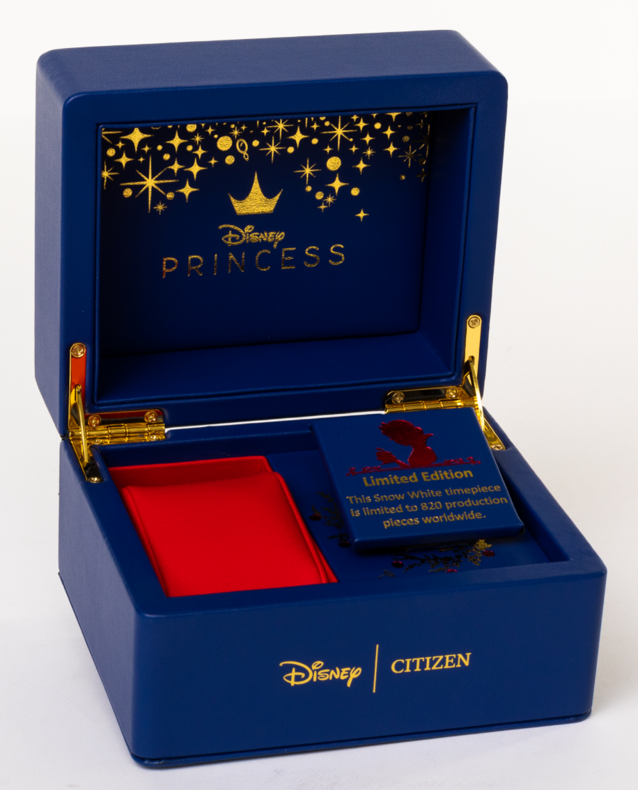
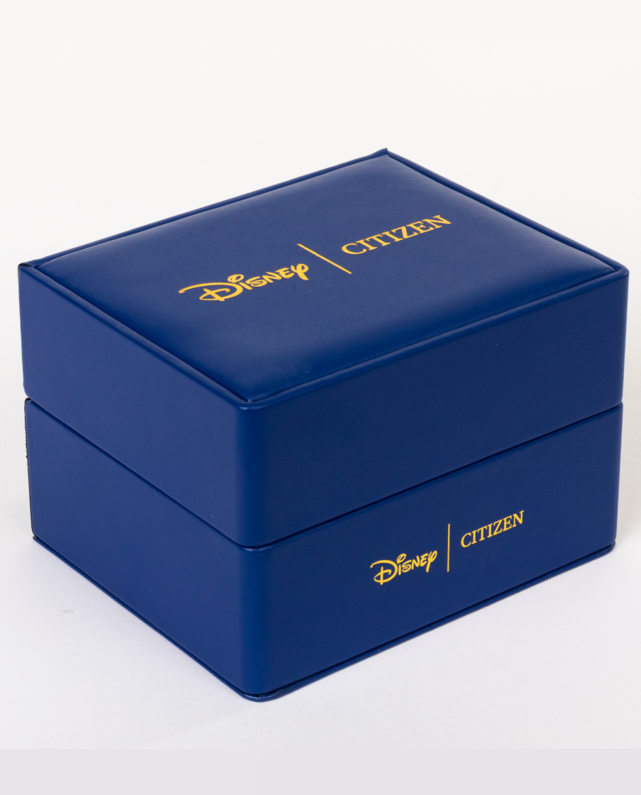
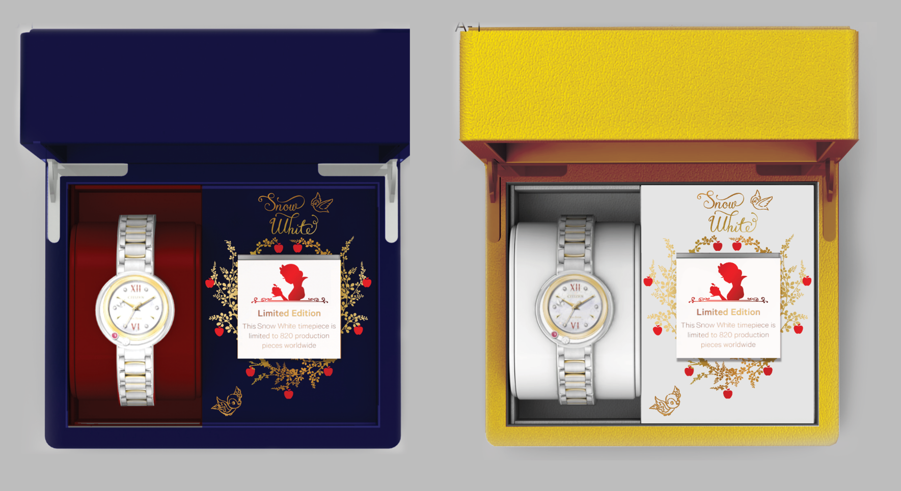
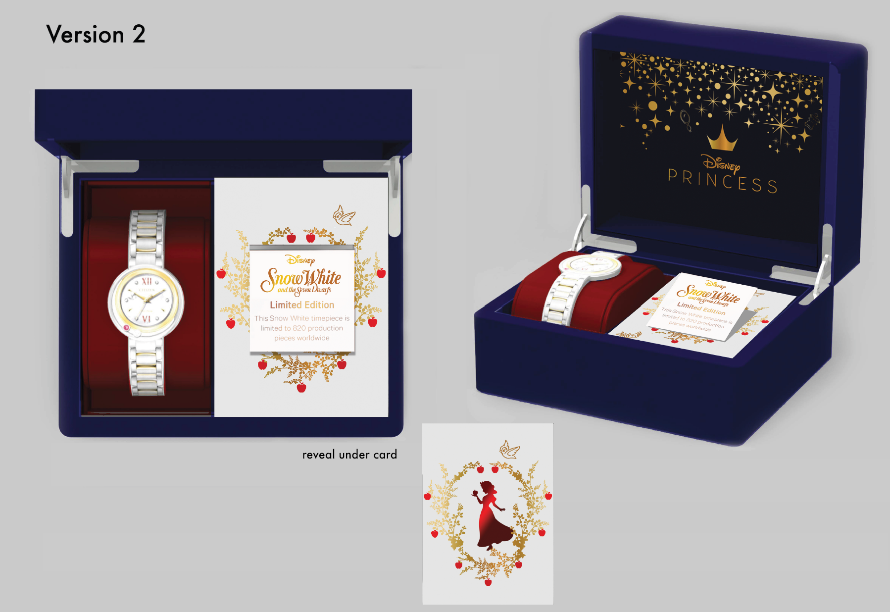
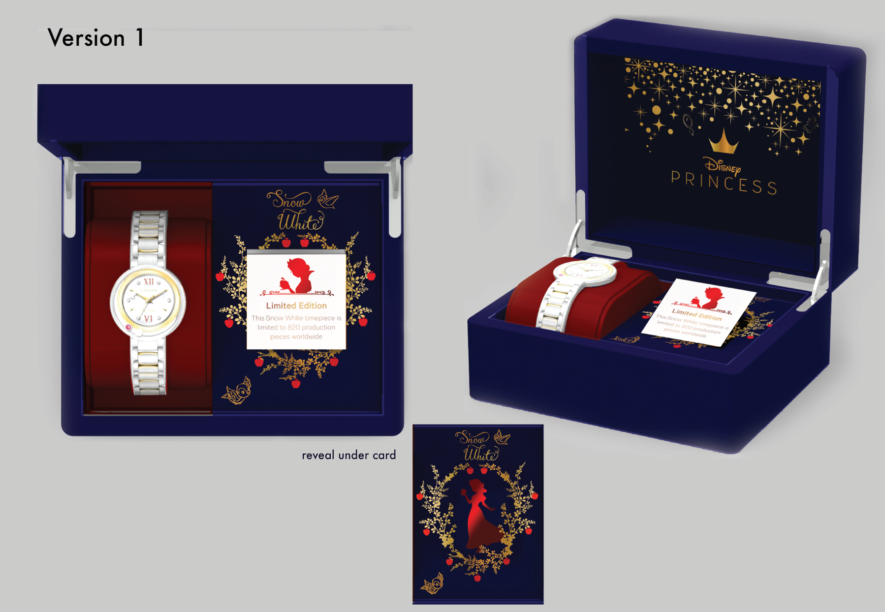
This was the last project I did during my time at Disney, and it turned out beautifully. They wanted the box to be more luxurious than their normal Disney Princess box, and I had the idea to use different colors of velvet and foil to indicate Snow White's iconic red apples, contrasting well with the gold foil and the blue velvet. Unfortunately I lost my early concepts from this project, but you can see some of my color variants in the process gallery below.
Columbia Mickey Mouse Collection
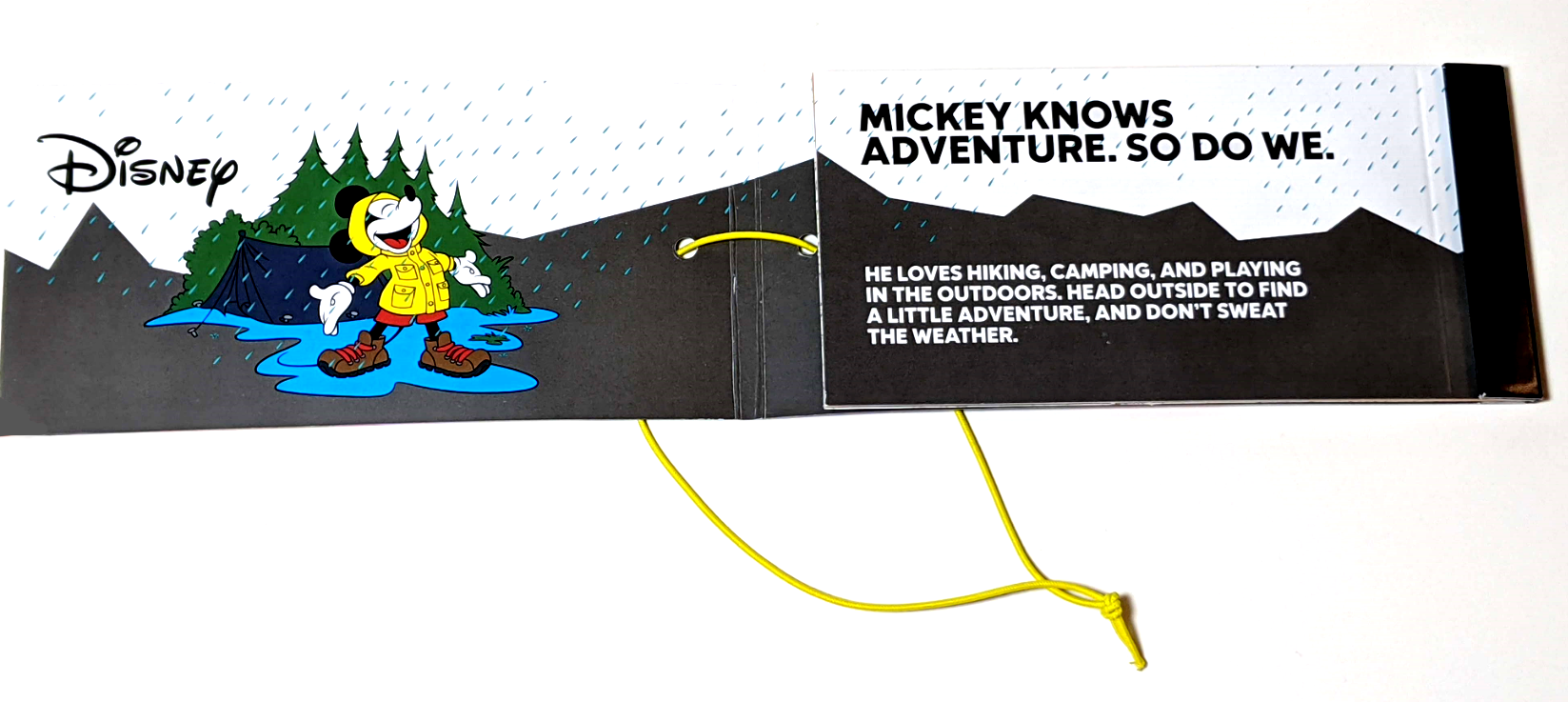
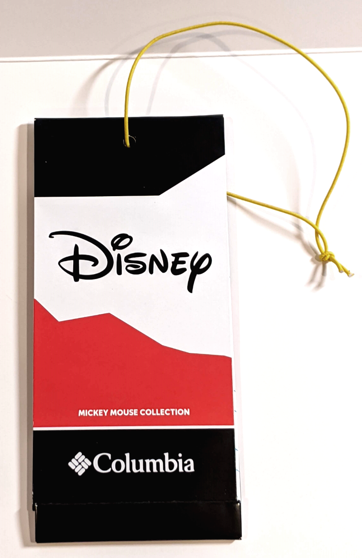
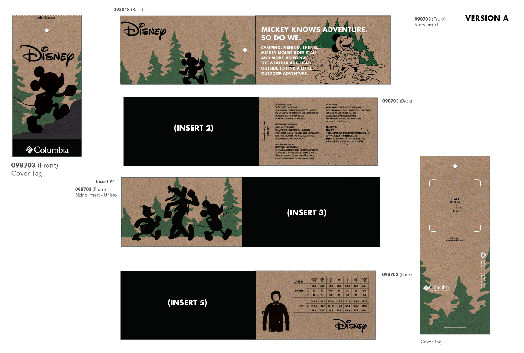
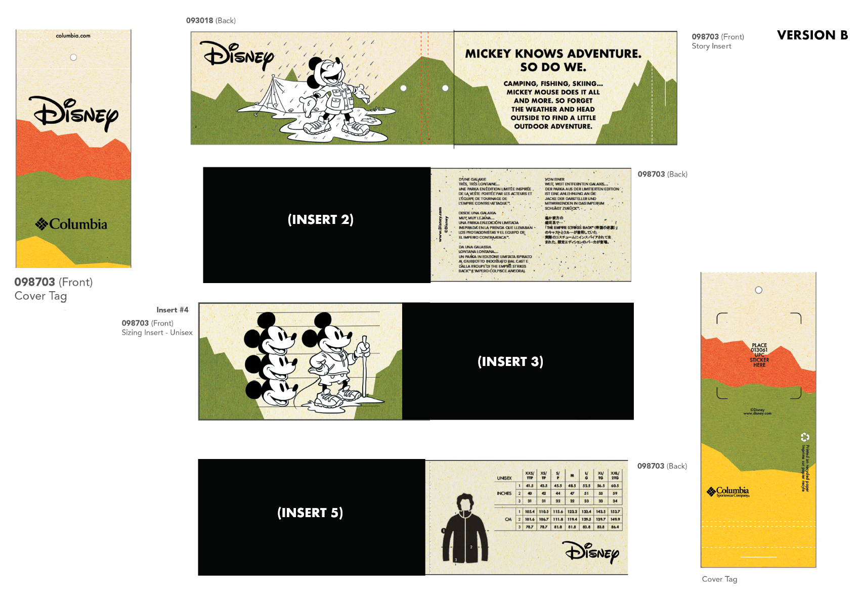
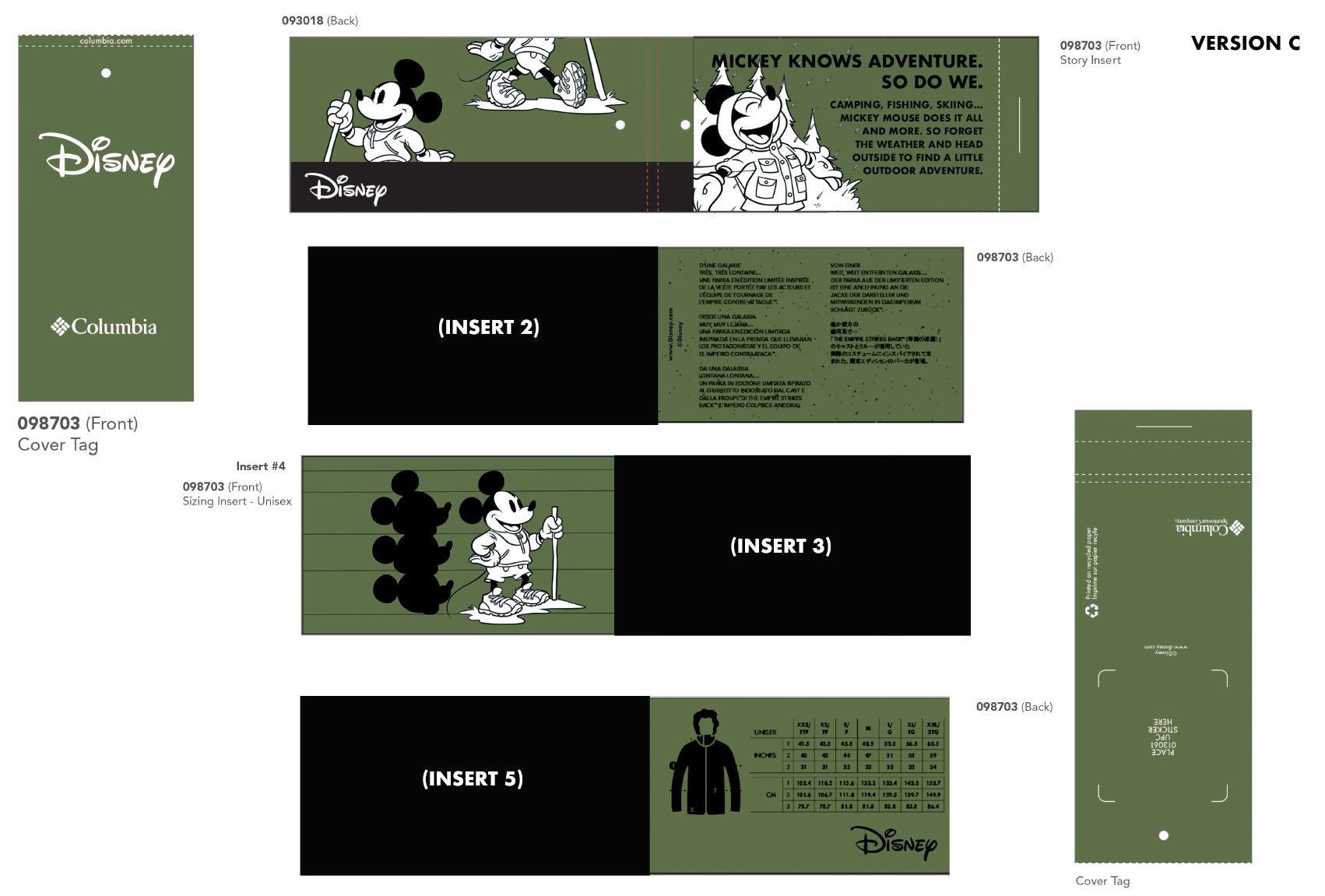
This was the first project I was tasked with when I arrived at disney, a special hangtag for the new Columbia Mickey Mouse collection. The hangtag needed to be Disney themed, but also Mickey Mouse, but also outdoorsy. It was an extremely fun challenge that allowed me to work directly with Disney character artists as well as Columbia's team to create a very fun and original hangtag. The original concepts were in rustic greens and reds as we explored a more recycled look, but the Columbia team decided to pivot to more Mickey-iconic red, black, and white. It was amazing to see the concepts come to life in this hangtag, and see my work in action.
